
Why We Design Brand Identity Systems That Can Survive a Rebrand
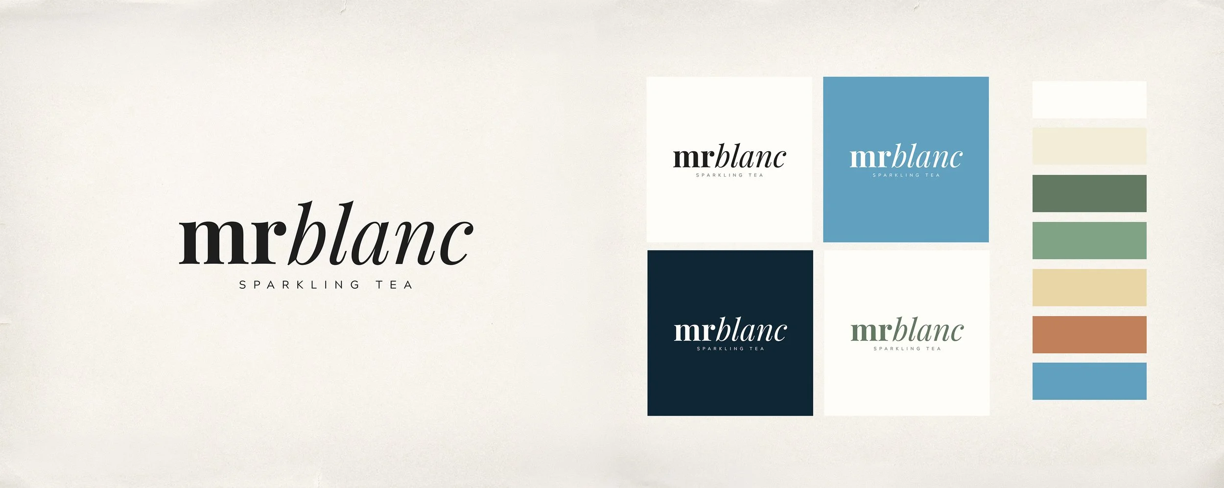
In November, we handed a client three logotype concepts and a finished colour palette for a new brand: Societea, a premium no- and low-alcohol sparkling tea. Three months later, in February, the name was gone. A licensing conflict in Australia forced a rebrand, and Societea became MrBlanc almost overnight.
The palette survived. The logotype architecture survived. Only the word changed.
That's not luck. It's the difference between designing a logo and designing a brand identity system, and it's a distinction that matters more than most founders realise until the name they picked collides with someone else's trademark.
The brief: a premium alternative, not a compromise
The brief was specific: a sophisticated, non-alcoholic alternative to wine and champagne, sold in 750ml bottles and piccolo four-packs, priced at AUD 25 to 30 a bottle. That price point sits the product next to grower champagnes and boutique non-alcoholic spirits, not next to soft drinks. The target audience was 20 to 55, unisex with a slight female skew: people choosing not to drink for health, lifestyle, or simply preference, without wanting to feel like they've downgraded the occasion.
The category backs this up. Off-premise sales of non-alcoholic beer, wine, and spirits are up 22% year over year, and 41% of consumers now say they've cut back or stopped drinking alcohol entirely, according to Datassential. The NoLo sector overall is forecast to pass $11 billion by 2026. In a category growing that fast, packaging carries more of the trust-building work than the liquid itself: consumers are picking fewer, higher-priced products, and the label has to earn its place next to the champagne rather than apologise for not being one.
Why brand names collide more than founders expect
Naming feels like the fun part of a launch. Legally, it's the riskiest. Australia has plenty of precedent for names that seemed fine at the concept stage and weren't: a streetwear label called Clothing the Gap was challenged by Gap Inc. over trademark similarity, and a Melbourne accommodation start-up called Notel was forced to rebrand after Accor's Novotel trademark holders objected, according to LegalVision. Registering a business name in Australia doesn't clear a trademark; a comprehensive IP Australia search does, and even that doesn't catch every regional or category-specific conflict until a product is actually on shelf.
Societea ran into exactly that kind of conflict. The name itself wasn't the problem going in; it became one once the brand was closer to market in Australia. For a founder, that's a gut punch. For a studio, it's a test of whether the identity work you did was actually reusable.
Building a mark, not just a name
We presented three logotype directions in the first milestone. One combined the S and T into a monogram with Nordic editorial restraint. Another gave the S a fluid, liquid-inspired stroke and shaped the O into a bowl, a nod to tea served rather than poured. The direction the client selected went further: a script wordmark built around a pictorial monogram where the S inside a circular O reads as both a tea bowl and an abstract leaf, depending on how you look at it.
That dual reading is the point. A mark built on visual logic, rather than on the specific letterforms of one word, doesn't automatically break when the word changes. It's the same reason a well-built packaging system separates structural decisions (grid, colour logic, lockup rules) from decorative ones (the specific typeface treatment of a name): the structure is the asset you can defend, the surface is the part that's genuinely at risk.
What actually carried through the rename
When MrBlanc launched in February, the extended colour palette, "Mineral Champagne" through to a deep slate graphite, came through untouched: the same seven-colour system, the same botanical greens and warm terracotta accents, the same restrained, editorial feel. The lockup rules carried over too: a small-caps "SPARKLING TEA" subtext beneath the wordmark, the same spacing logic, the same variations for horizontal and stacked use.
What changed was only the word inside that system. MrBlanc's lowercase wordmark sits in the same visual register Societea's did, because the system was never built around one name's specific curves and counters. It was built around a set of rules the name had to fit into. When the name changed, the rules didn't need to.
Where this changes how we scope identity work
This is the part of branding work that's easy to under-scope, especially on a fixed timeline and budget. It's tempting to treat a logo as the deliverable and the guidelines document as an afterthought. We've started treating the guidelines, the palette logic, and the lockup grammar as the actual product, with the logotype as one expression of it. That matters most in categories where naming is genuinely fragile: alcohol and NoLo, wellness, anything crossing into a new market with its own trademark register. A studio can't prevent a legal conflict over a name. What it can do is make sure the brand doesn't have to start from zero when one happens.
It's a small shift in process, but it changes what a client is actually paying for. Not a logo they hope survives, but a system built to.
The takeaway
Societea to MrBlanc wasn't a redesign. It was a stress test the identity passed without us touching the palette, the mark logic, or the guidelines. If you're naming a brand into a category with real trademark exposure, worth building the identity system first and treating the name as one input into it, not the foundation everything else depends on.
If you're heading into a launch where the name isn't locked yet, we're happy to talk through how to structure the identity so it isn't hostage to it.
