CREED Case Study: A Nicotine Pouch Packaging System
Walk down the nicotine pouch section of any convenience store and count how many cans actually stop you. Most won't. The category has settled into one look: white base, thin logo, a flash of color for flavor. It's a shorthand every brand borrows from every other brand, in a category that's growing fast enough that standing still is its own risk. The market is projected to jump from $6.69 billion in 2025 to $8.63 billion in 2026, a roughly 29% CAGR, on its way to an estimated $23.81 billion by 2030.
That's the shelf CREED's founder was trying to break into when the brief landed on our desk through Fiverr. He didn't want a label refresh. He wanted a can that people recognized from two meters away without reading the logo, in a category where almost nothing does that.
Here's how a single "redesign our pouch" request turned into a full visual system, and why that distinction ended up mattering more than any one design.
A Brief Built on What It Wasn't
The initial brief was clear about rejections and vague about direction, which is more common than people admit. No neon. No graffiti. No generic Scandinavian minimalism. No copying the existing pouch brands he'd already ruled out. He'd put together a moodboard pulling from performance brands, brutalist typography, and streetwear identity systems, and had even developed a few directions internally. Some felt too flat and safe. Others went too loud. None of them, in his words, felt like "true CREED DNA."
That's the actual job in a brief like this: the client knows the feeling they want, mature, edgy, engineered but still emotional, bold but controlled, and the work is translating a feeling into a repeatable visual mechanism. Given the urgency, we agreed to validate the direction fast with a single flavor before building anything larger. That decision shaped everything that followed.
Four Directions, One Winning Logic
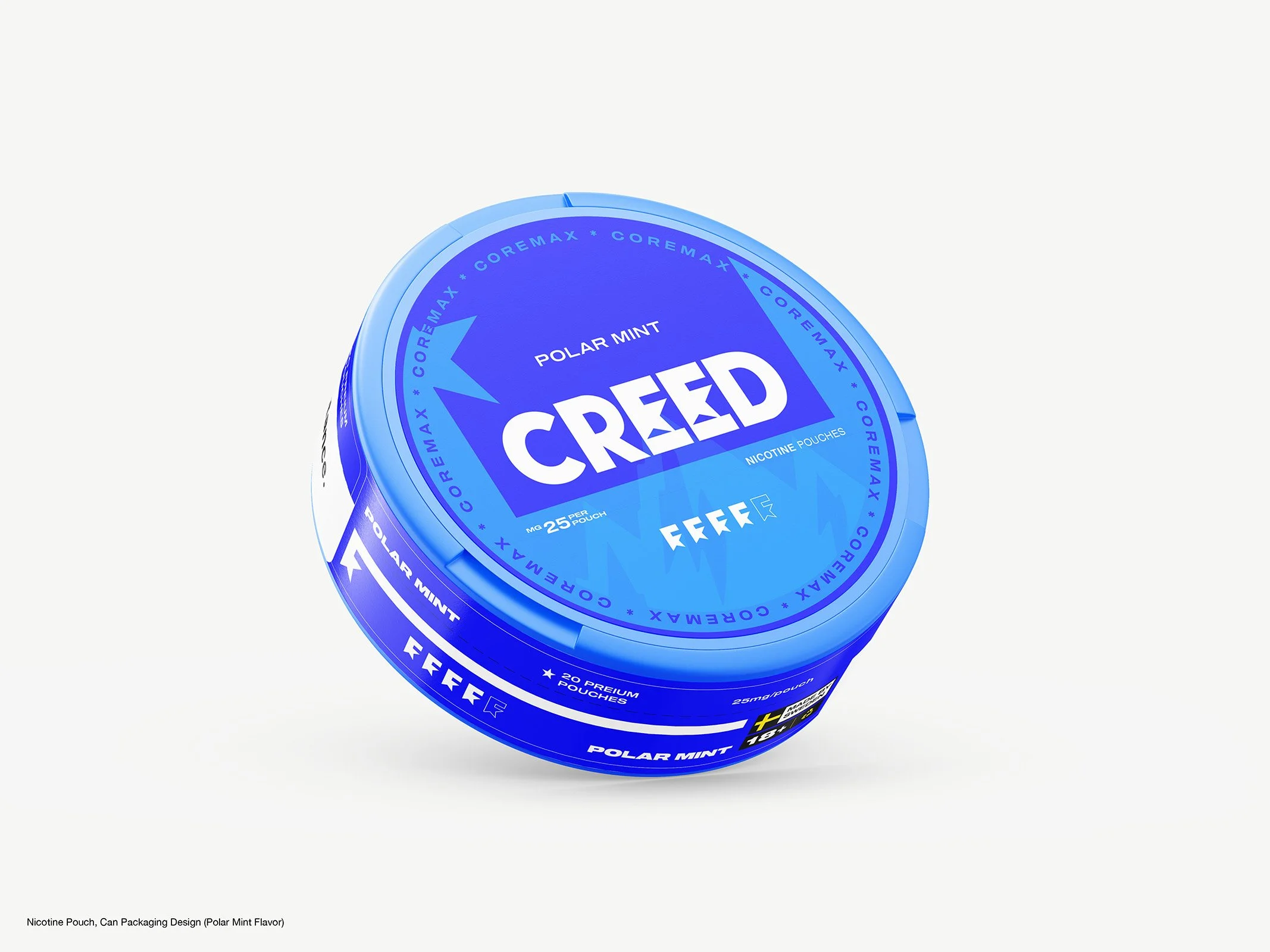
We took four concept routes to the first can, the Polar Mint flavor, each testing a different way to solve the same problem: recognizability without decoration.
System Ring used a colored outer ring as a flexible flavor indicator around a fixed central layout, built from day one to extend across a full product range. Brand First stripped the can back to a white surface and a strong red logo, letting typography and contrast carry the whole identity. Impact Blue leaned into a deep navy base to create a denser visual block than the pale palettes most competitors default to. Fresh Core used a white-and-blue combination tuned to read as "mint" at a glance.
This wasn't an arbitrary preference exercise. Research on shelf performance backs the instinct: color alone can lift brand recognition by up to 80%, according to the Institute for Color Research, and packaging using colors that break from category norms captures roughly 23% more visual attention than expected palettes, per a study in the Journal of Consumer Research. Given the category's addiction to pale, minimal palettes, both the navy and ring-based routes had a real shot at winning the 3-to-7-second window a product typically gets to earn a shopper's attention. System Ring won out, because it was the only one of the four built to scale past a single SKU.
Turning a Can Into a Brand DNA Element
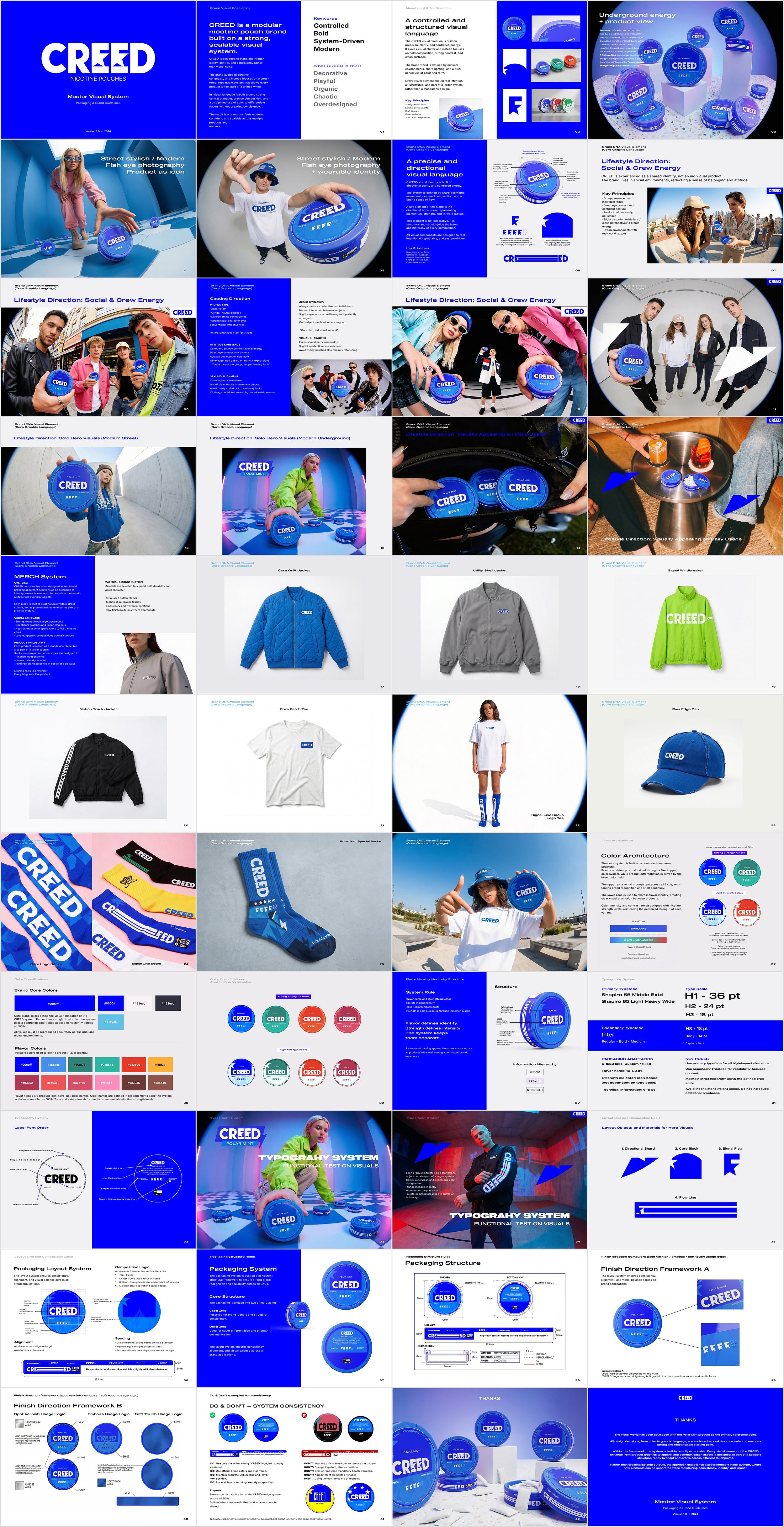
A design only becomes a system when it stops being redrawn for every new flavor. That's the difference between Phase 1 and what followed in the Master Visual System build.
The core of it is a directional arrow form set on a fixed angle system, anchored to a 61mm circular layout that every can shares. It's not decorative; it's structural, and it dictates hierarchy across every composition. Around it, the color logic splits into two zones: the upper zone stays fixed across every SKU for brand consistency, while the lower zone carries flavor identity. Color intensity is also tied to nicotine strength, so a "light" and a "hyper strong" variant are visually distinct at a glance, not just by small print. A modular symbol system backs that up for fast recognition.
Typography follows the same discipline: Shapiro for high-impact brand elements, Inter for anything that needs to stay legible at small sizes, with a strict type scale so nobody's tempted to introduce a fifth weight three SKUs from now. A finish framework (spot varnish, embossing on the logo and arrow graphic, soft-touch zones) adds a tactile, premium layer without touching the underlying logic. The same DNA element carries into merchandise, jackets, socks, caps, so a Signal Windbreaker and a Polar Mint can read as the same brand without either one looking like an afterthought.
Why We Split the Delivery Into Phases
Instead of disappearing for two weeks to deliver one polished reveal, we structured the work in three phases: a Mint Label Sprint for urgent, production-ready delivery in 4 to 6 days; a Master Visual System and guideline build, 6 to 8 days, once the direction was validated; and a rollout of four additional can designs built inside that established system.
This is a practical answer to a problem a lot of founders hit: you need something in market now, but you also don't want next year's flavor launch to mean starting from a blank page again. Locking the system down after the first can was approved, rather than before, meant the guideline reflected a direction the client had already seen work in the real world, not a theory.
How We Approach Packaging Work Generally
This project is a fairly direct example of how we think about packaging and identity work at 35milimetre: the deliverable is rarely just a piece of artwork, it's the logic behind it. A color architecture, a type scale, a finish framework, documented well enough that a fifth flavor or a merch drop doesn't require reinventing the can. Whether it's a compositing job for a beverage brand or a full identity build like CREED's, the goal is the same: get the system right once so production speed doesn't cost consistency later.
The Takeaway
A crowded, visually repetitive category doesn't reward a prettier can. It rewards a mechanism a shopper's eye can lock onto and a brand can keep reusing without diluting it. CREED's project moved from four exploratory directions to a documented, 15-to-20-page guideline precisely because the client refused to settle for "close enough to the rest of the shelf." If you're staring down a similar brief, one flavor to ship fast and a whole product family behind it, we're always happy to talk through what a system like this could look like for you.