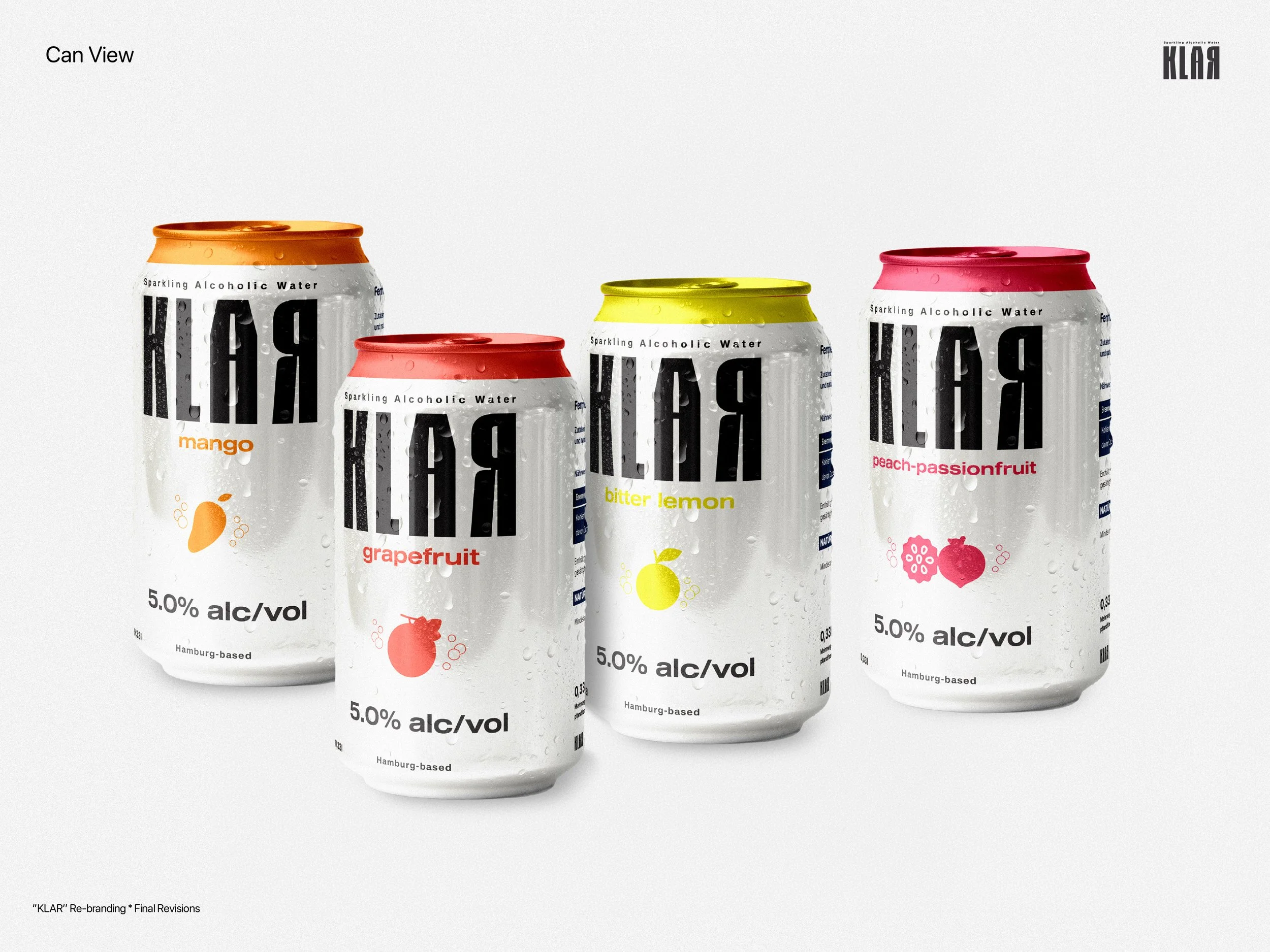
From Blank Label to Shelf-Ready: The Story Behind Klar's Rebrand
There's a particular kind of challenge that comes with inventing a category. When Hamburg-based startup Klar set out to bring alcoholic sparkling water to the German market, they weren't just launching a new drink — they were introducing a concept that barely existed on local shelves. Hard seltzer had already tried and failed to take off in Germany. So when Klar's founders sat down to rebuild their brand from the ground up, the brief they wrote wasn't really about making something look pretty. It was about making something make sense at a glance.
Starting from zero
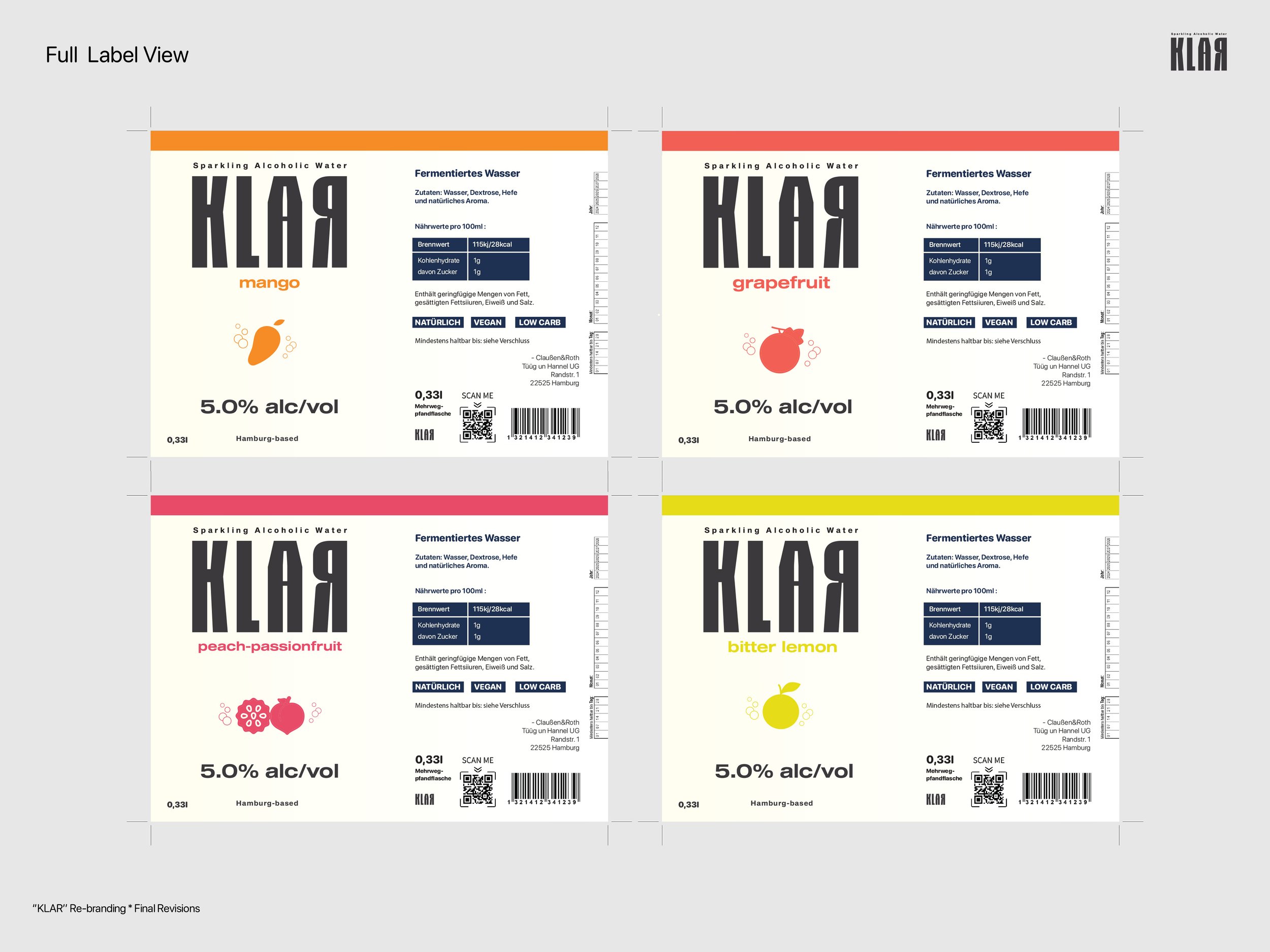
The founding team — three friends who'd turned a homebrew idea into a real product — came in with a clear rule: nothing from the old branding could carry over. Full stop. The new identity had to be built entirely from scratch, covering everything from the logotype down to the label on every bottle.
What they wanted was something that felt modern and a little bit loud in the best way — closer to the bold, colorful energy of American soda packaging than to anything overly serious. At the same time, they didn't want to lose their roots. Hamburg mattered to them, but they were adamant it shouldn't dominate the design. No skylines, no obvious postcard imagery. Just a quiet nod, tucked into the label in small type: proudly from Hamburg, without shouting about it.
The real design problem: this isn't just water
Early on, it became clear that the hardest part of this rebrand wasn't aesthetic — it was communication. Because "alcoholic water" doesn't have an established shelf presence in Germany the way beer or hard seltzer does elsewhere, there was a real risk that a customer might glance at the bottle, assume it was flavored mineral water, and walk right past it. The brief was blunt about this: someone should be able to pick up a bottle next to a Corona or a Desperados and instantly understand it belonged in that aisle.
That single problem shaped almost every decision that followed.
Round one: pulling back the fruit
The first full concept landed well. The team responded positively to the overall direction, especially a white emblem mark with a cloud motif worked into the logo. But there was a catch — the fruit illustrations on each label were too dominant. They were beautiful, but they were doing the wrong job. Instead of signaling "this is alcohol," they were signaling "this is a fruit drink," which undercut the whole point.
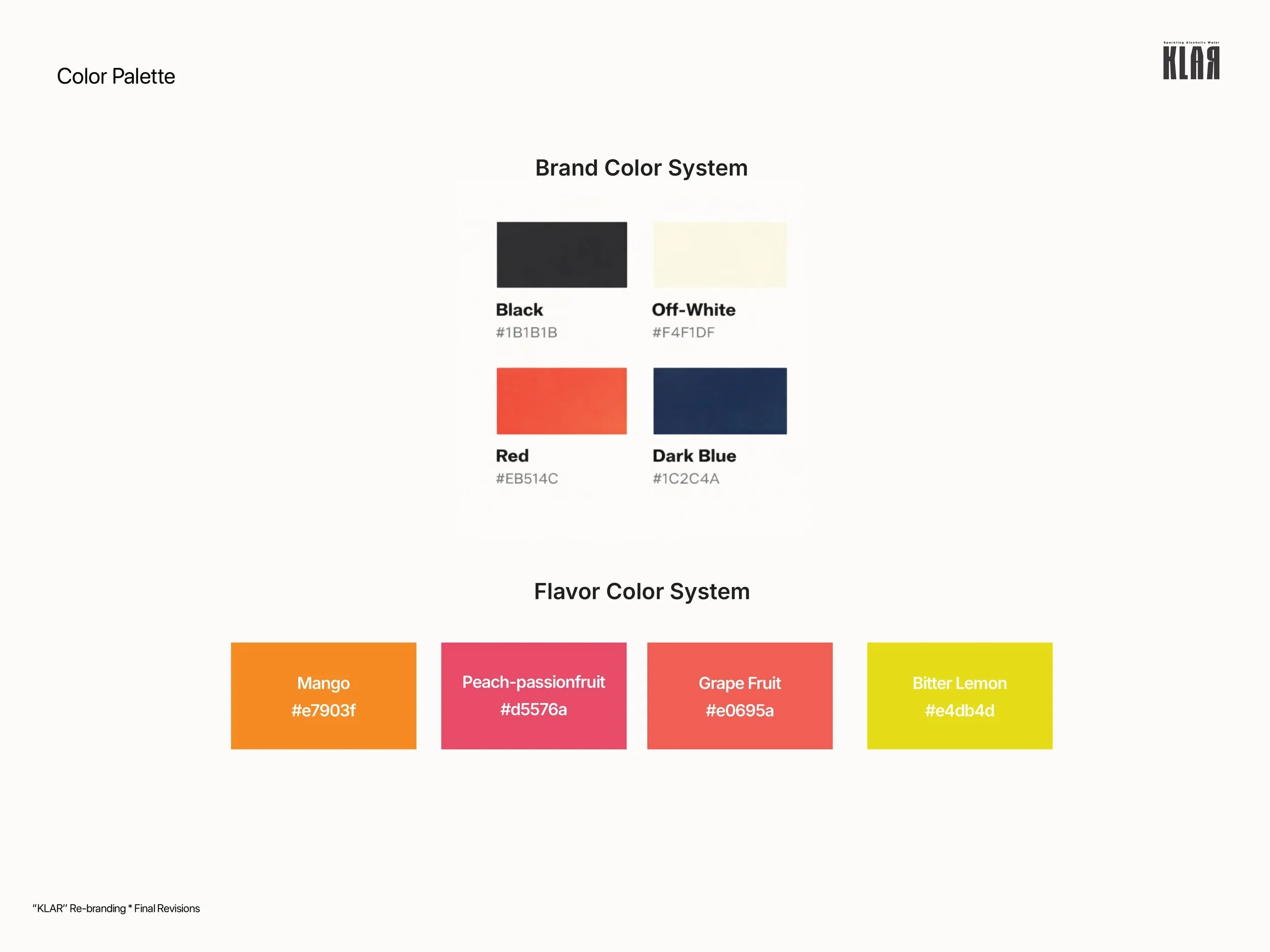
The fix wasn't to remove the fruit entirely, but to let color do more of the storytelling than illustration. Each flavor would live in its own distinct palette, recognizable before a customer even reads the word "Mango" or "Grapefruit." It was also in this round that the brand made a deliberate positioning choice: premium over party. There was a version of Klar that could have leaned into a more festival, dance-floor energy, but the team ultimately decided their audience — and their price point — belonged closer to the world of quiet, elevated hangouts than loud ones. Interestingly, that didn't mean the party spirit disappeared altogether; it simply migrated toward the can format, which was earmarked as the more casual, social sibling to the bottle.
Round two: refining the palette, simplifying the noise
With the direction confirmed, round two was about precision. Small decorative stars scattered across the label were cut for feeling too busy. Colors were pushed to be more saturated and vibrant rather than matte, giving the bottles more shelf presence. The Mango flavor shifted toward a warmer, punchier tone, while Peach Passionfruit — which had originally felt a little flat — moved toward a richer pink with a hint of purple, carefully avoiding anything that read as artificial or overly dark.
Typography got simplified too, trading complexity for clean, confident lettering, with a small addition at the base of the label: "Hamburg-based," kept intentionally understated.
The final details: bubbles instead of stars, and a font with personality
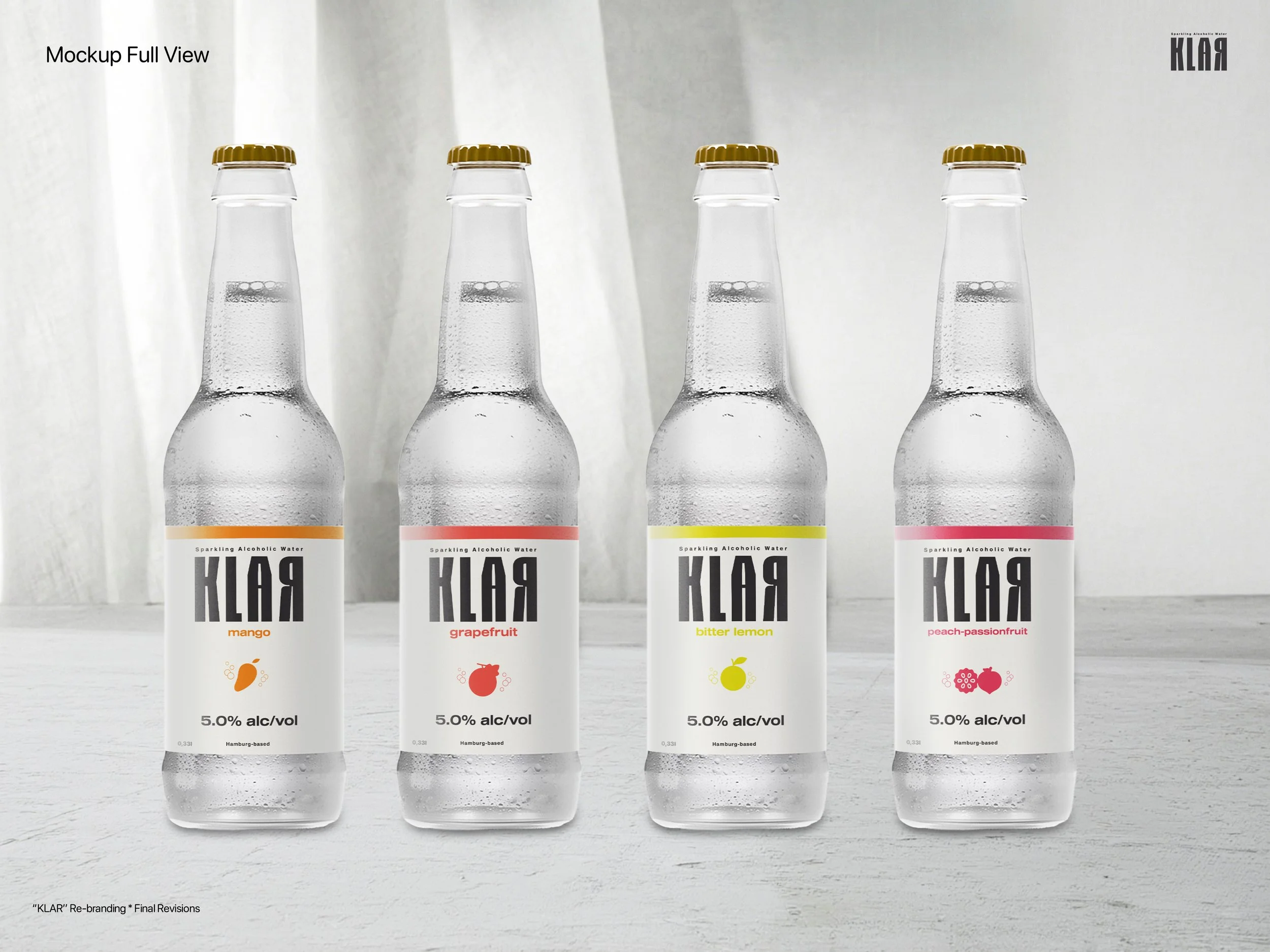
By the time the team sat down for a dedicated label review, most of the big questions had already been answered — what remained was sharpening the details. The Orange flavor was retired in favor of Bitter Lemon, landing on a yellow-green shade with just a touch of warmth. The stars that had been flagged earlier were finally replaced with something more fitting: a small cluster of rising bubble shapes, evoking carbonation and fruit dropping into sparkling water. Simple, minimal, and a little more premium than a scattering of stars ever could be.
One design choice that survived every round of feedback was the logotype itself — specifically, a deliberately misaligned "A" in the wordmark. Rather than smoothing it out, the team chose to keep the quirk as a piece of shelf disruption: something that catches the eye for being slightly unexpected in a sea of conventional beverage logos.
A brand that reads before it's read
What makes this project a good case study isn't really the color palette or the bubble graphics on their own — it's the discipline behind the process. Every round of feedback circled back to the same guiding question: does this communicate "alcoholic drink" before anyone reads a single word? Fruit took a back seat to color. Illustration gave way to typography. Decoration was allowed only if it earned its place.
By the time the labels were finalized, Klar had a visual identity that did double duty: distinct enough to stand out on a crowded shelf, and clear enough to answer the one question that mattered most before a customer even picked up the bottle.