What Is Visual Identity? Guide for Tech and Automotive Brands
![]()
Visual identity is one of those concepts that sounds straightforward until a major brand spends millions on a rebrand and watches its sales fall. The truth is, visual identity is far more than a logo sitting on a business card. It is the entire visual language a company uses to communicate who it is, what it stands for, and why it matters. For marketing managers and brand strategists in tech and automotive, getting this right is not optional. This guide breaks down the core components, the methodology, the sector-specific rules, and the governance principles that separate brands that endure from those that stumble.
Table of Contents
- Defining visual identity: More than a logo
- Building a successful visual identity: Steps and methodology
- Tech and automotive sector nuances: Guidelines, scalability, and adaptation
- Adaptive identity: Governance, testing, and the 90/10 rule
- Why the conventional wisdom on visual identity is changing
- Unlock your visual identity with professional agency support
- Frequently asked questions
Key Takeaways
| Point | Details |
|---|---|
| Visual identity is multifaceted | It includes logos, colors, typography, imagery, and more—not just a logo. |
| Methodology matters | Building a visual identity requires clear steps: values, elements, guidelines, and governance. |
| Sector-specific adaptation | Tech brands need scalable digital systems; automotive brands must balance tradition and innovation. |
| Adaptive governance for success | The 90/10 rule enables consistency and contextual adaptation, preventing brand stagnation. |
| Alignment prevents rebrand failure | Brands succeed when visual identity reflects true strategy and audience, as shown by Kia vs Jaguar. |
Defining visual identity: More than a logo
Most people, when asked to describe a brand’s visual identity, will point to the logo first. That instinct is understandable, but it only scratches the surface. Core elements include the logo, color palette, typography, imagery and photographs, icons, graphics, illustrations, patterns, motion design, and physical assets like packaging and signage. Each of these elements works in concert, and weakness in any one of them creates a gap between how a brand intends to be perceived and how it actually lands with an audience.
Think of visual identity as the visual grammar of a brand. Just as grammar gives language structure and meaning, visual identity gives a brand’s communications coherence and recognizability. When every touchpoint, from a product page to a trade show banner to a social media animation, speaks the same visual language, recognition compounds over time. When those touchpoints contradict each other, the brand feels fragmented, even if the product itself is excellent.
Consistency is the engine behind brand recognition, and documentation is what keeps that engine running. Without a clear set of guidelines, even the most thoughtfully designed identity erodes as teams grow, agencies rotate, and platforms multiply. A brand book is not bureaucracy. It is the single source of truth that protects the visual equity you have built.
Here is a quick overview of how the core elements function within a complete visual identity system:
| Element | Primary function | Common failure point |
|---|---|---|
| Logo | Anchor of recognition | Inconsistent sizing or color use |
| Color palette | Emotional tone and differentiation | Off-brand colors in digital assets |
| Typography | Personality and readability | Mixing too many typefaces |
| Imagery and photography | Storytelling and context | Inconsistent style or quality |
| Icons and illustrations | Clarity and visual hierarchy | Mismatched styles across platforms |
| Motion design | Engagement and modernity | Animations that conflict with brand tone |
| Packaging and signage | Physical brand experience | Disconnection from digital identity |
Beyond documentation, the way imagery is produced and treated plays a defining role. Whether you are working with visual identity in media or physical product lines, the quality and consistency of your visual assets communicate brand standards before a single word is read.
“A visual identity is not a static artifact. It is a living system that must be managed, protected, and evolved with intention.”
For tech and automotive brands specifically, the stakes are high because the number of touchpoints is enormous. A single product launch can touch digital ads, packaging, in-store displays, event materials, and motion graphics simultaneously. Every one of those surfaces is an opportunity to reinforce or undermine the brand.

Building a successful visual identity: Steps and methodology
With a clear understanding of visual identity’s makeup, you will need a proven methodology to create one that scales. The methodology to build a strong visual identity follows a logical sequence: define brand values, mission, personality, and target audience first; then develop the core visual elements; create scalable systems and guidelines; document rules for consistent use across print, digital, packaging, and events; and finally, apply and govern across all teams and partners.
That sequence matters more than most people realize. Brands that skip straight to logo design without first articulating their values and audience end up with visuals that look polished but feel hollow. The visual system should be a direct translation of the brand’s strategic foundation, not a decoration layered on top of it.
Here is how we recommend approaching each phase:
- Define your foundation. Clarify what the brand stands for, who it serves, and how it wants to be perceived. For a tech brand, this might mean emphasizing precision and forward momentum. For an automotive brand, it might mean balancing performance heritage with a vision for electrification.
- Develop core elements. Design the logo, select the color palette, choose typography, and establish imagery guidelines. Each decision should trace back to the foundation defined in step one.
- Build scalable systems. Create templates, component libraries, and asset frameworks that allow teams to produce on-brand content at speed without reinventing the wheel each time.
- Document everything. A comprehensive brand guide covers usage rules, spacing, color codes, approved typefaces, and examples of correct and incorrect applications.
- Apply and govern. Roll out the identity across all channels and establish a governance process to review, approve, and update assets as the brand evolves.
Pro Tip: Involve your internal teams and key agency partners in the documentation phase. Guidelines that are built in isolation often fail in practice because the people using them had no input in creating them.
One statistic worth keeping in mind: brands that present themselves consistently across all platforms can see revenue increases of up to 23%. That figure reflects the compounding value of a well-governed visual system, not just good design taste.
Tech and automotive sector nuances: Guidelines, scalability, and adaptation
Once you have a methodology, recognizing sector-specific requirements is crucial for effectiveness. Tech and automotive brands operate in very different visual environments, and the governance challenges they face are distinct.
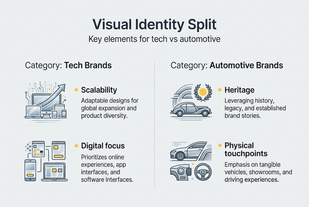
In the technology sector, the primary challenge is scalability across digital platforms. Google’s identity guidelines are a strong example of this: strict rules govern logo sizing, spacing, color usage, and typography, with explicit instructions not to alter or distort the logo or deviate from approved fonts. These rules exist because a tech brand’s identity must perform consistently across thousands of partner integrations, app stores, developer portals, and marketing materials produced by teams around the world.
Automotive brands face a different kind of pressure. They must balance a rich heritage with the need to signal innovation, particularly as the industry shifts toward electrification. This tension has produced some of the most instructive case studies in recent branding history.
| Brand | Approach | Outcome |
|---|---|---|
| Jaguar | Erased heritage in 2024 rebrand | Sales drop and backlash |
| Kia | Aligned rebrand with EV strategy | Successful repositioning |
| Strict digital-first guidelines | Consistent global recognition |
Jaguar’s 2024 rebrand is a cautionary tale. By abandoning the visual cues that its loyal audience associated with the brand, Jaguar created confusion rather than excitement. Kia, by contrast, built its rebrand around a clear strategic shift toward electric vehicles, giving audiences a reason to accept the new visual language because it was anchored in a product reality they could see and understand.
For automotive brands, the physical touchpoints add another layer of complexity. A visual identity must work on a vehicle’s bodywork, in a showroom environment, on a digital configurator, and in a television commercial. Each of those contexts demands different treatments while maintaining a coherent whole.
Pro Tip: For tech brands managing partner ecosystems, create a tiered asset library with pre-approved lockups for common use cases. This reduces the risk of off-brand applications without requiring central approval for every execution.
Adaptive identity: Governance, testing, and the 90/10 rule
Sector-specific strategies must also be governed by adaptive principles for sustained relevance. One of the most counterintuitive lessons in brand management is that total consistency is not the goal. Avoid total consistency because it leads to irrelevance over time. The recommended framework is a 90/10 split: 90% of the identity remains fixed to protect core assets and maintain recognition, while 10% is reserved for contextual adaptation that keeps the brand feeling current and relevant to specific audiences or platforms.
This principle is especially valuable for brands operating across global markets or multiple product categories. A technology brand launching in a new region may need to adapt certain visual tones to resonate locally, while keeping the logo, typography, and core color palette intact. An automotive brand introducing a new electric sub-brand can experiment with a fresh visual accent while preserving the parent brand’s foundational equity.
Audience testing is the mechanism that makes adaptive identity work without guessing. Before committing to a visual evolution, testing with core audience segments reveals whether the change reads as progress or disruption. Jaguar skipped this step, or at least did not act on what it found, and the result was a rebrand that alienated rather than energized.
Some practical governance principles worth building into your process:
- Assign clear ownership of the brand identity system within your team or agency structure.
- Establish a regular review cycle, at minimum annually, to assess whether the identity still aligns with the brand’s current positioning.
- Maintain a set of “distinctive assets,” the specific visual elements that audiences most strongly associate with the brand, and protect these even during periods of evolution.
- Use audience panels or structured testing to validate visual changes before full rollout.
“The brands that endure are not the ones that never change. They are the ones that know exactly what to protect and what to evolve.”
Governance is not glamorous work, but it is the difference between a brand that compounds its visual equity over decades and one that has to rebuild recognition from scratch every few years.
Why the conventional wisdom on visual identity is changing
For a long time, the dominant advice in brand strategy was simple: be consistent, protect the logo, and update only when absolutely necessary. That advice made sense in a slower media environment. It does not hold up as well today.
What we have seen, both in our own work with tech and automotive clients and in high-profile cases like Jaguar’s, is that visual identity misalignment is the root cause of most failed rebrands. It is not that the new design was objectively bad. It is that it did not connect to the brand’s product reality or audience expectations. Kia’s rebrand caused confusion initially too, but it was backed by a clear strategic narrative around electric vehicles, and that alignment gave audiences a framework for accepting the change.
The lesson we draw from this is that visual identity work is fundamentally strategic, not just aesthetic. The most technically accomplished design will fail if it is not grounded in a clear understanding of what the brand is actually delivering. For marketing managers and brand strategists, this means investing in the strategic foundation before the design brief, and treating brand asset strategy as an ongoing discipline rather than a one-time project. Adaptive frameworks and honest audience testing are undervalued tools, and the brands that use them well are building something that lasts.
Unlock your visual identity with professional agency support
Putting these principles into practice requires more than a good brief. It requires the kind of execution that makes strategy visible, and that is where professional expertise becomes essential.

At 35milimetre, we work directly with tech and automotive brands to translate visual identity strategy into high-end imagery, compositing, CGI, and design assets that hold up across every touchpoint. Whether you need product visuals that align with strict brand guidelines or campaign imagery that signals a strategic shift, our agency retouching services are built to deliver at the level these sectors demand. From a single hero image to a full asset library, we bring the technical precision and creative judgment that brand-defining work requires.
Frequently asked questions
What makes up a brand’s visual identity?
A brand’s visual identity includes logos, color palettes, typography, imagery, icons, patterns, motion design, and physical assets like packaging and signage. Each element contributes to how audiences recognize and interpret the brand across every context.
How does visual identity differ between tech and automotive brands?
Tech brands prioritize digital scalability and guidelines to manage consistent application across partner ecosystems and platforms, while automotive brands must balance physical and experiential assets with heritage and innovation signals. The governance challenges are distinct but equally demanding.
What is the 90/10 rule in visual identity governance?
The 90/10 rule means 90% consistency protects core brand assets and recognition, while the remaining 10% allows for contextual adaptation to stay relevant across audiences, markets, and platforms.
Why do some rebrands fail and others succeed?
Rebrands fail when the new visual identity misaligns with strategy or audience expectations, as Jaguar’s 2024 case demonstrated. Success, as seen with Kia, depends on anchoring visual change in a clear strategic narrative and validating it through audience testing before full rollout.