How to develop high-end visuals: a creative director's guide

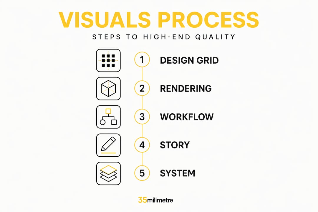
Getting high-end visuals right is harder than it looks, and the gap between “polished” and “premium” is almost always a systems problem, not a talent problem. Creative directors and marketing managers at automotive and tech brands know this tension well: you have strong ideas, skilled people, and the budget to execute, yet the final output still falls short of that aspirational, campaign-defining quality. This guide explains how to develop high-end visuals through a structured approach, covering design fundamentals, advanced rendering, AI-driven production pipelines, and cinematic storytelling, so every asset you ship reflects the brand standard your audience expects.
Table of Contents
- How to develop high-end visuals starting with design principles
- Mastering advanced rendering techniques for realism
- Building scalable AI-driven workflows for high-end visuals
- Verifying and enhancing visuals with cinematic storytelling
- Why high-end visuals are about system, not solo artistry
- Partner with expert visual production to elevate your brand
- Frequently asked questions
Key Takeaways
| Point | Details |
|---|---|
| Design fundamentals matter | Consistent use of grids, hierarchy, color, and typography creates premium quality. |
| Combine rendering techniques | Using both Ambient Occlusion and Direct Shadows enhances photorealism. |
| Build scalable workflows | Implement AI pipelines like ComfyUI for repeatable, efficient visual production. |
| Cinematic storytelling engages | Lighting, motion, and composition evoke emotions critical for luxury brands. |
| Systematic approach wins | High-end visuals result from disciplined systems, not one-off effects. |
How to develop high-end visuals starting with design principles
The foundation of any premium visual is not the tool or the budget. It is disciplined design. Visual design fundamentals such as grid alignment, visual hierarchy, deliberate color use, and consistency are what separate imagery that feels genuinely high-end from imagery that merely looks expensive. As Nielsen Norman Group notes, a reliable way to develop “high-end” visuals is to apply these fundamentals consistently across every design decision.
Grid systems give your layouts structure that viewers feel even when they cannot articulate it. A well-constructed grid creates balance and makes scanning effortless, whether the asset is a full-page automotive spread or a product feature card on a tech landing page. Visual hierarchy does the next job: it tells the viewer’s eye where to go first, second, and third, using size, weight, and placement rather than decoration. Think of it as choreography. The image does not shout everything at once; it leads.
Color strategy is where many teams stumble. A limited, intentional palette almost always reads as more sophisticated than a broad one. For luxury automotive and premium tech brands, restraint in color is a signal of confidence. The same logic applies to typography: one or two font families, used consistently, with deliberate size contrast between headers and body copy, create a visual language that feels considered and coherent. You can explore how these principles translate directly to campaign execution through visual content strategies for campaigns and visual strategies for ad campaigns.
- Grid alignment anchors every element and creates a sense of order that premium audiences subconsciously trust.
- Visual hierarchy uses size and weight to direct attention without relying on gimmicks.
- Color palettes work best when they are limited and emotionally intentional, not just on-brand.
- Typographic consistency with two font families maximum reinforces polish across all touchpoints.
- Uniformity across assets ensures the campaign reads as a cohesive body of work, not a collection of one-offs.
Pro Tip: Before exporting any asset, run a squint test. Blur your vision slightly and look at the composition. If the hierarchy and focal point are still obvious, the design is working. If it collapses into noise, the visual hierarchy needs more contrast.
Mastering advanced rendering techniques for realism
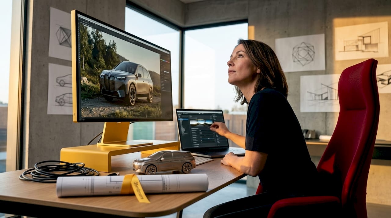
Once the design framework is solid, the quality of your 3D product renders and computational imagery becomes the next decisive factor. For automotive and tech brands, realism is not optional. A render that looks like a render, rather than a photograph, undermines the premium positioning the entire campaign is built around.
Shadow rendering is one of the most underestimated tools in this process. Ambient Occlusion and Direct Shadows are the two primary methods worth mastering. Ambient Occlusion simulates the soft, diffused shading that naturally occurs where two surfaces are close together, giving objects weight and grounding them in their environment. Direct Shadows cast sharper, more defined shadows from a specific light source, replicating the kind of precision lighting you would see in a professional automotive shoot. Combining both methods yields photographic-quality depth that would otherwise require significant reshooting to achieve.
The tuning of shadow strength, softness, and sampling quality lets you control mood without changing the entire lighting rig. A high-end electric vehicle render with crisp, defined shadows communicates power and confidence. The same model with softened, ambient-dominant shading reads as refined and approachable. These are not incidental differences. They are brand decisions executed through technical settings. Tips for stunning graphics at this level always come back to lighting precision and how shadow behavior reinforces the story you are telling. For a deeper look at techniques that translate directly to product-level output, see these product visuals elevation tips.
- Ambient Occlusion adds contact-area softness that grounds objects and builds perceived weight.
- Direct Shadows create defined, source-specific shadow geometry for photographic realism.
- Combined shadow methods produce layered depth that a single method cannot replicate alone.
- Shadow quality settings (sampling, softness, strength) let you align rendering mood with brand tone.
- Strategic lighting complement shapes how shadow methods read, so always design both together.
Pro Tip: When rendering metallic automotive surfaces, use a combination of high-resolution HDR environment maps alongside Ambient Occlusion. The environment map provides the reflective complexity that makes paint look real, while the AO keeps the contact points grounded. Neither alone produces the result you need.
Building scalable AI-driven workflows for high-end visuals
Getting a single stunning image is achievable with enough effort. Getting a library of them, consistently, on a production schedule, is a workflow problem. This is where AI-driven pipelines change the equation for creative teams working at scale.
ComfyUI, recommended by NVIDIA for building creator workflows, runs locally on NVIDIA RTX GPUs and supports image generation, video creation, and language model integration in a single node-based environment. Unlike prompt-in, image-out tools that offer little control, ComfyUI lets your team build reusable node graphs that encode your quality standards directly into the workflow. The setup process involves downloading required model files (which can total around 150GB), installing the necessary plugins, and loading pre-built node configurations. NVIDIA estimates a 30 to 60 minute ramp to get a team operational, which is a reasonable investment for what becomes a repeatable production asset.
Practical workflows available in ComfyUI include image layering and compositing, object removal and replacement, and photo-to-3D model conversion. For an automotive campaign, this means generating background environments, placing product renders, and adjusting lighting conditions across dozens of variants without rebuilding from scratch each time. For tech brands, it means product configuration imagery at scale. Linux manual installation is required for full capability; Windows support varies per workflow, so plan your infrastructure accordingly. The key shift in mindset here is treating AI not as a creative experiment but as a production tool, one that scales your team’s output without scaling your headcount. You can see how this fits into broader production thinking through high-efficiency visual workflows.
| Workflow capability | Application for automotive/tech | Infrastructure requirement |
|---|---|---|
| Image generation and layering | Campaign background creation and product compositing | NVIDIA RTX GPU, Linux preferred |
| Object removal and replacement | Clean hero shots and variant generation | Plugin installation required |
| Photo-to-3D conversion | Product modeling from reference photography | 150GB+ model downloads |
| Video creation | Motion assets for digital campaigns | Node graph configuration |
- Download required ComfyUI models and confirm GPU compatibility.
- Install plugins relevant to your primary workflow types (compositing, generation, video).
- Load pre-built node graphs aligned to your campaign requirements.
- Run test outputs against your brand’s visual standards before full production.
- Document the node configurations that produce approved results for team-wide repeatability.
Pro Tip: Build a “brand standard node graph” that encodes your approved color grading, shadow settings, and output resolution. Share it as a locked template across your team. This single step eliminates the drift that makes AI outputs feel inconsistent from one project to the next.
Verifying and enhancing visuals with cinematic storytelling
Technical quality alone does not make an image resonate. The final layer of high-end visual production is emotional, and cinematic storytelling is the discipline that handles it. Luxury brands have understood this for decades: the difference between a product shot and a campaign image is narrative.
Meticulous lighting, controlled movement, and crafted compositions are the tools luxury brands use to create aspirational, emotionally resonant imagery that captivates consumers. Soft diffusion lighting creates warmth and approachability. Rich, directional shadow designs communicate exclusivity and precision. These are not aesthetic choices made in isolation; they are brand decisions that position the product in the consumer’s mind before a single word of copy is read.
Motion control cinematography brings another dimension to this, particularly for video assets. By programming precise, repeatable camera movements, production teams achieve a level of control that handheld work cannot match. Every frame lands exactly where it was designed to land. For an automotive brand shooting a new model, that precision communicates care and intentionality, which the viewer absorbs as a reflection of the product itself.
Emotional resonance is not a finishing touch. It is a design parameter that should be defined at the brief stage, not added in post-production.
Composition is where all the previous work either succeeds or fails. A render with excellent shadows and technically accurate color grading can still underperform if the framing does not direct the consumer’s focus to the right story. For best practices for high-end designs, composition should reflect brand identity at every level: the angle, the negative space, the relationship between product and environment. See how these principles connect to video output quality through these post-production video tips.
Why high-end visuals are about system, not solo artistry
Here is an opinion worth sitting with: the pursuit of high-end visuals often fails not because teams lack creativity, but because they treat each project as a fresh creative problem rather than an instance of a repeatable system. We see this constantly. A brand invests in one exceptional campaign image, gets great results, and then struggles to replicate that quality for the next asset because no one documented what made the first one work.
Good visual design is fundamentally about systematizing scanning, perception, and readability through grid alignment, hierarchy, color use, and consistency. That framing from Nielsen Norman Group is worth internalizing. “High-end” is not a style; it is a standard, and standards require systems to maintain. The aesthetic-usability effect tells us that visually polished interfaces and imagery are perceived as more functional and trustworthy, which means every dollar you invest in visual quality returns through consumer confidence, not just aesthetics.
Scalable workflows empower your entire team, not just your best individual artist. When the quality is built into the process rather than dependent on a particular person’s eye, you reduce design debt, avoid costly late-stage revisions, and ship campaign assets that hold up under scrutiny across every format and platform. We have found that brands willing to invest in building these systems, even when the upfront setup feels slower, consistently outperform those chasing visual quality project by project. For a broader view on how this connects to brand differentiation, visual branding strategy is worth reading alongside this guide.
Partner with expert visual production to elevate your brand
Understanding how to enhance visual quality is one thing. Executing it consistently across a full campaign calendar is another challenge entirely, especially for in-house teams managing multiple briefs simultaneously.
At 35milimetre, we work directly with creative directors and marketing teams at automotive and tech brands to bring post-production precision and visual storytelling craft to every asset. From advanced retouching and compositing to CGI and AI-enhanced imagery, our professional retouching services are built for brands that cannot afford for their visuals to look anything less than exceptional. Whether you need to create product visuals that hold up in high-visibility placements or a full campaign library developed to a consistent premium standard, we bring the technical depth and creative judgment to deliver it. Let’s build something worth seeing.
Frequently asked questions
What are the key design principles to develop high-end visuals?
The core principles are aligning elements to a grid, establishing clear visual hierarchy, using color with intention, and maintaining consistency across every design choice. Applied together and without exception, these fundamentals are what reliably produce imagery that reads as premium rather than merely polished.
How do Ambient Occlusion and Direct Shadows improve visual realism?
Ambient Occlusion simulates soft, contact-area shading that gives objects weight and depth, while Direct Shadows produce sharper, source-specific shadows for photographic precision. Combining both methods produces the layered, lifelike shading quality that separates a professional render from a standard one.
What is ComfyUI and how does it support high-end visual creation?
ComfyUI is an open-source, node-based tool that runs locally on NVIDIA GPUs, allowing teams to build scalable AI-driven workflows for image generation, compositing, and video production. Its value is repeatability: once your quality standards are encoded into a node graph, they become a production asset your entire team can use.
Why is cinematic storytelling important in high-end visual marketing?
Because technically perfect imagery without emotional direction does not move audiences. Cinematic storytelling techniques such as controlled lighting, precise composition, and deliberate motion create the aspirational quality that turns a product shot into a brand statement.