Top illustration styles for agencies to boost visual storytelling

Choosing the right illustration style for an agency campaign has never been more consequential, or more complicated. Visual feeds are saturated with polished, AI-generated imagery, and audiences are developing a sharp eye for content that feels genuinely human versus content that feels manufactured. Handcrafted, imperfect styles are dominating 2026 trend conversations precisely because they push back against that sterile perfection. For creative directors and marketing managers, the challenge is not simply finding a style that looks good. It is finding a style that serves the brand story, lands emotionally with the target audience, and holds up across every campaign touchpoint. This article walks you through how to evaluate your options, which styles are delivering results, and how to make a confident choice.
Table of Contents
- How agencies should evaluate illustration styles in 2026
- Handcrafted and human-first: Imperfect illustration approaches
- Expressive storytelling: Comic, playful, and global styles
- Minimalist and quiet graphics: When less really is more
- What most agencies miss about matching illustration style to campaign goals
- Bring your agency’s vision to life with professional illustration and retouching
- Frequently asked questions
Key Takeaways
| Point | Details |
|---|---|
| Imperfect human styles | Handcrafted, tactile approaches are the top agency trend for brand authenticity in 2026. |
| Mix and match for impact | Blending expressive and minimalist styles yields memorable, goal-aligned campaigns. |
| Comic styles lead | Comic-inspired illustration is the highest-earning and most commissioned approach for agencies. |
| Global diversity matters | Incorporating diverse viewpoints makes campaigns relevant and relatable worldwide. |
| Data-driven selection | Agencies use research, workshops, and real commissioning data to match style to story. |
How agencies should evaluate illustration styles in 2026
Having set the stage for why style matters, let us get specific about how to choose the right approach for your next campaign. Picking an illustration style should never be a purely aesthetic decision. The style you commission is a strategic tool, and it needs to earn its place by supporting design’s impact in advertising and reinforcing what the brand actually stands for.
The most effective agencies approach style selection through a structured set of criteria. Start with brand story alignment: does this style reflect the personality, values, and voice of the brand you are representing? A playful, hand-drawn aesthetic works brilliantly for a wellness startup but may undermine a premium financial services client. Then consider emotional resonance. The style should evoke the feeling the campaign is designed to produce, whether that is trust, excitement, nostalgia, or energy.
Practical legibility is an equally important factor that agencies sometimes undervalue in favor of visual interest. A highly expressive or textural illustration might look striking in a print spread but become unreadable at mobile scale. Always pressure-test your style choices across every format the campaign will actually use.
Cultural sensitivity deserves its own checkpoint. If a campaign is intended for a global or diverse audience, the illustrative language you choose needs to reflect that breadth. Flat, generic representations of people and environments can alienate entire audience segments before the headline is even read.
“Agencies use data-driven commissioning and workshops to match illustration styles to project goals like narrative impact and emotional resonance.” Creative directors commissioning 2025
Pro Tip: Run a style selection workshop with both your creative team and the client before committing to a direction. Showing three to five style references side by side and asking each stakeholder to rank them by campaign fit, not personal taste, consistently produces more aligned briefs and fewer rounds of revision.
Handcrafted and human-first: Imperfect illustration approaches
With criteria in mind, let us look at the most sought-after style for 2026: human, imperfect illustration. The term covers a broad family of approaches, including hand-drawn line work, sketchy gestural marks, doodle aesthetics, and surfaces with visible grain or texture. What connects them is a deliberate departure from digital smoothness.
Hand-drawn lines and texture revival are proving especially powerful in branding and packaging because they communicate trust and approachability in a way that vector-clean imagery simply cannot replicate. When a consumer sees a coffee brand use irregular brushstrokes and slightly uneven lettering, the subconscious read is craft, care, and authenticity. That signal is worth a significant amount of brand equity.
Here is why agencies are actively investing in this direction for elevating brand storytelling:
- Handcrafted styles feel genuinely differentiated in a market where AI image generation has made polished visuals cheap and ubiquitous.
- Textural illustration carries emotional warmth that photograph retouching alone rarely achieves.
- Imperfect marks invite engagement by leaving just enough ambiguity for the viewer to lean in.
- Doodle and sketch aesthetics often perform well in social media environments because they feel native to how people actually communicate.
The business case for investing in skilled illustrators in this space is strong. Advertising consistently pays significantly more than editorial illustration, making high-quality handcrafted work an investment that agencies can justify to clients who are focused on measurable impact.
Pro Tip: When briefing a human-first illustrator, ask them to preserve imperfections rather than clean up final linework. The wobble in the stroke and the ink bleed at the edge are doing real work. Removing them in the name of polish can neutralize the entire emotional effect you are paying for.
Consider how this approach played out in packaging and retail campaigns over the past two years. Brands that introduced hand-lettered labels and illustrated secondary packaging consistently reported stronger shelf standout during consumer testing. The imperfection itself became the differentiator, because everything else on the shelf had been rendered to the same frictionless digital standard.
Expressive storytelling: Comic, playful, and global styles
Imperfect styles are not the only answer. Expressive approaches are breaking out in new ways, and agencies that limit their toolkit to hand-drawn aesthetics alone are leaving real campaign power on the table.
Comic-style illustration leads commissions across major agencies, with top-booked and highest-earning illustrators working primarily in this mode. The reasons are practical: comic art handles narrative sequencing naturally, it works across both static and motion formats, and it carries a built-in sense of drama and character that pure graphic design struggles to match. For campaigns that need to tell a story quickly and memorably, comic-style illustration is one of the most efficient tools available.
Playful and naive styles occupy a different emotional register. Where comic art tends toward energy and action, naive or childlike illustration conveys warmth, safety, and accessibility. This makes it well suited to family-focused brands, healthcare campaigns, and any context where the audience needs to feel at ease rather than activated.
Global and culturally diverse illustration has emerged as a distinct strategic priority. Agencies are actively seeking artists with unique cultural viewpoints, because campaigns grounded in genuine cultural specificity resonate more deeply with target communities than generic global aesthetics. This is not a box-checking exercise. It is a recognition that audiences can tell the difference between an illustrative voice that knows their world and one that is approximating it from a distance.
Here is a quick comparison to help you navigate the choice:
| Style | Best for | Avoid when |
|---|---|---|
| Comic/sequential | Narrative campaigns, product launches | Luxury or ultra-premium positioning |
| Playful/naive | Family, health, and community brands | Highly technical B2B contexts |
| Culturally specific | Regional campaigns, diverse audience targeting | Generic global brand guidelines |
For agencies building out their design assets for agencies, understanding these distinctions up front saves significant revision cycles later. Comic art in media projects also demonstrates how sequential visual storytelling transfers across product categories.
Minimalist and quiet graphics: When less really is more
To round out your toolkit, let us address the opposite trend: when clean simplicity takes the lead. Not every campaign needs expressive energy. Sometimes the most powerful thing a visual can do is get out of the way and let the message land.
Minimalist and quiet graphic styles are gaining traction precisely because digital environments are noisy. Short attention spans and high content volume mean that a restrained, purposeful image often cuts through faster than an elaborate one. There is a clarity at work in well-executed minimalist illustration that busy, expressive styles simply cannot deliver in every context.
For agencies managing campaigns across digital products, app interfaces, and performance marketing formats, minimalism offers practical advantages. Icons read at small sizes. Color palettes stay consistent across light and dark modes. Visual hierarchies remain intact even when a layout shifts between desktop and mobile.
The trade-off is emotional warmth. Minimalist illustration tends to communicate efficiency, clarity, and intelligence rather than personality or approachability. That makes it a strong fit for fintech, SaaS, and productivity-focused brands, but a poor match for campaigns that need the audience to feel something before they think something.
Here is a balanced view for creative directors weighing this approach:
Pros of minimalist illustration in agency work: Scales cleanly across digital formats, maintains legibility at small sizes, supports fast visual comprehension, and pairs well with data-driven performance campaigns.
Cons: Lower emotional temperature, limited storytelling range, and greater risk of blending into the sea of clean-but-forgettable digital content.
Effective creative workflows for brands often use minimalist illustration as a system-level visual language while reserving expressive styles for hero moments. That combination tends to give campaigns both structural clarity and emotional punch. Consider design platforms for agencies when building a scalable asset library around a minimalist visual system.
What most agencies miss about matching illustration style to campaign goals
Here is a perspective shaped by years of working alongside agencies on high-stakes visual projects: the biggest mistake is treating illustration style selection as a trend-compliance exercise. Picking the most-mentioned style in a 2026 trend report does not guarantee it will serve your specific campaign objectives. Trends describe what is popular. They do not tell you what your audience needs to feel at 8 p.m. on a Tuesday when they are scrolling past your ad.
The agencies doing the most memorable work right now are mixing modes. They are pairing a hand-drawn warmth with minimalist structural clarity, or grounding a globally diverse illustration in a comic-style narrative frame. These combinations do not fit neatly into a single trend category, which is exactly why they stand out.
Emotional resonance cannot be automated. A style must serve the campaign’s specific emotional objective, not just look current. We recommend testing two or three style directions in actual agency-client workshops using real campaign briefs, not abstract mood boards. The design impact insights you gather from those sessions will be worth more than any trend deck.
Bring your agency’s vision to life with professional illustration and retouching
Ready to bring these styles to your next campaign? Whether you need custom illustration developed from scratch, retouching that integrates illustration seamlessly into photography, or compositing that blends multiple visual modes into a single campaign asset, our team is built for exactly this kind of work.
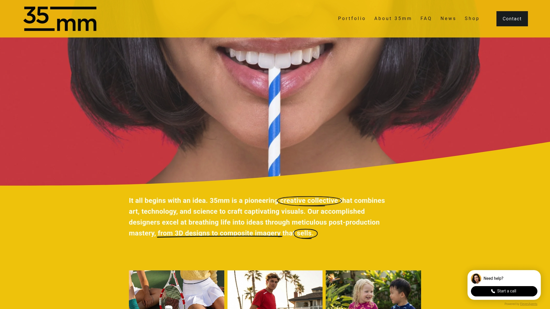
At 35milimetre, we work directly with advertising agencies and creative directors to move from concept to campaign-ready visuals without the friction that slows production down. Our studio combines post-production expertise, graphic design, and 3D capability in one tight team, with the flexibility to scale when your project demands it. If you are building something that needs to stand apart, let us talk.
Frequently asked questions
What is the most effective illustration style for advertising agencies in 2026?
Handcrafted and comic styles lead in effectiveness because they deliver authenticity and storytelling impact that polished digital imagery cannot replicate. The right choice depends on your specific campaign objective and target audience.
How can agencies balance expressive and minimalist illustration trends?
Successful agencies combine expressive details for hero moments with minimalist clarity for system-level design, aligning each style choice with campaign clarity goals rather than applying a single mode across all touchpoints.
Why are comic-style illustrations popular among agencies?
Comic-style illustration is the top-booked and highest-earning category in agency commissions because it handles narrative sequencing naturally and works across both static and motion formats.
How do agencies ensure diversity in illustration campaigns?
Leading agencies actively seek artists with unique cultural perspectives to build campaigns that resonate with specific communities rather than approximating diversity through generic global aesthetics.