How to create product visuals that elevate your brand

You put real effort into a product launch, the campaign goes live, and the engagement is flat. The images look fine, technically, but they’re not moving people. This is one of the most common frustrations we hear from marketing managers and creatives at agencies and startups. The problem usually isn’t the product itself. It’s that the visuals aren’t doing enough work. A product image is one still frame standing in for a physical experience, and when it’s generic, the audience feels nothing. This guide walks you through a practical, structured approach to creating product visuals that build brand equity and actually perform in campaigns.
Table of Contents
- Define your goals and audience
- Gather tools and set requirements
- Follow the SPLCBA framework for creation
- Review, refine, and adapt for campaigns
- What most brands overlook about product visuals
- Bring your product visuals to the next level
- Frequently asked questions
Key Takeaways
| Point | Details |
|---|---|
| Clarify your goals | Start with a clear audience and objective to create visuals that truly convert. |
| Leverage proven frameworks | Use the SPLCBA method to ensure consistency and brand alignment in product images. |
| Choose the right tools | Select physical or digital platforms that match your campaign needs, from traditional shoots to advanced AI generators. |
| Refine and adapt | Test, edit, and adapt visuals for each campaign and platform to maximize results. |
| Balance structure with creativity | Let brand stories and testing guide when to follow or flex visual formulas. |
Define your goals and audience
With your motivation clear, it’s time to pinpoint goals and audience. Before you open any editing software or brief a photographer, you need to know exactly what you want your visuals to accomplish. That sounds obvious, but it’s a step most teams rush past, and it shows in the output.
The most common campaign visual goals fall into a few clear categories. Brand awareness visuals prioritize mood, identity, and emotional resonance over product detail. Product launch imagery needs to communicate novelty and key features at a glance. Conversion-focused visuals are built around clarity, trust signals, and removing purchase hesitation. Each of these demands a different visual language, and trying to serve all three with a single image set is a recipe for mediocrity.
Knowing your audience segments shapes every creative decision that follows. A younger, trend-driven demographic on Instagram responds to lifestyle context, aspirational settings, and bold color palettes. A B2B buyer evaluating a tech product on a website wants clean, precise imagery that communicates reliability. Lifestyle visuals convert better for emotional purchases like fashion, while white background shots perform stronger for commodity items where clarity matters most.
Aligning your visual style with brand positioning is equally important. If your brand is premium, your imagery needs to reflect that through controlled lighting, refined compositions, and intentional negative space. If your brand is playful and accessible, the visual energy should match. Misalignment between brand voice and visual execution creates a subtle disconnect that audiences feel even when they can’t articulate it.
Once you know your goals and audience, think about how visual post production services can help you adapt the same core assets for different platforms without rebuilding from scratch. Adapting for platform context is essential. Instagram rewards atmosphere and story. A product detail page rewards clarity and accuracy. LinkedIn favors polished, professional framing.
Pro Tip: Build separate visual briefs for each platform rather than trying to repurpose one set of images everywhere. Segmenting by platform at the planning stage saves significant time in post-production and produces stronger results across the board.
Gather tools and set requirements
Now that you know your goals, gather everything you need to execute efficiently. The right toolkit makes the difference between a smooth production workflow and a frustrating one.
Here’s a practical comparison of the physical and digital tools most relevant to product visual production:
| Tool type | Examples | Best for |
|---|---|---|
| Camera equipment | DSLR, mirrorless camera, tripod | Controlled, high-resolution product shots |
| Lighting kit | Softboxes, ring lights, reflectors | Consistent, shadow-controlled lighting |
| AI image generators | Midjourney, Firefly, DALL-E | Concept visuals, lifestyle backgrounds, rapid iteration |
| Editing software | Adobe Photoshop, Lightroom | Retouching, color grading, compositing |
| 3D rendering tools | Blender, Cinema 4D | CGI product renders, packaging visualization |
Beyond hardware and software, you need your brand assets organized and accessible before production begins. This means your approved color palette, typography, logo files, and any existing visual guidelines. Without these, even technically excellent images can feel off-brand.

For AI-generated visuals specifically, selecting tools that support structured prompting is critical. A side-by-side AI tool analysis can help you identify which platforms handle product-specific prompts most reliably. The SPLCBA prompting framework reliably delivers consistent, conversion-ready product visuals when applied correctly, and your chosen AI tool needs to support the level of prompt specificity that framework requires.
Consistency requirements are another setup consideration that teams often underestimate. Decide on your standard image dimensions, file formats, color profiles, and naming conventions before you shoot or generate a single asset. A professional retouching agency can help enforce these standards at scale, especially when you’re producing large asset libraries across multiple campaigns.
The goal at this stage is to remove variables. The more decisions you make upfront, the faster and more consistent your production process becomes.
Follow the SPLCBA framework for creation
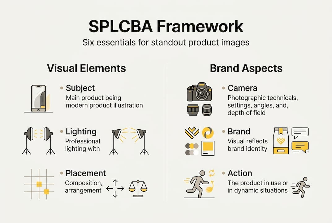
With tools in hand, here’s where a structured framework like SPLCBA ensures standout results. SPLCBA stands for Subject, Placement, Lighting, Camera, Brand, Action, and it’s a proven formula for consistent, high-performing product visuals whether you’re prompting an AI tool or briefing a photographer.
Here’s what each element means in practice:
- Subject: Define the product precisely. Include material, finish, color, and any key features that must be visible.
- Placement: Specify where the product sits in the frame. Centered for authority, off-center for lifestyle context, elevated angles for texture detail.
- Lighting: Describe the light quality and direction. Soft diffused light for beauty products, hard directional light for tech to show form.
- Camera: Set the perspective and lens behavior. Close-up for detail shots, wide for environmental context, shallow depth of field for premium feel.
- Brand: Inject brand-specific cues. Color palette, props, surface textures, or environmental elements that reinforce brand identity.
- Action: Define any implied or visible movement. A pour, a splash, a hand interaction, or simply a static display.
The difference between using SPLCBA and improvising is significant. Without it, outputs tend to be inconsistent in lighting, off-brand in color, and unclear in focal intent. With it, every image in a campaign set feels like it belongs together.
Skipping even one SPLCBA element typically weakens the final visual. Brand cues without proper lighting feel flat. Perfect lighting without defined placement produces compositionally weak images. Each element reinforces the others.
Pro Tip: Prompt iteratively. Start with a base SPLCBA prompt, review the output, then adjust one variable at a time. This approach surfaces the best visual direction faster than trying to perfect the prompt on the first attempt. You can also use a side-by-side AI tool analysis to benchmark which tools respond best to specific prompt structures.
For teams working with photographers rather than AI, SPLCBA works equally well as a creative brief structure. It forces clarity on both sides of the brief and reduces the back-and-forth that eats into production timelines. Embedding branding elements in product visuals from the start of the shoot, rather than adding them in post, also produces more cohesive results.
Review, refine, and adapt for campaigns
Once your product visuals are created, validation and refinement are crucial for campaign success. Even the best-planned shoot or AI generation session produces assets that need critical review before they go live.
Start by evaluating each image against your original brief. Does it communicate the intended message clearly? Does it reflect your brand positioning accurately? Is the product the clear focal point, or does the composition compete with it? These questions should be answered before any image reaches a campaign manager.
The SPLCBA method produces consistent outputs that are campaign-ready, but you still need to review for brand and platform fit. An image that looks excellent in isolation may feel out of place within the broader campaign context. Always review assets as a set, not individually.
A/B testing is the most reliable way to validate visual effectiveness in live campaigns. Run two versions of a key visual with different compositions, color treatments, or lifestyle contexts, and let performance data guide your refinements. Even small changes, like adjusting the background tone or the product angle, can produce measurable differences in click-through and conversion rates.
Cross-team input is valuable at the review stage. Creative directors, account managers, and media buyers often catch things that the production team misses because they’re evaluating the image from a different perspective. Build a structured feedback round into your workflow rather than treating review as an afterthought.
For retouching and final adjustments, working with a dedicated visual editing services partner can accelerate the refinement process significantly, especially when you’re adapting assets across multiple formats and placements.
Pro Tip: Document every successful prompt, lighting setup, or retouching combination that produces strong results. This becomes your visual production playbook and dramatically speeds up future campaigns while maintaining brand consistency.
What most brands overlook about product visuals
Stepping back, there’s a bigger lesson creative teams should absorb. Most brands invest heavily in getting the formula right, and then they stick to it rigidly. The result is visual output that’s technically correct but emotionally inert. Audiences recognize when they’re looking at a template, even if they can’t name it.
The brands with the most resonant visual identities aren’t the ones with the strictest style guides. They’re the ones that treat their visual guidelines as a foundation, not a ceiling. They test aggressively, adapt quickly, and allow the brand to breathe across different contexts. A rigid visual formula protects consistency but often kills the creative surprise that makes an image memorable.
What we’ve seen across real campaign case studies is that iterative, story-driven visual development consistently outperforms single-round production. The brands that win aren’t necessarily the ones with the biggest budgets. They’re the ones willing to treat every campaign as a learning opportunity and refine their visual language over time. Frameworks like SPLCBA are genuinely useful, but they work best when they inform creative decisions rather than replace them.
Bring your product visuals to the next level
If you want an expert edge in visual production, the next step is easy. At 35milimetre, we work directly with ad agencies and startups to develop product visuals that perform across every campaign touchpoint. From compositing and color grading to AI-enhanced imagery and full professional retouching and post-production, our team brings over two decades of hands-on experience to every project.
Whether you need a single hero image or a complete visual asset library, we build imagery that reflects your brand with precision and intention. Browse our visual marketing projects to see what’s possible, and reach out when you’re ready to elevate your next campaign.
Frequently asked questions
What is the SPLCBA framework for product visuals?
SPLCBA stands for Subject, Placement, Lighting, Camera, Brand, and Action, a structured prompt method designed to produce consistent, campaign-ready visuals whether you’re working with AI tools or briefing a photographer.
Should I use lifestyle or white background shots for ads?
Lifestyle visuals convert better for emotional purchases like fashion and lifestyle products, while clean white background imagery performs strongest for commodity items where product clarity is the priority.
Can AI tools truly replace traditional product photography?
AI tools can generate campaign-quality images when guided by structured frameworks like SPLCBA and grounded in clear brand assets. For most agencies, AI-generated visuals work best as a complement to traditional photography rather than a full replacement.
How can I test if my product visuals are effective?
A/B test images within active campaigns and evaluate performance against click-through rate, conversion rate, and time-on-page to identify which visual treatments resonate most with your target audience.