How graphic design shapes brand identity: key strategies

Most brand managers assume that once the logo is locked and the color palette is approved, the hard work of branding is done. That assumption is expensive. Graphic design is not the finishing coat on top of a brand strategy — it is the mechanism through which that strategy becomes real, visible, and felt by customers. For technology and automotive companies especially, where products are complex and audiences are skeptical, visual language carries enormous weight. This guide breaks down how graphic design functions within a brand identity system, what pitfalls to avoid, and how to build a visual presence that earns trust and recognition at every touchpoint.
Table of Contents
- What is graphic design’s role in branding?
- Key components of brand identity in tech and automotive
- Visual consistency and trust: Why design systems matter
- Common pitfalls and future trends in brand design
- A fresh perspective: Rethinking graphic design’s value in brand leadership
- Enhance your brand’s story with professional visual design
- Frequently asked questions
Key Takeaways
| Point | Details |
|---|---|
| Design drives strategy | Successful branding starts with aligning graphic design to strategic business goals. |
| Consistency builds trust | Uniform visuals across all touchpoints increase brand recognition and customer confidence. |
| Evolve with innovation | Brands that adopt new design trends, such as motion branding, stay relevant in tech and automotive markets. |
| Avoid common pitfalls | Always align design updates with actual brand and product evolution to prevent customer confusion. |
What is graphic design’s role in branding?
Graphic design is often misunderstood as decoration. In reality, it functions as the visual translator for everything your brand stands for. When a customer encounters your product page, your vehicle brochure, or your app interface, they are reading your brand before they read a single word. The shapes, colors, typefaces, and imagery you use communicate values, quality, and personality in a fraction of a second.
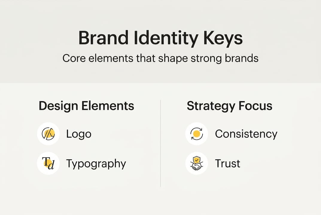
Graphic design translates brand strategy into visual elements including logos, color palettes, typography, and imagery to ensure consistent expression across touchpoints. That is a functional definition, but the implications run deep. A logo is only one node in a much larger system. The real power lies in how all the visual elements work together to create a unified experience.
For tech and automotive brands, the stakes are particularly high. Customers interact with your brand across a wide range of surfaces: digital ads, trade show booths, packaging, social media, and physical products. Each of those surfaces is an opportunity to reinforce or undermine the brand promise. Visual branding for brands that operate across multiple channels requires a level of discipline and intentionality that goes far beyond choosing a nice font.
Brand guidelines serve as the rulebook that makes this consistency possible. They define exactly how each visual element should be used, in what contexts, at what scale, and in what combinations. Without them, even a well-designed logo becomes inconsistent when applied by different teams or agencies. With them, every touchpoint reinforces the same message.
“A brand without guidelines is like a story told by a hundred different narrators. The plot might be the same, but the voice changes with every chapter.”
The core visual assets that make up a brand identity system typically include the following:
- Logo and logo variations (primary, secondary, icon-only)
- Color system (primary, secondary, and functional palettes)
- Typography (display fonts, body fonts, and hierarchy rules)
- Imagery style (photography direction, illustration style, CGI or 3D render guidelines)
- Iconography and graphic elements (supporting shapes, patterns, and textures)
Understanding visual communication in business means recognizing that each of these assets carries meaning on its own and multiplies its impact when used consistently. With the foundation set, we next explore how graphic design components work together to form cohesive brand identities.
Key components of brand identity in tech and automotive
Technology and automotive brands face a unique design challenge. Their products are technically sophisticated, and yet their marketing must feel accessible, aspirational, and emotionally resonant. The visual system has to do a lot of heavy lifting.
The table below illustrates how design priorities differ between the two sectors:
| Visual element | Technology brands | Automotive brands |
|---|---|---|
| Logo style | Minimal, geometric, scalable | Bold, engineered, heritage-aware |
| Color palette | Cool neutrals, electric accents | Metallic tones, deep contrasts |
| Typography | Clean sans-serif, digital-first | Strong serifs or custom typefaces |
| Imagery | UI screenshots, abstract tech visuals | Studio photography, lifestyle scenes |
| Motion | Interface animations, product demos | Launch films, kinetic logo reveals |
Building a cohesive branding design system in either sector requires a clear sequence. First, define your brand strategy before touching any design tool. Second, translate strategic values into visual principles. Third, design the core assets with those principles as your filter. Fourth, document everything in a living brand guide. Fifth, audit regularly as your product and market evolve.
Strategy before design is not just good advice — it is the difference between a brand that looks polished and one that actually performs. Prioritize strategy before design to avoid decorative visuals; use guidelines as rulebooks for scalability in tech and automotive multi-touchpoint environments.
One area where technology brands have a distinct advantage is motion branding. Because their products live primarily in digital environments, they can use kinetic identity elements that static brands simply cannot. An animated logo, a signature transition effect, or a consistent motion language across UI interactions all contribute to a brand experience that feels alive and intentional.
Pro Tip: If you are managing a tech brand, invest in a motion design system alongside your static brand guidelines. Kinetic identity is not a luxury — it is increasingly the primary way digital-first audiences experience your brand.
Automotive brands, by contrast, must balance digital motion with the gravitas of physical product. A kinetic logo reveal works beautifully in a launch film, but the same brand must also hold up on a dealership sign, an embossed door panel, and a printed owner’s manual. Versatility across materials and contexts is the real test of a well-designed identity.
Visual consistency and trust: Why design systems matter
There is a psychological principle at work in brand recognition that designers call processing fluency. When audiences encounter familiar visual patterns repeatedly, their brains process that information faster and with less friction. That ease of processing gets interpreted as trustworthiness. Consistent design, in other words, literally makes your brand feel more credible.

Visual consistency builds trust via processing fluency; in rebrands, align visuals with product evolution to mitigate backlash, as in Kia’s success versus Jaguar’s risks. The Kia example is instructive. Their 2021 rebrand was bold, but it was backed by a genuinely new product lineup. The visual shift felt earned. Jaguar’s more recent repositioning, by contrast, has drawn criticism precisely because the visual transformation appeared to outpace the product story.
Brands that maintain design consistency see up to 23% higher perceived value among target audiences. For technology and automotive companies operating in premium or competitive segments, that number is not trivial. It translates directly into purchase consideration and customer loyalty.
Design systems are the infrastructure that makes consistency scalable. A design system is more than a style guide — it is a shared library of components, rules, and principles that every team can access and apply. For a global automotive brand managing dozens of markets and agencies, a robust design system is the only way to maintain coherent visual identity at scale. Implementing design systems effectively requires clear ownership, regular audits, and digital asset management tools that keep everyone working from the same source of truth.
Best practices for maintaining visual consistency include conducting quarterly brand audits across all channels, assigning a dedicated brand manager or design lead as the final authority on visual decisions, using a digital asset management platform to distribute approved assets, and reviewing design for brand touchpoints whenever a new product or market is introduced. These are not bureaucratic steps — they are the habits that separate brands with lasting equity from those that look different every year.
Common pitfalls and future trends in brand design
Even experienced brand teams fall into predictable traps. Knowing what they are is half the battle.
The first and most common pitfall is prioritizing aesthetics over strategy. A visually stunning identity that does not reflect the brand’s actual positioning creates cognitive dissonance for customers. They see one thing and experience another. The gap erodes trust faster than a poorly designed logo ever could.
The second pitfall is inconsistent application across channels. This happens when different teams, agencies, or regional offices apply brand assets without proper guidelines or oversight. The result is a fragmented visual identity that confuses rather than reassures.
The third pitfall is rebranding without product alignment. Rebrands risk short-term confusion if visuals precede product proof. If your brand looks like it has evolved but your product has not, customers notice. The visual promise becomes a liability rather than an asset.
On the trend side, motion branding is reshaping what brand identity means in digital ecosystems. Motion branding integrates time as a material for kinetic identities in digital and tech environments. This is a genuinely new design dimension. Time, rhythm, and movement are now part of the brand toolkit in ways that were not possible even five years ago.
“The brands that will lead the next decade are not the ones with the best logos. They are the ones with the most coherent visual systems across every surface their customers touch.”
Artificial intelligence is also changing how brand assets are created and scaled. AI-assisted image generation and compositing allow studios to produce brand-consistent visuals faster and at lower cost, without sacrificing quality. For visual storytelling strategies in tech and automotive, this opens new possibilities for personalized campaigns and rapid iteration.
Pro Tip: Before launching any new visual element publicly, test it internally across every major touchpoint. A logo that looks great on a phone screen may fall apart on a billboard or an embossed metal badge. Catch those issues before your audience does.
Having tackled what sets successful brands apart and what to avoid, let’s draw out the bigger perspective for technology and automotive marketers.
A fresh perspective: Rethinking graphic design’s value in brand leadership
After working with technology and automotive brands for over two decades, we have noticed a persistent pattern: design is brought in late. Strategy is set, messaging is written, and then someone asks the design team to make it look good. That sequence is backwards, and it costs brands more than they realize.
The most effective brand identities we have seen are built when designers are in the room during strategy conversations, not after them. When design leads, it forces clarity. Visual decisions expose ambiguities in positioning that words can hide. You cannot design a color palette for a brand that does not know whether it wants to feel premium or accessible. The act of designing forces the choice.
In tech and automotive, the brands that consistently outperform their competitors treat their design teams as strategic partners, not service providers. They invest in systems, not just assets. They give designers authority, not just briefs. That shift in how design is valued internally is what separates a brand with lasting equity from one that refreshes its look every three years and wonders why nothing sticks.
Enhance your brand’s story with professional visual design
Building a brand identity that holds up across every surface your customers encounter takes more than good taste — it takes technical expertise, strategic thinking, and the ability to execute at a high level consistently. That is exactly what we do at 35milimetre.
Our team has spent over two decades helping technology and automotive brands craft visual identities that are both strategically grounded and visually exceptional. From advanced retouching services and compositing to CGI and AI-enhanced imagery, we bring every tool in the post-production toolkit to bear on your brand’s visual story. If you are ready to invest in a visual identity that earns trust and drives recognition, explore our visual post production capabilities and let’s talk about what your brand needs next.
Frequently asked questions
Why is graphic design vital for tech and automotive brands?
Graphic design creates a cohesive brand experience and makes technical products relatable across all customer communication channels. Graphic design translates brand strategy into visual elements that ensure consistent expression across every touchpoint.
How does motion branding benefit digital-focused companies?
Motion branding uses kinetic visuals to make digital brands more dynamic and memorable, especially in fast-moving tech sectors. Motion branding integrates time as a design material, giving digital identities a dimension that static assets simply cannot match.
What risks are associated with rebranding and visual updates?
Uncoordinated rebrands can confuse customers if visual changes outpace meaningful product improvements. Rebrands risk short-term confusion when visuals move ahead of the product story that should support them.
How do brand guidelines contribute to consistency?
Brand guidelines ensure every team applies visual identity correctly, supporting brand consistency across all platforms. Use guidelines as rulebooks for scalability in tech and automotive multi-touchpoint environments.
What is the most important consideration before launching a new brand look?
Align all visual changes with product and market strategy to avoid alienating your current audience. In rebrands, align visuals with product evolution to mitigate backlash and protect the equity you have already built.