Why Packaging Design Quietly Decides How Your Brand Gets Judged?
A shopper walks into a supermarket and passes roughly 300 products a minute. Somewhere between three and seven seconds after a pack enters their field of view, a decision is already forming. They won't call it a decision. They'll call it a feeling.
That's the window your packaging design has to work in. Not the brand film, not the campaign, not the website. The pack. It is the one piece of brand communication that every buyer touches, usually before any other signal has reached them.
We spend a lot of time in post-production looking at packs under that kind of pressure, and the honest view is this: packaging is where most brands are judged, and it's also where they most often underinvest. This piece is about why, and what to ask before you sign off the next pack.
The shelf is a courtroom, and the verdict comes in seconds
The numbers here are well-established, but they still surprise brand teams when you put them on the table at once.
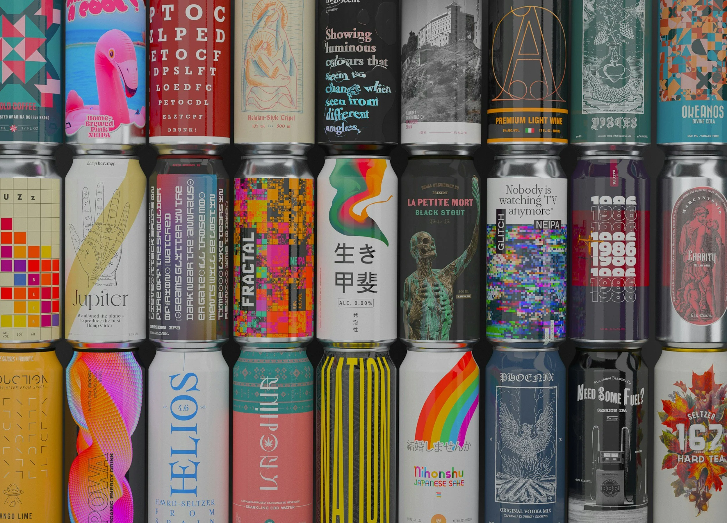
According to Ipsos research, 72% of consumers say packaging design influences their purchasing decisions, and 81% have tried a new product because its packaging caught their eye. Shelf studies show that disruptive, well-designed packaging is noticed by 76% more shoppers in the first five seconds of viewing a cluttered shelf.
Layer on the neuroscience. Consumer neuroscience reviews put somewhere between 85% and 95% of purchase decisions in the subconscious, most of them made in under two seconds. In practical terms, the buyer has responded to your pack long before they've read the claims, noticed the certifications, or registered the price tier.
So the shelf is less of a showroom and more of a courtroom. The pack is the defendant, the evidence, and the closing argument rolled into one. And in most categories, it doesn't get to speak.
What the brain actually reads first
If the judgement is that fast, what is actually being processed?
Colour, mostly. A body of research consistently points to colour as the single biggest driver of snap brand judgement, accounting for something in the region of 90% of initial impressions. Then shape and symmetry. A 2022 study published in ScienceDirect on premium perception found that symmetry in packaging design had a measurable positive effect on how premium consumers rated a brand, independent of the product inside. Then the mark, the typography, the density of the label.
What this means for anyone commissioning packaging is uncomfortable. The signals that decide the sale are pre-verbal. A shopper feels that one bottle looks more considered than the one next to it, but if you asked them to explain why, they'd struggle. So would most clients. "It just doesn't feel premium" is a real brief; it's just not an actionable one until someone translates it into the actual design variables at play.
That is the work. Packaging design is a translation job between a half-formed emotional response and a production-ready die line.
Why good packaging is a craft problem, not a decoration problem
A lot of packaging work fails not because the concept was weak but because the craft dropped somewhere between the comp and the printed pack. The design looked right in a Figma frame; worse in the photograph; worse again under poor store lighting on a low-end phone camera.
This is where we tend to earn our keep. When we work on bottle and label projects for FMCG and premium categories, a real portion of the job is not the concept — it's fixing the gap between how a pack is supposed to read and how it actually does. A specular highlight on a glass bottle that looked clean in the studio plate might be blown out and need to be rebuilt in compositing so the silhouette reads at two metres. A label metallic might photograph dead and need to be re-lit in post. A CGI bottle might need to be intentionally dirtied with light imperfection so it sits next to a real photograph without giving the trick away.
None of that shows up in the design review. All of it shows up on the shelf.
The studios that get packaging right treat it as a pipeline problem: structural design, graphic design, photography or CGI, post-production, press, shelf test. The pack is the output of the pipeline, not a layer in a PSD.
What's changing in 2026
Three shifts are worth watching, because each one changes what a pack is being asked to do.
Sustainability is getting specific. The generic "eco-friendly" claim is losing value as regulators and shoppers get sharper. 2026 trend reports from Packaging Insights and Zenpack point to a shift from vague green messaging to demonstrable circularity: refill systems, lighter luxury, and material choices that can be defended when audited. If your pack tells a sustainability story, it increasingly has to prove it.
The pack is becoming a data object. The EU's Digital Product Passport initiative is pushing QR codes back onto packaging in a serious way, and forward-looking brands are treating the code not as a compliance sticker but as an extension of the brand surface. That has design consequences. Where the code sits, how it integrates with the hierarchy, and what lives on the other end are now part of the brief.
The hand is back. As AI-generated packaging concepts flood every mood board, there is a visible counter-swing toward imperfect, hand-drawn, textured design. Not as nostalgia, but as a trust signal: a way of communicating that a human made choices here. We see this in early concept rounds constantly now. Clients who would have asked for clean and minimal a year ago are asking for something that looks authored.
All three trends sit on top of the same underlying truth the research already established: the pack is the fastest brand signal you have, and it is being asked to carry more meaning, not less.
How to commission packaging that survives the five-second test
A short, honest list of questions to run a pack through before you sign it off. Not a framework, just the checks that tend to catch the problems we see most often in post.
Does it read at two metres? Photograph the comp on a desk, step back, and look at it through the phone. If the name, the product cue, and the brand mark don't survive that distance, no amount of detail underneath is going to save it.
Does it hold its own against the three loudest competitors? Put it next to them, not on its own. Most comps are approved in isolation. Almost no shelf decisions happen in isolation.
Does the hero mark still work when the pack is crumpled, poorly lit, or shot on a phone by a shopper in-store? That is how most people will actually encounter the brand after the first purchase. User-generated content is free media; unreadable user-generated content is worse than none.
Does the production-ready file match the render? The number of pack launches that arrive 10% off the approved design because of substrate, ink density, or print tolerance is high. Someone has to own that translation, and it should be somebody with production, not just design, in their head.
Does the pack have a reason to be on this shelf, not just a reason to exist? Distinctiveness is not novelty. It is the quality of belonging to this category and still being recognisable inside it.
The quiet part out loud
Most brand teams put packaging at the end of the calendar. The campaign gets built, the platform gets agreed, and somewhere near the finish line the pack is updated to match. That order makes sense on paper and fails in the store, because the pack is what every buyer actually encounters first.
The quiet truth is that packaging is carrying more of the brand than the rest of the system combined, at least for the decisions that happen in under five seconds. That is most of them.
If you're rebuilding a label system, working through a range refresh, or just trying to get a pack to hold up from render through to retail, we're always happy to look at it with production eyes.