
Keep the Product, Change the Campaign: How Reference-Led AI Is Reshaping Product Imagery
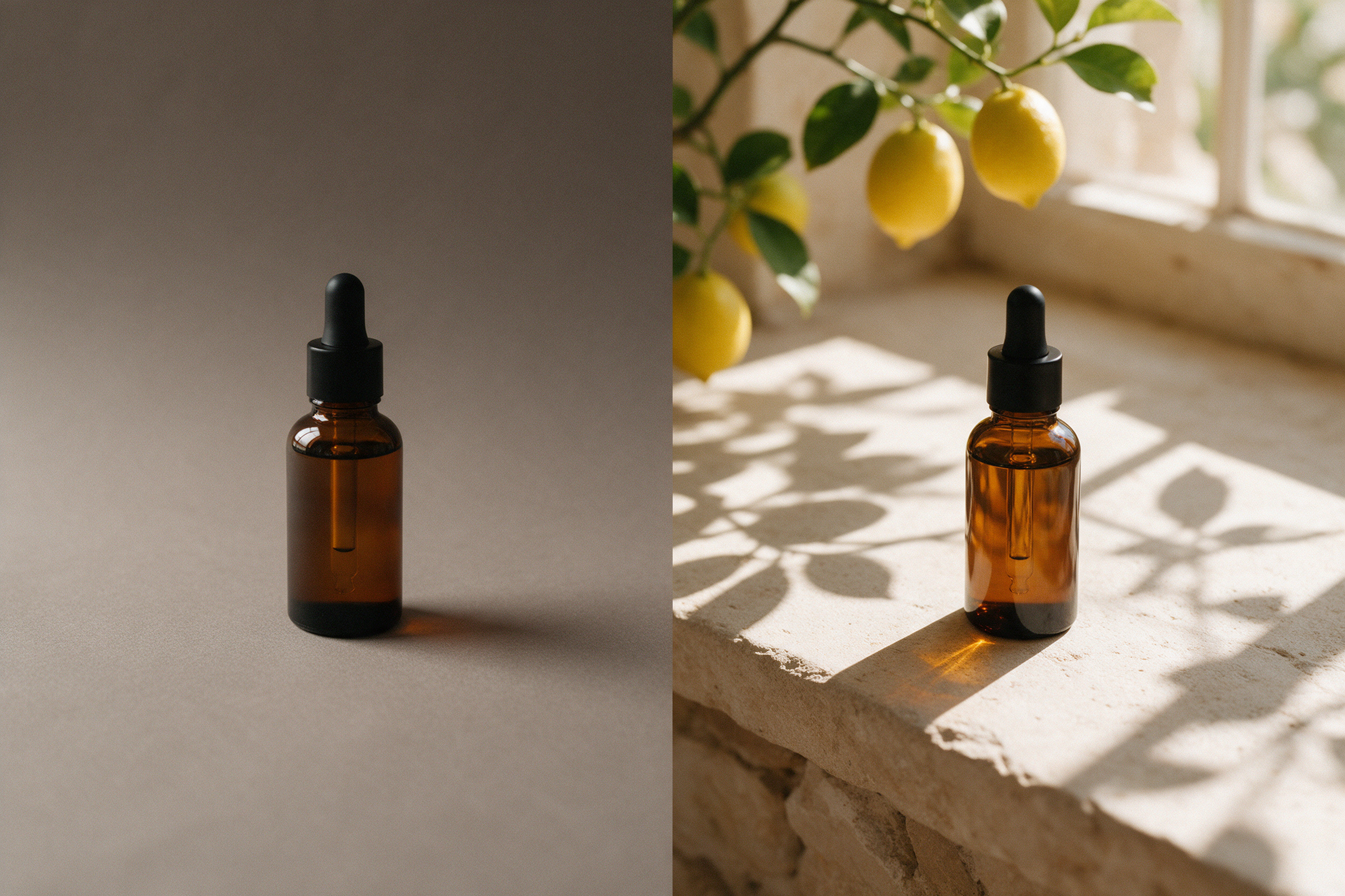
One request keeps turning up in the briefs that reach us, phrased a dozen different ways: we already have the product photo, can you give us more campaigns out of it? Lifestyle scenes, seasonal versions, a clean marketplace shot, a moodier one for ads. Ten years ago that meant a new shoot or a lot of compositing hours. Today it means a conversation about AI, and the conversation is changing in a useful way.
The early pitch was "generate a product image." The more sensible pitch now is "generate everything around the product and leave the product alone." That small shift decides whether the result is usable or a legal headache.
The shift: from generating products to generating around them
A recent guide from Dreamina, an AI image tool vendor, puts it bluntly: keep the real product as the reference and inspect brand-critical details before publishing. Its sharpest line is one I would happily put on a studio wall: a beautiful background is not useful if the product shape, color, logo, packaging, buttons, ports, material or label changes. Yes, it is a vendor writing about its own category, so read the tool rankings with a pinch of salt. The principle itself is sound, and it matches what we see from the production side.
Tool makers are converging on the same idea. A newsletter that landed in our inbox this week from Maground pitches exactly this: start with real photography, then transform weather, season and lighting with AI. Different brand, same logic. The photograph is the anchor; the AI works on the context.
Why fidelity matters more than beauty
Nobody at a brand will complain that the stone ledge behind the bottle is not a real ledge. They will absolutely notice if the shoulder of the bottle is slightly rounder, if the cap ribbing changed, or if the label typography turned into something that only looks like typography. Those are the details a brand manager, a packaging designer or a compliance reviewer checks first.
That is why the useful question has moved from "which model makes the prettiest image?" to "which workflow keeps a real product anchored while everything else changes?" A pretty output you cannot approve is just a mood board.
What a sane reference-led workflow looks like
There is no single correct pipeline, but the shape is consistent:
Start with a clean, well-lit product photograph. Sharp, accurate color, no strange reflections you cannot explain. Garbage in, garbage out still applies.
Separate the product. A careful mask, including edges, transparency in glass and soft shadows, so the real pixels stay untouched.
Explore the campaign direction with AI. Generate scenes, lighting and props as references rather than final art. Adobe documents one route: explore concepts in Firefly Boards, then send a selected concept into Photoshop to finalize layout, color, textures and details with familiar production tools.
Rebuild the product into the scene by hand. Contact shadow, edge color spill, light direction, reflections and depth of field all need to agree with the new environment.
Run a brand-critical check before anything goes out: label, logo, proportions, materials.
Where AI still slips (and where retouching earns its keep)
This is the part that gets glossed over. Even when the product pixels are protected, the scene around them is not automatically believable:
Reflections in glass and metal. A bottle photographed on a grey sweep does not contain a lemon tree. If you drop it into a sunlit window scene, the glass needs the right highlights and colors, and that usually means manual work.
Contact shadows. They are the number one giveaway of a pasted product. They need to match the light direction and the surface texture.
Text and small print. Generated text near or on packaging is unreliable; anything readable should be set properly or kept from the original photo.
Scale and perspective. Camera height and lens feel have to match between the product photo and the generated scene, or the product floats.
None of this is a reason to avoid AI. It is a reason to be clear about which parts are generated, which are photographed, and which are finished by a person.
Practical takeaway: a five-point check before you publish
Does the product shape match the source photo when overlaid?
Are logo, label and packaging text identical to the original artwork?
Do color and material look the same as the physical product under neutral light?
Do shadows and reflections agree with the new scene?
Would you be comfortable if the customer put the photo next to the product they receive?
If the answer to any of these is no, the image is not finished, however good the background looks.
