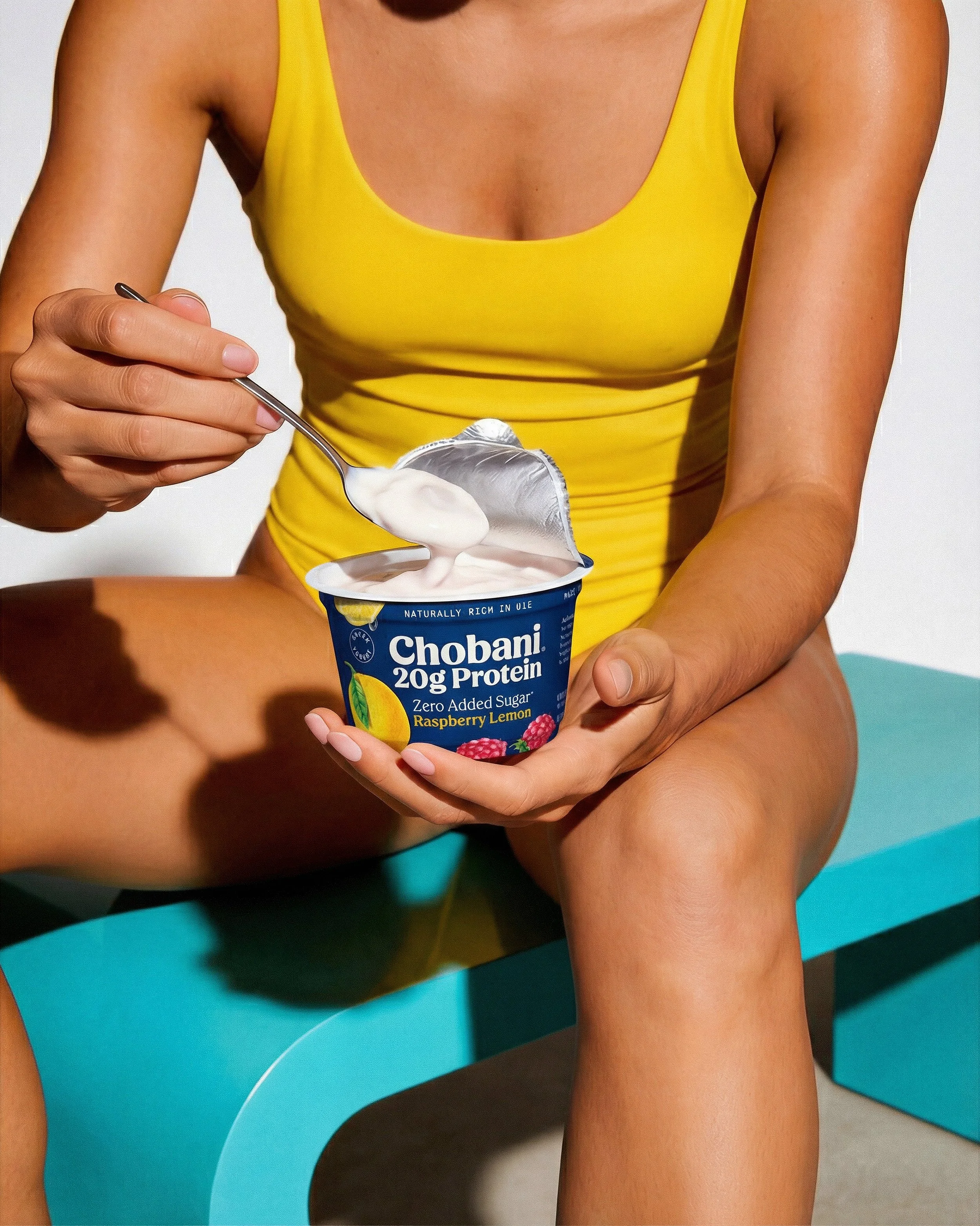
What Chobani's Cup Proves About Packaging Design When You Have No Marketing Budget
In 2007, Hamdi Ulukaya had a factory, a recipe, and about $150,000 left. No ad budget. No agency. One salesman. Audible's Business Wars podcast opens its Chobani series on exactly this problem: he had 18 months of work and zero cups sold, and the only thing standing between him and a national grocery chain was a cup design.
That's the detail worth pulling out of the Chobani story. Not "great branding," which is what most retrospectives call it. The packaging wasn't decoration on top of a marketing plan. It was the marketing plan, because it was the only thing Ulukaya could afford to invest in.
That's a useful case study for any brand or startup weighing packaging against ad spend, and it's exactly the kind of decision we help clients make at 35milimetre.

Why the cup shape mattered more than the logo
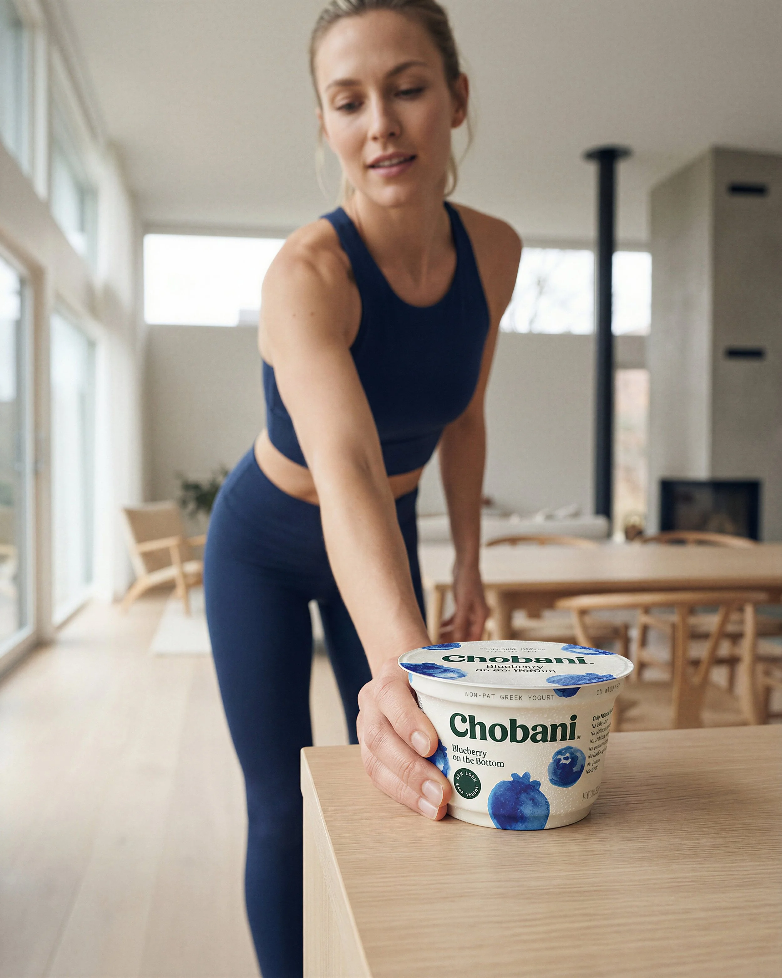
American yogurt cups were tall, narrow, and interchangeable; that was the entire category. Ulukaya's yogurt reminded him of the thick, creamy Greek-style yogurt his family made in Turkey, and he wanted the cup to say so before anyone read a word on the label.
So Chobani went squat and wide-mouthed, closer to a Turkish serving bowl than a supermarket yogurt cup. Paired with bright white plastic, it stood apart on a shelf where every competitor's cup looked the same shape from three feet away. Reporting on the brand's early packaging investment puts the initial spend at around $250,000, a serious bet for a company that hadn't sold a single case yet (Colin Keeley, Chobani Business Breakdown).
That's the first lesson: differentiation at the shelf doesn't start with the graphic. It starts with the silhouette, because that's what a shopper's eye registers before anything else.
The sleeve decision was a production choice, not a design one
Here's the detail most packaging write-ups skip. Most yogurt brands print graphics directly onto the cup, which is cheaper but produces flatter, duller color. Chobani printed onto plastic sleeves and slid them over the cups instead. More expensive, but the colors came out bolder and sharper, and the print quality held up on shelf.
This is the part of packaging strategy that lives in production, not concepting, and it's the part we spend most of our time on at 35milimetre. A great label concept can still look muddy on the shelf if the print method, substrate, or color separation isn't right. Chobani's team understood that the visual asset only works if the physical output matches it; the same principle applies whether you're compositing a bottle shot, retouching a label for print, or building a CGI render of packaging that hasn't been manufactured yet.
The name, the price, and the aisle were one visual system
Ulukaya named the yogurt Chobani, from çoban, the Turkish word for shepherd. Small detail, but it meant the packaging carried a story instead of just a flavor name.
Then came price and placement, and this is where the podcast gets specific. When Chobani finally sat down with ShopRite's buyer, the reaction wasn't about taste alone: "I like the packaging too. And the price. A dollar twenty-nine, that's smart. Tells people this is special without pricing them out like most artisan brands." That's a buyer reading the whole visual and commercial package in one sentence.
Ulukaya also refused to let Chobani sit in the specialty or organic aisle. He wanted it in the regular dairy case, next to Yoplait and Dannon, priced and packaged to look like it belonged there rather than like an import charging a premium for the privilege. The cup, the price, and the shelf location were all doing the same job: telling shoppers this was a serious, everyday product, not a niche one.
Why this still checks out against the data
None of this is nostalgia for a 2007 packaging decision. It holds up against current consumer research. Recent industry data puts the share of buyers who say packaging design influences their purchase decision at 72%, and 81% of consumers report buying a new product specifically because of its packaging (uPrinting, 25 Key Packaging Statistics You Should Know). For premium-positioned products, 61% say they're more likely to repurchase if the packaging looks premium (Enterprise League, Statistics You Should Know About Packaging Design).
Chobani didn't stop treating packaging as strategy once it had an ad budget, either. In 2017, with sales growth slowing as competitors like Yoplait Greek and Dannon Oikos caught up, the company redesigned its identity in-house: it dropped the white plastic and fruit photography for illustration inspired by 19th-century American folk art, and swapped its block lettering for a softer serif type (CNBC, Chobani redesigns logo, packaging to woo consumers to yogurt again). Different market, same instinct: when growth stalls, packaging is one of the first levers worth pulling, not the last.
Where this connects to what we do
We see the Chobani pattern regularly with brands and startups who come to us with a strong product and a limited budget. The packaging or key visual has to carry weight an ad campaign would otherwise carry: shape, color, print quality, and how the product photographs on shelf or on a product page. That's compositing work, retouching work, and increasingly CGI work when a client needs to visualize packaging before a production run exists. The mechanics are different from a 2007 yogurt cup, but the underlying decision is the same one Ulukaya made: the packaging is doing sales work, so it has to be built like it.
The takeaway
Chobani's packaging wasn't a branding flourish layered onto a business plan; it was the business plan, because it was the one thing a founder with no ad budget could actually control and afford. The shape, the sleeve, the price, and the shelf placement all pointed at the same idea before a single commercial ran. If you're weighing where to put a limited budget on a product launch, that's worth remembering: the packaging usually reaches more people than the ad does.
If you're working through a packaging or product-visual decision like this, we're always happy to talk it through.