How to Art-Direct AI Imagery so It Matches Your Brand Guidelines
The question that blocked most AI work in 2024 and 2025 was "can the model render this?" That question is effectively closed. Nano Banana 2, which shipped in February 2026, hit 94% text accuracy on packaging and signage work. Midjourney v7's new style modes, out earlier this year, lock a referenceable aesthetic across an entire generation session. FLUX.2 and Gemini 3 handle near-photographic fidelity on most briefs.
The problem moved. The new bottleneck is consistency; keeping the same brand look across forty assets, ten markets, three formats and six weeks of production. AI models don't understand brand guidelines. They understand prompts. The gap between those two is where art direction has to step in.
Why AI "drifts" across a campaign
Every generative model is doing essentially the same thing: sampling from a learned distribution of images weighted by your prompt. Slight prompt changes, slight reference swaps, and the distribution shifts. Aesthetic consistency, the kind a brand needs across a whole launch, is not a default property of these systems. It has to be engineered.
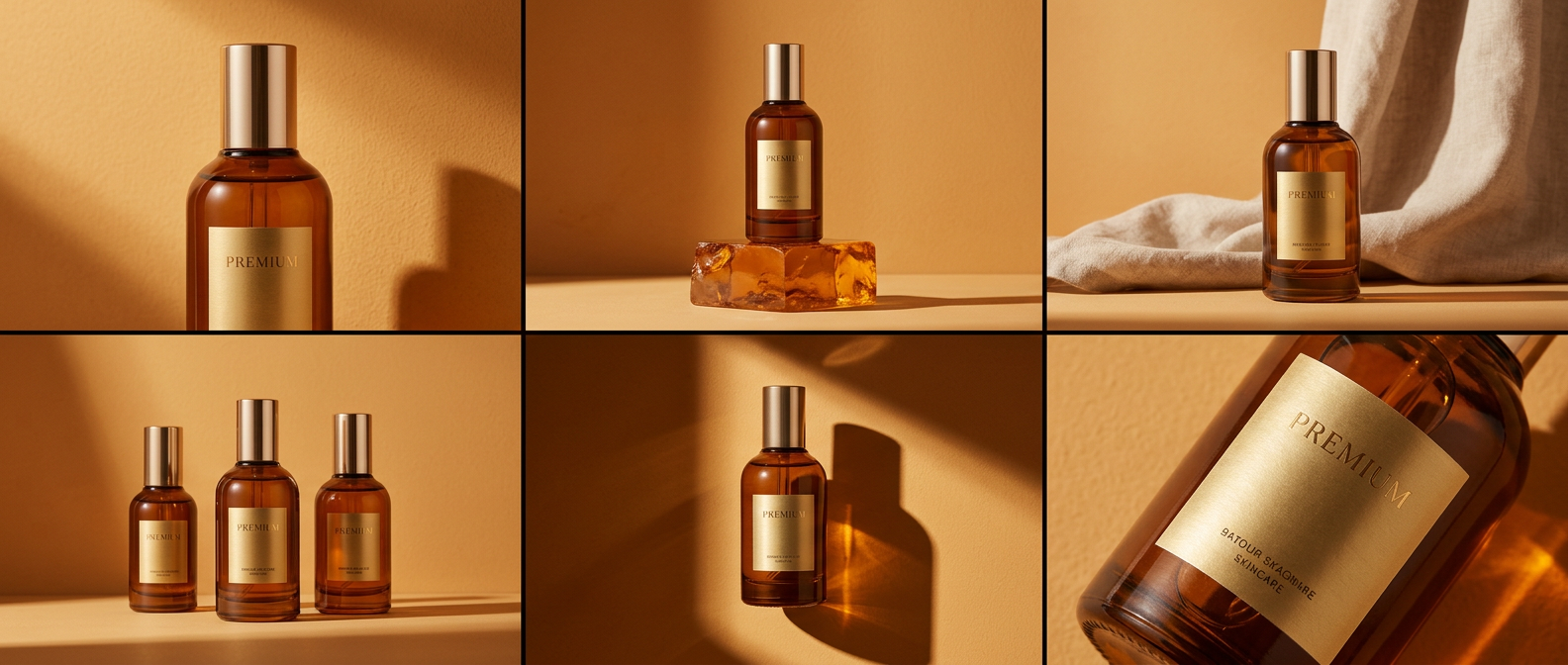
The patterns that show drift fastest: colour palette drifting warmer or cooler between shots, the "texture" of the image changing (smoother in one, grainier in another), typography rendering slightly differently on each pack shot, and small recurring elements, like a background logo or a uniform, shifting in each frame.
Treat AI like the worst junior designer on the team
This is the framing we use internally. The model is a new hire with infinite capacity and zero institutional memory. It has never seen your brand book. It doesn't know what the CEO hates. It will happily deliver whatever you asked for, even if the ask was ambiguous.
Your job is to give it the same thing you'd give a strong junior: a reference board tighter than you think it needs to be, a style guide translated into the language the model speaks, a review structure that catches drift early, and named guardrails it can't cross.
What belongs in the art-direction package for an AI campaign?
A working pack for a model-driven campaign, in our experience, includes:
- Reference boards for each scene type, with 6 to 12 images per board, annotated for what to take and what to ignore.
- Character sheets if the campaign has a recurring person, mascot, or figure; turnarounds, wardrobe, expression range, lighting.
- Palette locks as hex values, plus a set of "reference" images showing the palette in context. Models respond better to images than to colour codes alone.
- Negative prompt libraries for what the brand will not accept; specific styles, aesthetics, artists, or compositional clichés that have to stay out of the output.
- Typography handling rules; where type gets rendered by the model (rarely) and where it gets composited in afterwards (usually).
- Camera and composition rules; what lens feel, aspect ratio, eye-level, depth of field the brand uses. "Cinematic wide-angle" is not a style; specific lens references are.
- Lighting grammar; how the brand handles key light, fill, rim, colour temperature.
The pack becomes an input to the generation process itself, not a reference the team consults and ignores.
How do you prevent drift in production?
Three tactics, in order of effectiveness. First, generate in locked sessions. Most models now support seeds, style references, and session-level memory. Use them. Generating the whole campaign in one session with consistent references beats ten separate sessions almost every time.
Second, batch by scene, not by shot. If the campaign has three core scenes, run all variations of scene one before moving to scene two. It keeps the model's "state" consistent and makes drift visible immediately.
Third, run a consistency pass at the end. A compositor or art director sits with the full set, flags the images that drifted off, and either regenerates or composites them back into consistency. This is the bit that gets skipped under time pressure and is the main reason campaigns feel "off".
The role of compositing in brand consistency
Even with the best art direction, you'll have frames that need manual intervention. Compositing is where final brand consistency gets enforced. A slightly cooler image gets colour-graded warmer to match the set. A label that drifted gets replaced with the brand's actual artwork. A background colour that read slightly off-palette gets corrected.
This is where post-production craft still does most of the heavy lifting. Art direction sets the intent; generation provides the raw material; compositing unifies the output. Skip the last step and the campaign never quite hangs together.
How 35milimetre handles this on a multi-asset brief
A typical on-brand AI brief runs through our studio in four stages. We build the art-direction pack upfront with the client (usually a half-day session plus a few days of prep). We generate in batched sessions, with named art-director ownership. We run a consistency review on the full set, marking drift. We composite, colour-grade, and unify. The last stage is where half the value lives; it's also the stage clients sometimes want to cut. We push back, because the alternative is "forty images that look mostly similar", which is not the same thing as a campaign.
Closing takeaway
AI imagery staying on-brand isn't a technical problem; it's an art-direction problem with a technical component. The studios who'll be doing this work at scale in 2027 are the ones already building reference packs, running locked generation sessions, and owning a consistency pass at the end. The model is the easy part now.
If you're briefing a multi-asset AI campaign and want it to hold together across the full set, we're glad to talk through how we structure the pack.