Visual branding: define, differentiate, and drive ROI

Most marketing teams assume that a polished logo and a consistent color palette are enough to call their visual branding done. That assumption is costing them. Research shows that structured brand platforms yield 367% ROI over three years, with measurable benefits reaching $4.22 million from efficiency gains, cultural alignment, and marketing performance. Visual branding is not a one-time design project. It is a living system that shapes how your audience perceives, remembers, and trusts your company across every touchpoint. This article breaks down what visual branding actually means at a strategic level, what its core components are, and how to implement it in a way that generates real, trackable results for your team.
Table of Contents
- What is visual branding and why does it matter?
- Core elements of a successful visual brand
- How visual branding drives business results
- Implementing and innovating your visual branding system
- Why the best visual branding strategies break the rules
- Elevate your visual branding with expert support
- Frequently asked questions
Key Takeaways
| Point | Details |
|---|---|
| Visual branding is strategic | A brand’s visual system goes far beyond logos, acting as the operational face that builds and reinforces identity at every touchpoint. |
| Consistency drives ROI | Research proves that unified visual branding delivers massive returns, operational efficiency, and improved culture for marketing teams. |
| Kinetic systems outperform static guides | Modern brands rely on living, adaptable visual systems to support innovation and stand out in digital environments. |
| Systematic rollout matters | Successful visual branding change starts with an audit, a living style guide, and buy-in across teams for ongoing evolution. |
What is visual branding and why does it matter?
Visual branding is often confused with brand identity as a whole, but the distinction matters. Brand identity is the full picture: your values, voice, mission, and personality. Visual branding is the face of that identity. It is the specific, deliberate set of visual decisions that communicate who you are before a single word is read. Think of it as the translation layer between your brand’s meaning and your audience’s perception.
At its core, visual branding encompasses your logo, color palette, typography system, imagery style, iconography, and layout logic. Each of these elements works together as a system, not in isolation. A logo without a supporting color story is incomplete. A photography style without a consistent layout system creates visual noise. The power of visual branding comes from the coherence of the whole, not the quality of any single piece.
For mid-sized marketing teams, the practical challenge is consistency at scale. When multiple designers, agencies, and regional teams are producing assets simultaneously, visual drift happens fast. That is where a style guide becomes a critical operational tool. As G2’s breakdown of visual branding makes clear, the mechanics of visual branding emphasize system over single elements, with style guides serving as the primary enforcement tool for teams managing complexity.
The business case for investing in this system is not abstract. Consistent visual presentation across all channels directly reduces the cognitive load (mental effort required to process information) your audience faces when encountering your brand. Familiarity builds trust. Trust accelerates purchase decisions. That chain of cause and effect is why visual branding belongs in a board-level conversation, not just a creative brief.
“Visual branding is the ‘face’ to brand identity’s ‘soul.’ The mechanics emphasize system over single elements, with style guides as the primary enforcement tools for mid-sized teams.”
If your team is still treating visual post production concepts as an afterthought in campaign planning, you are likely leaving brand equity on the table. The companies that win on visual branding treat it as infrastructure, not decoration.
Core elements of a successful visual brand
Understanding what visual branding is sets the stage. Understanding what makes it effective is where most teams fall short. The shift happening across the industry right now is from static visual systems to what practitioners call kinetic branding, which refers to adaptive, dynamic visual frameworks that evolve with context, platform, and audience behavior.
| Element | Traditional approach | Modern kinetic approach |
|---|---|---|
| Logo | Fixed lockup, strict usage rules | Responsive variants for different contexts |
| Color | Fixed palette in a PDF | Adaptive color logic with digital-first specs |
| Typography | Print-focused type hierarchy | Variable fonts with screen-optimized sizing |
| Photography | Shot list and mood board | Defined aesthetic system with AI-assisted consistency |
| Layout | Grid templates in static files | Modular design systems with flexible components |
The table above captures a real tension that marketing leaders are navigating right now. Static brand guidelines served well in a print-dominated world. In a digital-first environment, they become a bottleneck. Teams need retouching and visual standards that flex without fracturing.
Neurobranding research adds another layer to this conversation. According to Brandingmag’s analysis of neurobranding mechanics, the subconscious influence of repeated visual cues, particularly patterns and colors, primes audience perception far more powerfully than logo recognition alone. Your audience is processing your brand before they consciously register it. That means the texture of your imagery, the rhythm of your layouts, and the emotional temperature of your color choices are doing heavy lifting you may not even be measuring.
Pro Tip: Build a living brand system, not just a static PDF guide. Host your visual standards in a shared digital environment where updates push to all users in real time. This single operational change eliminates version confusion and keeps your team aligned without requiring constant manual oversight.
The practical elements to prioritize are photography style, iconography consistency, and layout logic. These three are the most frequently violated in mid-sized organizations and the most visible to your audience when they are inconsistent.

How visual branding drives business results
The strategic argument for visual branding is clear. The financial argument is even clearer. When your team operates from a unified visual system, the downstream efficiency gains are significant and measurable.
Consider the direct costs of visual inconsistency: designers recreating assets from scratch because no approved templates exist, campaign launches delayed by approval loops, and brand errors caught only after publication. Each of these is a real cost center. A unified visual system eliminates most of them.
The data is compelling. Brand management platforms deliver 367% ROI over three years, with a six-month payback period and $4.22 million in measurable benefits. Those benefits come from three sources: operational efficiency, internal culture alignment, and marketing performance. All three are directly connected to how well your visual system is built and maintained.
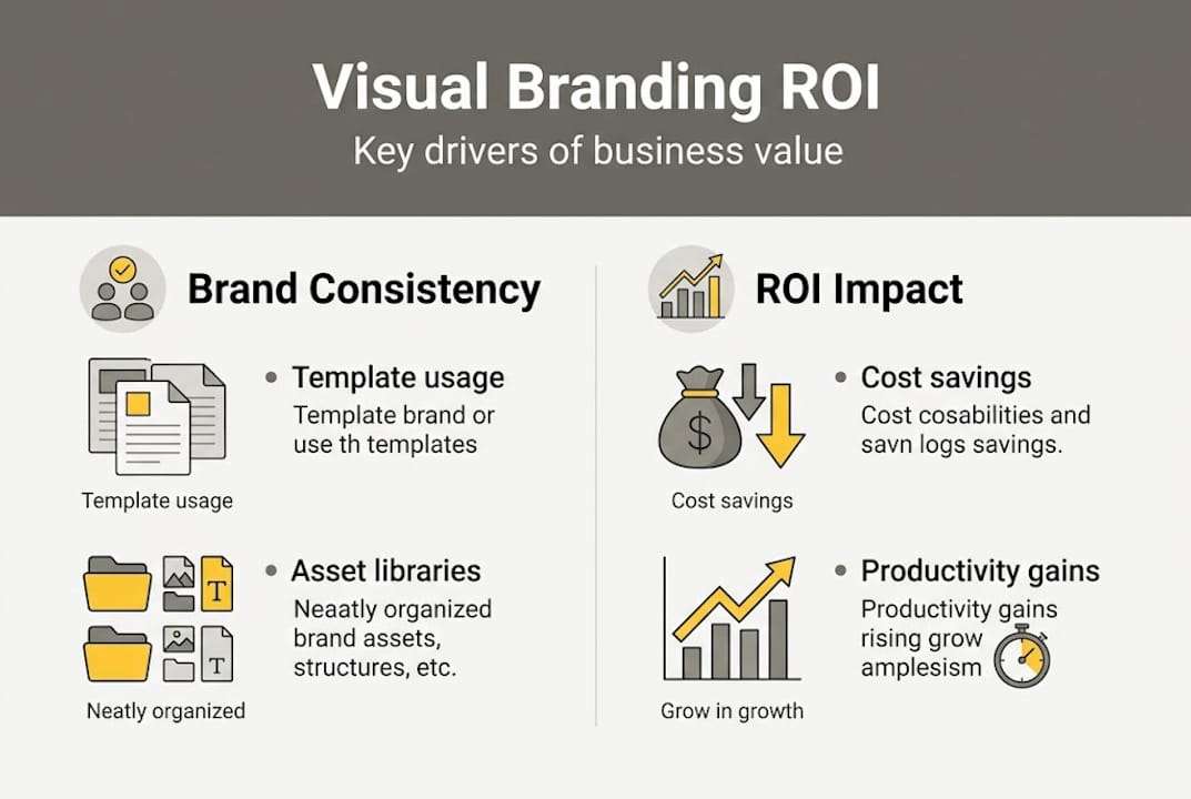
Efficiency gains show up immediately. When designers work from approved templates and asset libraries, production time drops. Approval cycles shorten. Campaign velocity increases.
Cultural impact is less obvious but equally important. When internal teams understand and can articulate the visual brand, they make better decisions independently. You spend less time correcting and more time creating.
Marketing performance is where the ROI compounds. Consistent brand imagery across paid, organic, and owned channels builds the kind of visual familiarity that shortens the consideration phase for buyers.
Here are three steps to start closing the brand consistency gap at your organization:
- Audit every active visual touchpoint across your digital and physical channels and identify where visual drift has occurred.
- Prioritize the highest-traffic and highest-impact channels for immediate standardization, starting with your website, social profiles, and paid media.
- Establish a single source of truth for approved visual assets, accessible to every team and agency partner producing work under your brand.
These steps are not glamorous, but they are the foundation on which every high-performing visual brand is built.
Implementing and innovating your visual branding system
Knowing the value of a strong visual system is one thing. Rolling it out across a mid-sized organization with multiple stakeholders, legacy assets, and competing priorities is another challenge entirely. The good news is that implementation does not require a complete rebrand. It requires a structured process.
Start with an internal audit. Map every visual touchpoint your brand currently occupies: website, email templates, social media profiles, sales decks, packaging, event materials, and any third-party placements. You will almost certainly find inconsistencies you were not aware of. That is normal. The audit is not about blame. It is about building a clear picture of where the system needs reinforcement.
Next, build or update your style guide to reflect current visual standards. As G2 emphasizes, the mechanics of a strong visual brand prioritize system over individual elements. Your style guide should cover not just what your brand looks like, but how and why each element is used. Context matters as much as specification.
Rolling out new visuals requires education, not just distribution. Share the reasoning behind your visual decisions with your team. When people understand why a photography style was chosen or why a specific typeface communicates trust, they apply the standards more thoughtfully and with less need for correction.
Innovation comes after the foundation is stable. Once your team is operating from a unified system, you can begin introducing kinetic elements: adaptive templates for different platforms, motion graphics that extend your visual language into video, and interactive media that brings your brand to life in digital environments. The goal is to bring your branding to life in ways that feel cohesive, not chaotic.
Pro Tip: Involve cross-functional feedback when iterating on your visual system. Sales, customer success, and product teams interact with your brand in ways that marketing often does not see. Their input surfaces blind spots and strengthens the system for everyone.
Why the best visual branding strategies break the rules
Here is a perspective that most brand management guides will not give you: the teams obsessing over brand policing are often the ones producing the most forgettable work. Consistency is necessary, but uniformity is not the goal.
The brands that generate outsized engagement are the ones that use their visual system as a foundation to take calculated risks. They localize imagery for specific markets. They humanize their visual language with imperfect, authentic photography. They experiment with color and layout in ways that feel surprising but still recognizably on-brand. That balance is hard to achieve, but it is where real differentiation lives.
We have seen this firsthand working with brands across technology and automotive sectors. The campaigns that performed best were never the ones that followed the style guide most rigidly. They were the ones that understood the spirit of the visual system well enough to push against its edges thoughtfully. Visual innovation examples from our own work consistently show that the most memorable imagery comes from creative tension, not perfect compliance.
In a saturated market, sameness is the real risk. A well-built visual system should give your team the confidence to be bold, not the excuse to play it safe.
Elevate your visual branding with expert support
Building a visual branding system that performs at this level takes more than guidelines. It takes production expertise, creative vision, and the technical ability to execute at a high standard across every format and channel.
At 35milimetre, we work with marketing teams and brand strategists to produce imagery that does more than look good. From compositing and color grading to CGI and AI-enhanced visuals, our work is built to support professional visual branding services that hold up under scrutiny and stand out in competitive environments. If your visual brand is ready for a level of craft that matches your ambition, we would like to be part of that conversation.
Frequently asked questions
How does visual branding differ from graphic design?
Visual branding is the strategic system unifying all visual expressions of a brand, while graphic design refers to creating individual visuals or assets within or outside of that system.
What are the essential elements of a visual brand?
The essentials are logo, color palette, typography, imagery style, iconography, and layout systems, all working as a cohesive visual framework rather than independent choices.
Can updating visual branding really increase ROI?
Yes. Structured brand management systems have been shown to deliver 367% ROI over three years, driven by efficiency gains, reduced production errors, and stronger marketing performance.
How can mid-sized companies keep visual branding consistent?
Style guides and digital asset platforms help all teams apply the same standards, reducing errors and preventing the visual drift that weakens brand recognition over time.
What does ‘kinetic branding system’ mean?
A kinetic branding system is a flexible, adaptive set of visual elements and templates designed to evolve with digital contexts, as opposed to static PDF guidelines that quickly become outdated in fast-moving markets.