Braveheart Sake – From Freedom to Shelf
Client Vision
The founders of Shin Koji approached us with a bold idea: create a brand for a sake-based, low-ABV RTD called Braveheart. The name represented two intertwined concepts:
Brave → freedom, rebellion, unchained spirit.
Heart → Shinpaku, the “white heart” of rice, central to sake brewing.
The brand needed to be geeky yet cool, rebellious yet rooted in tradition, and most importantly, instantly recognizable on the shelf.
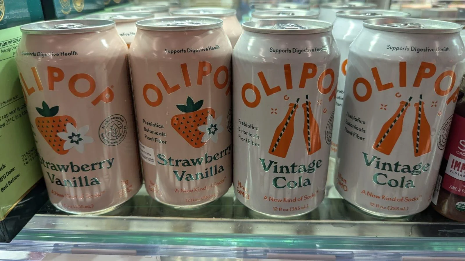
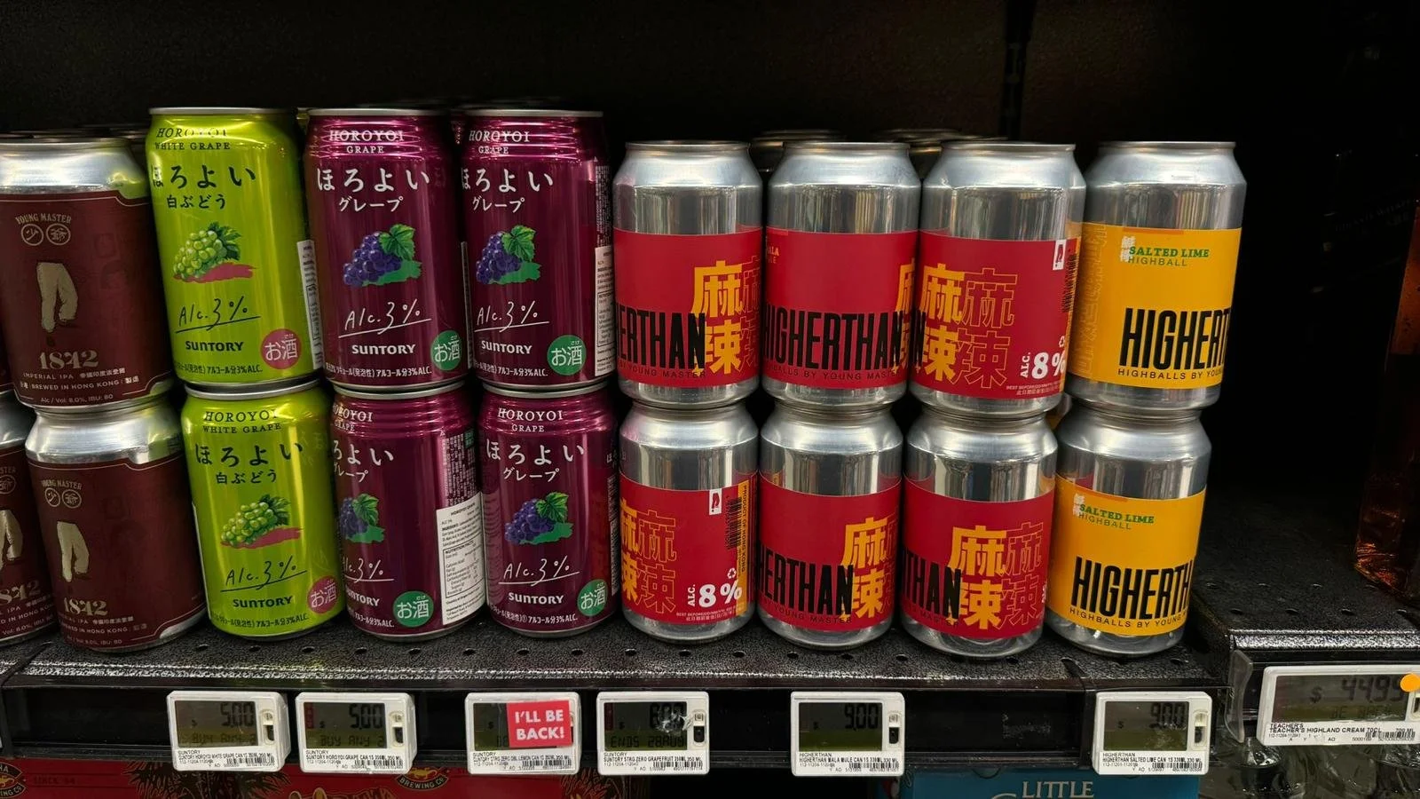
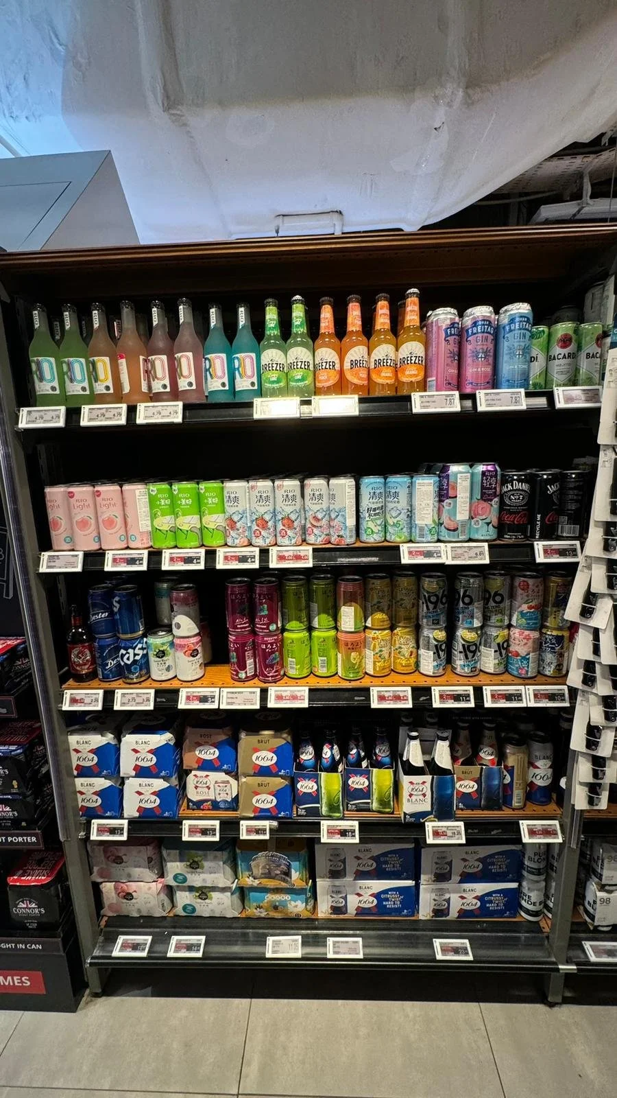
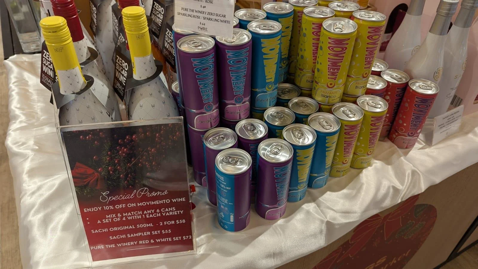
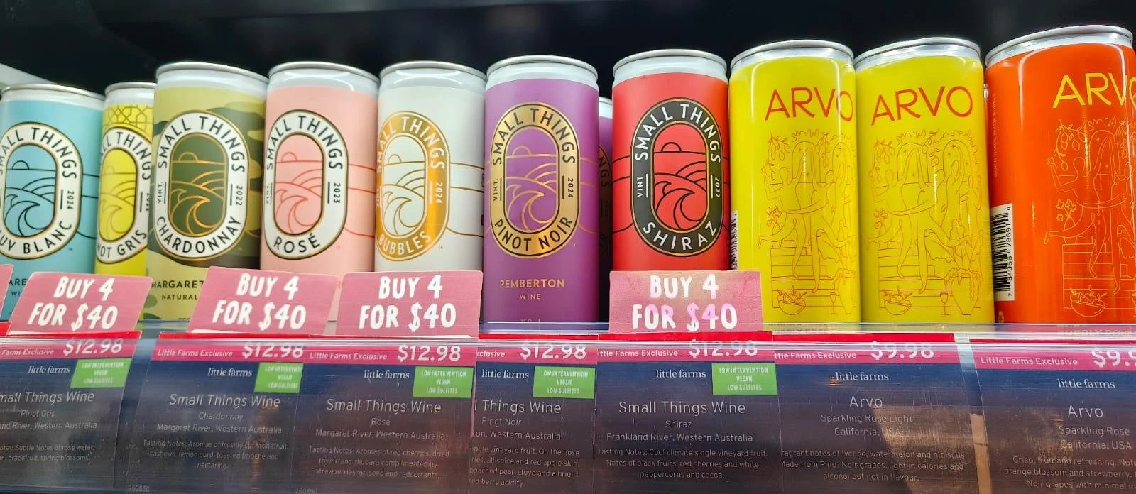
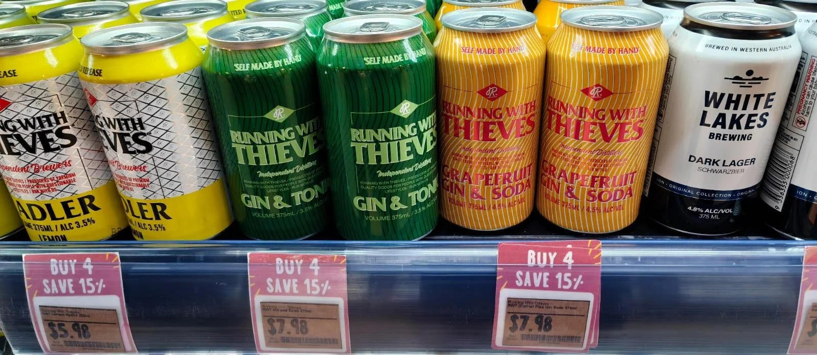
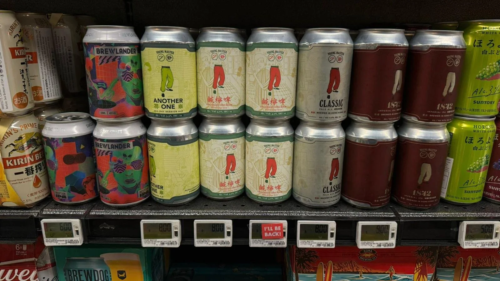
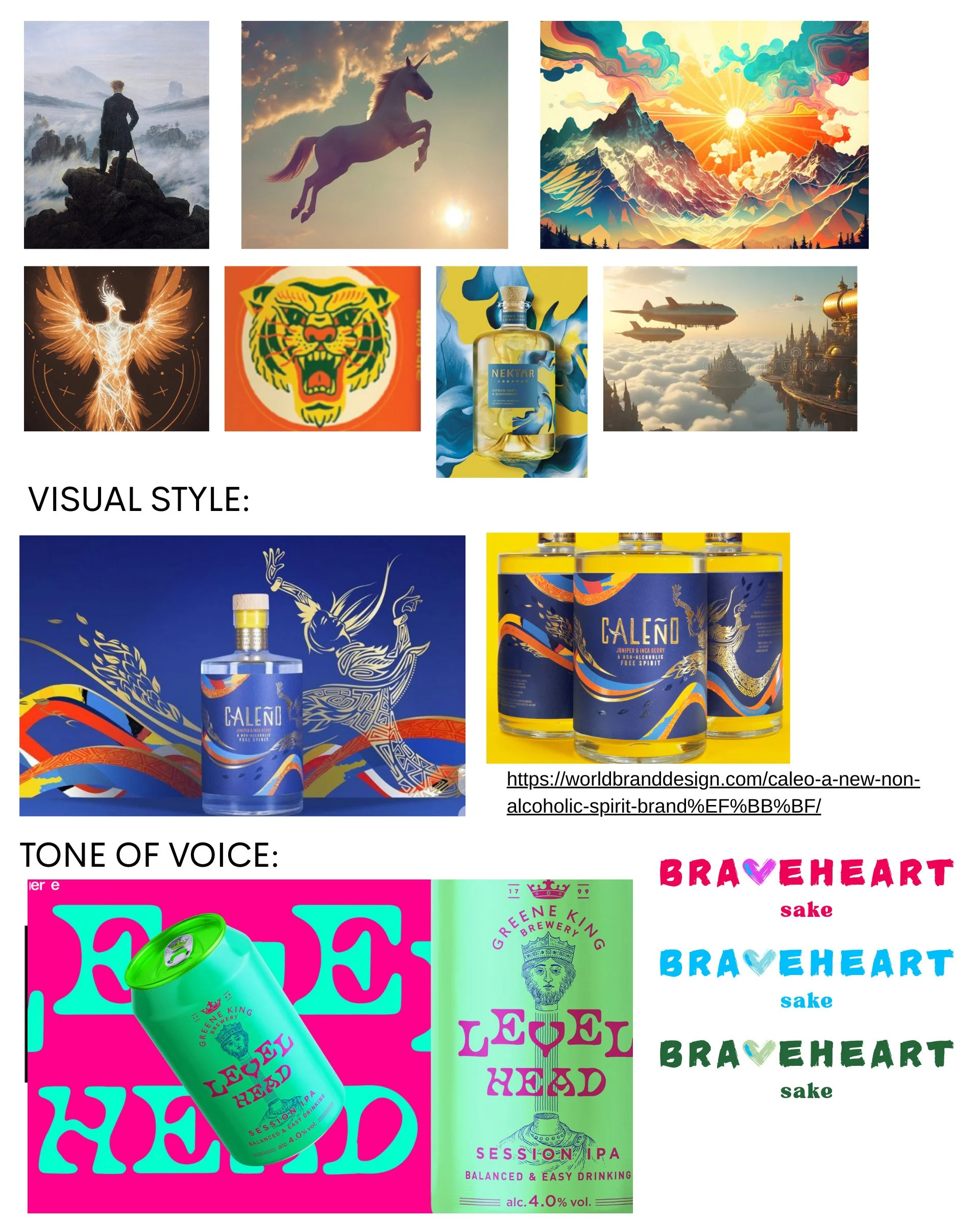
One of the questions we asked was what the shelf space in the Singapore market looked like.
Stage 1: Defining the Identity
The initial brief emphasized:
A hand-drawn logotype with a heart integrated into “Braveheart.”
References to freedom symbols (whales, wings, landscapes).
Asian artistic sensibilities balanced with edgy, modern touches.
Our First Logo Directions
We explored three distinct logotype directions:
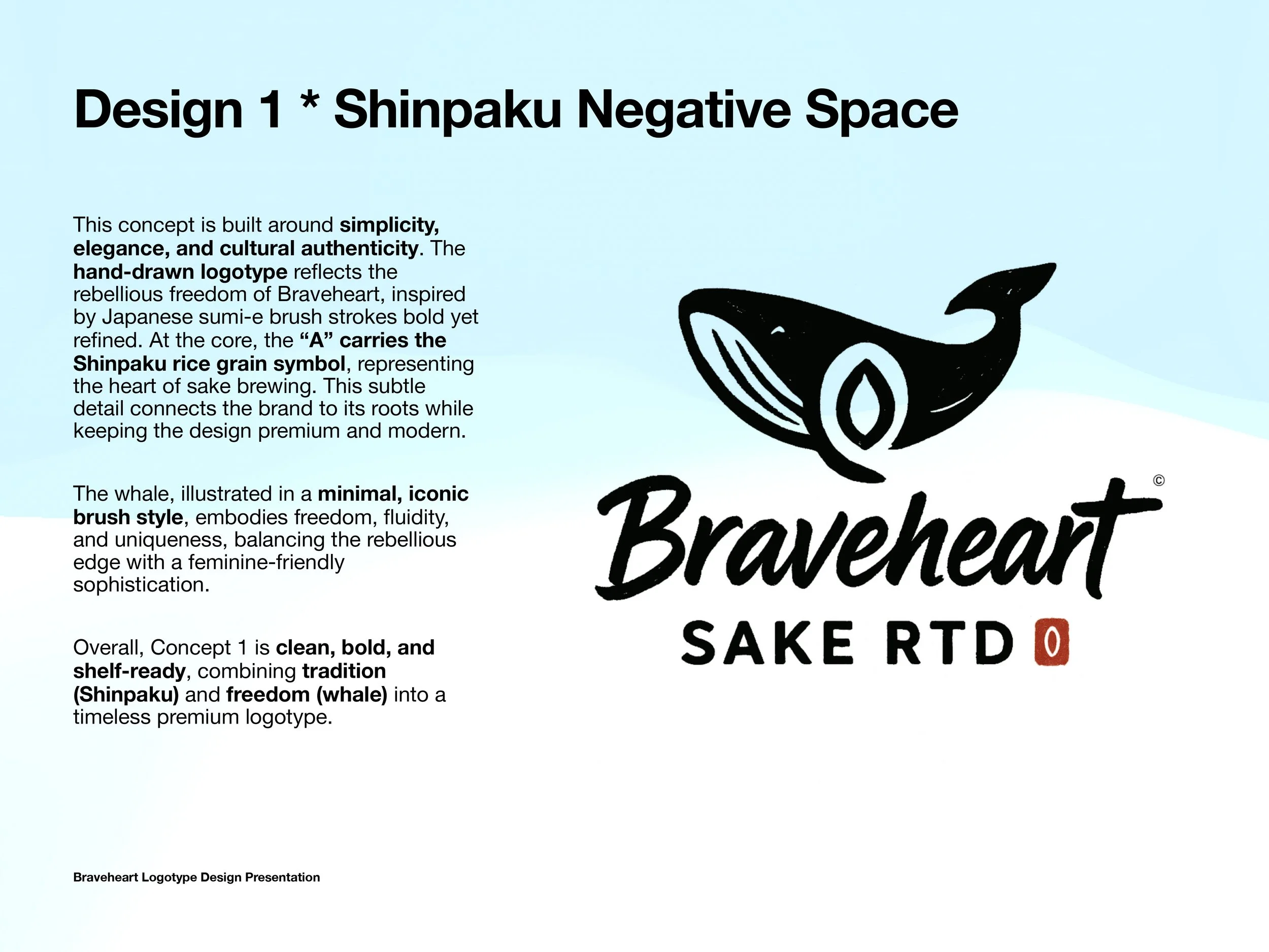
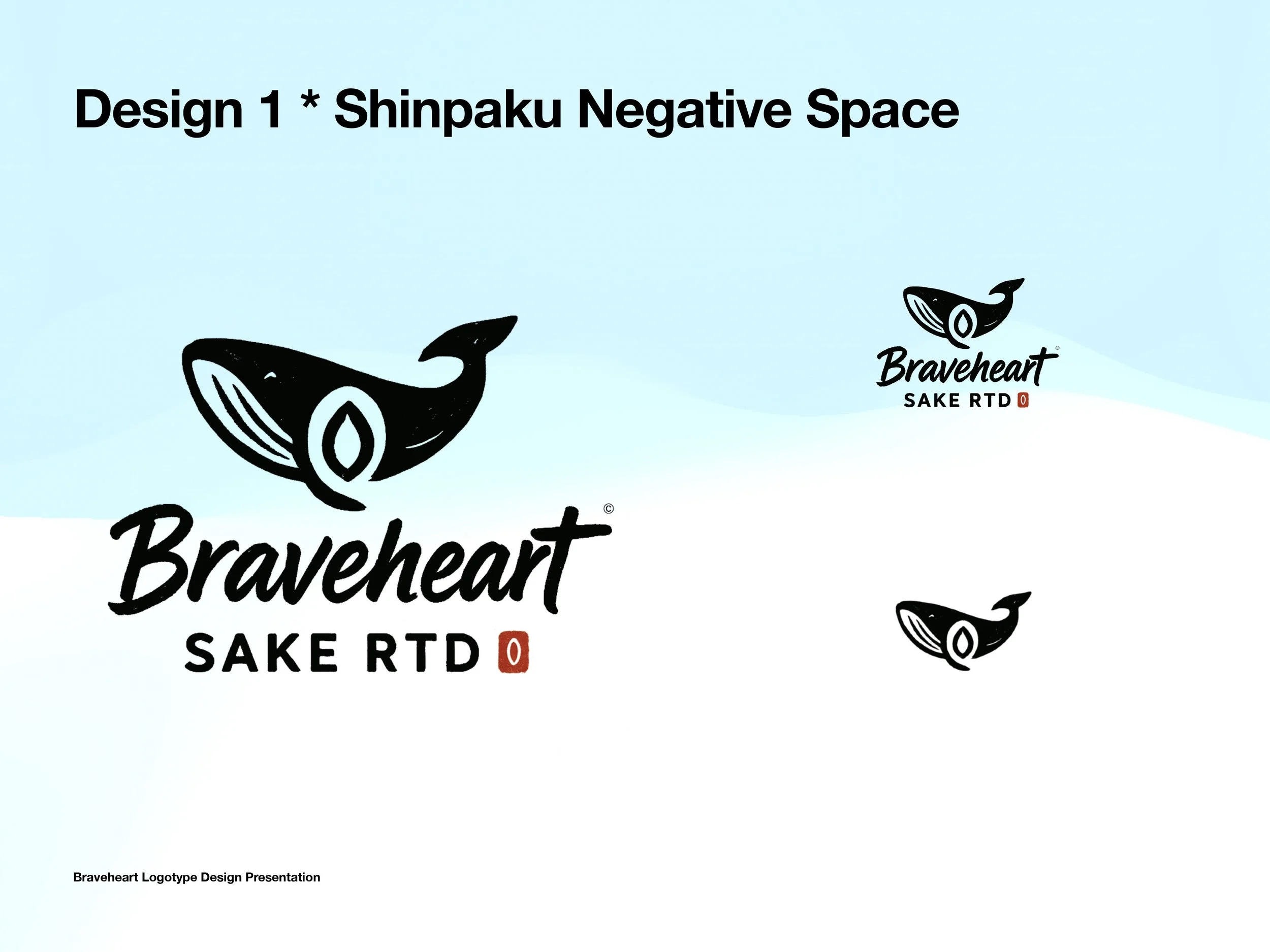
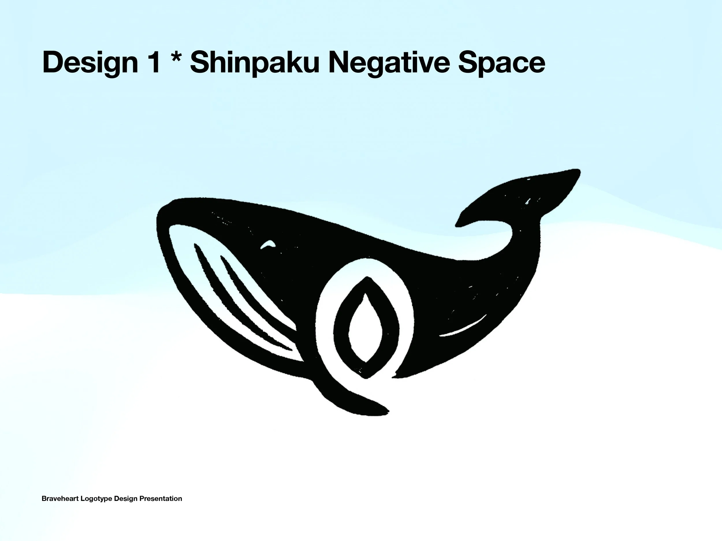
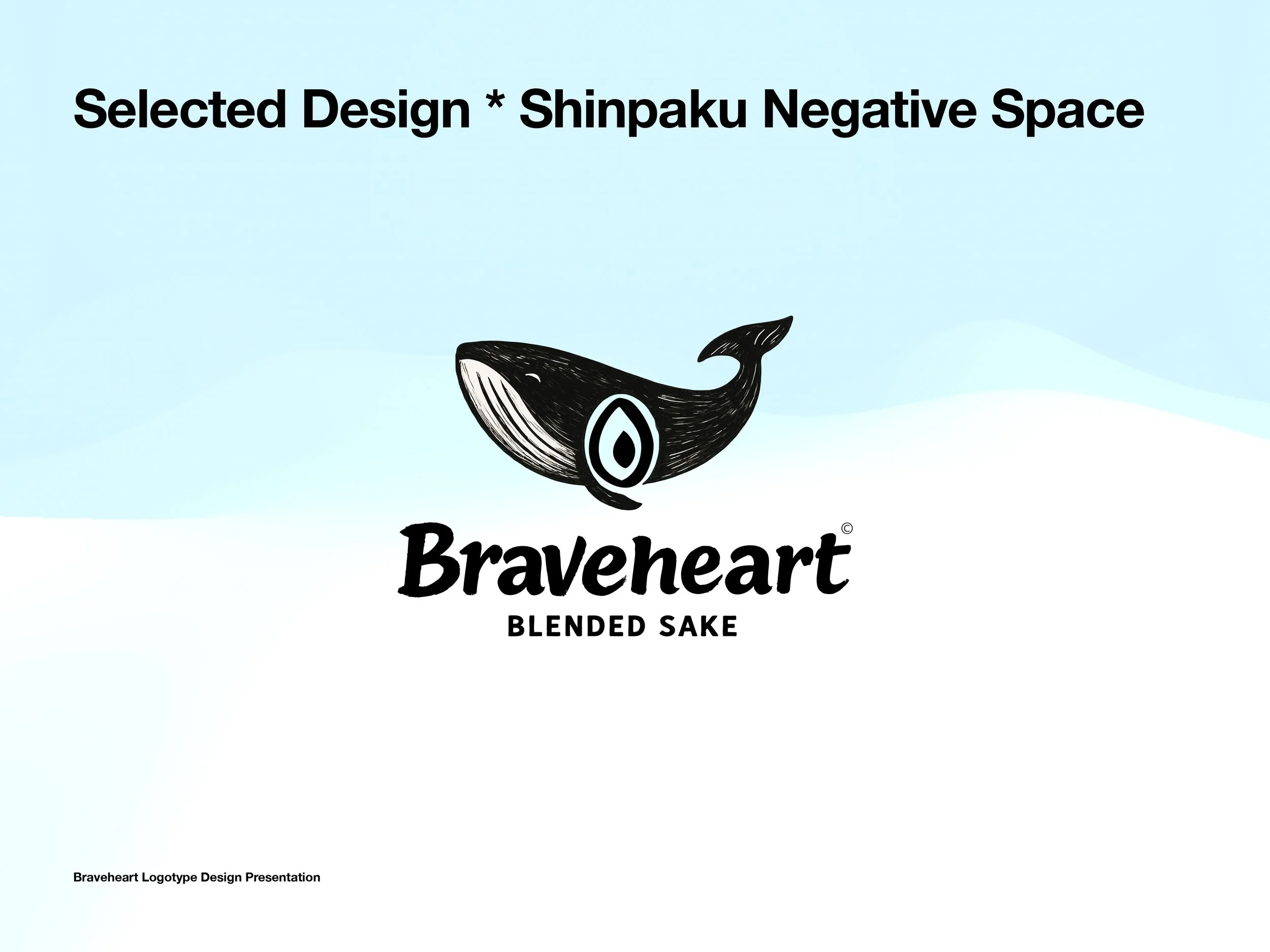
Shinpaku Negative Space – Elegant brush-stroke lettering with the rice grain hidden in the “A.” A whale motif symbolized freedom and fluidity.
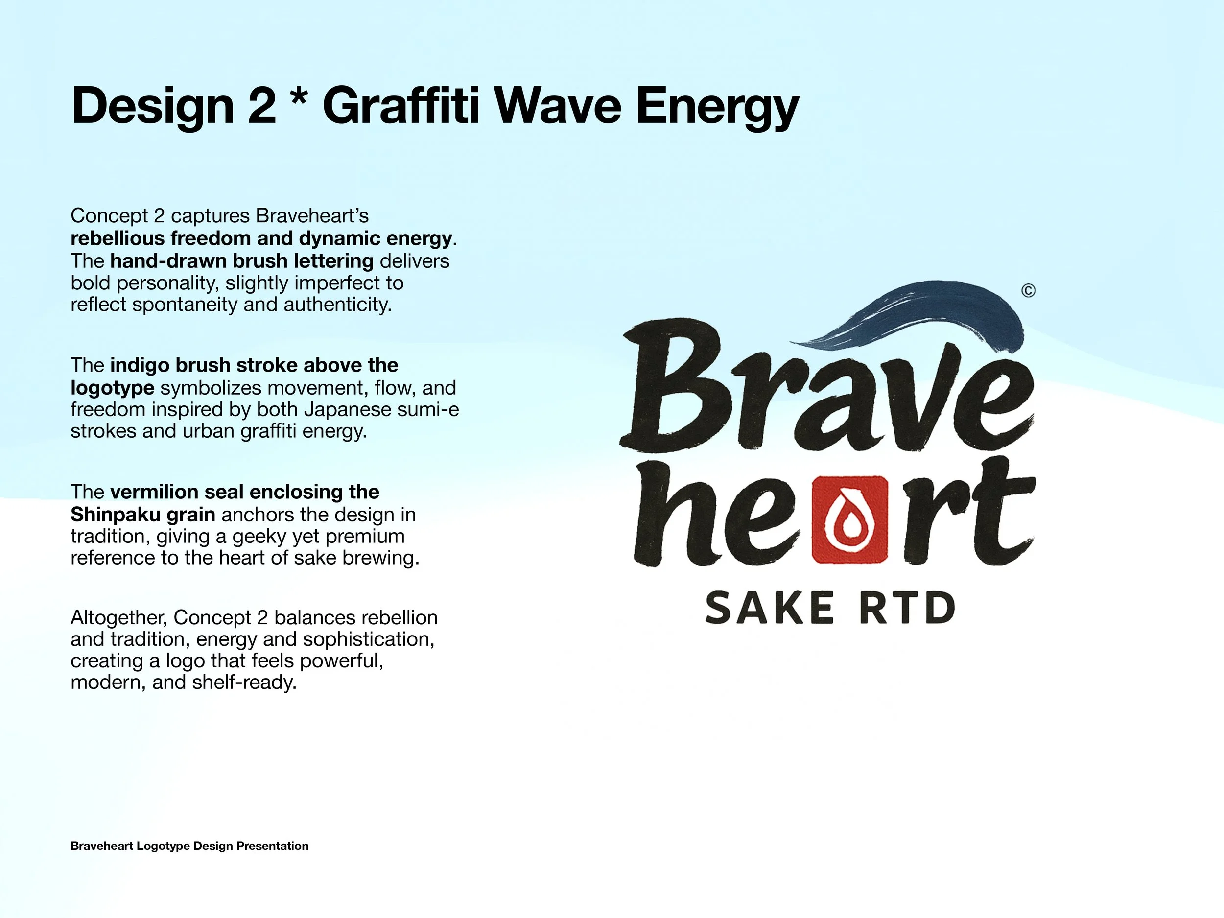
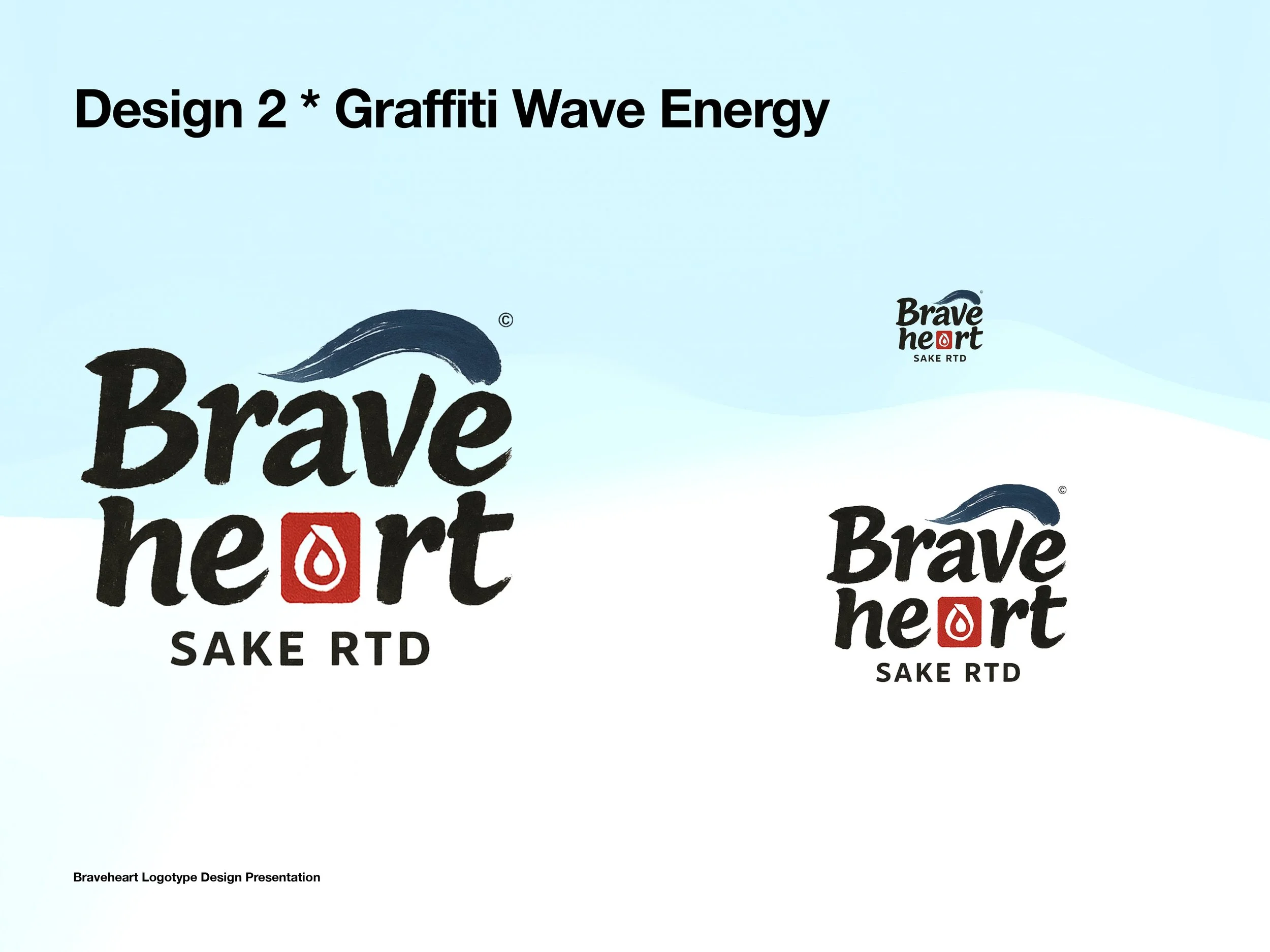
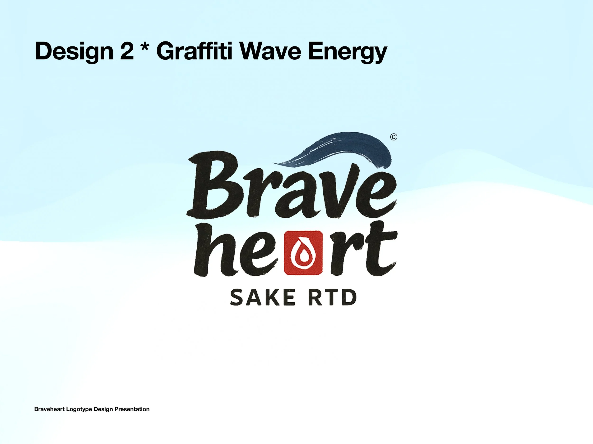
Graffiti Wave Energy – Bold, imperfect brush lettering with a dynamic indigo stroke and vermilion Shinpaku seal.
Ink-Grain Signature – Expressive brush typography with ink-texture depth and subtle integration of the rice grain.
Each path translated the Brave + Heart duality differently, from premium elegance to urban rebellion.


Stage 2: Refinements
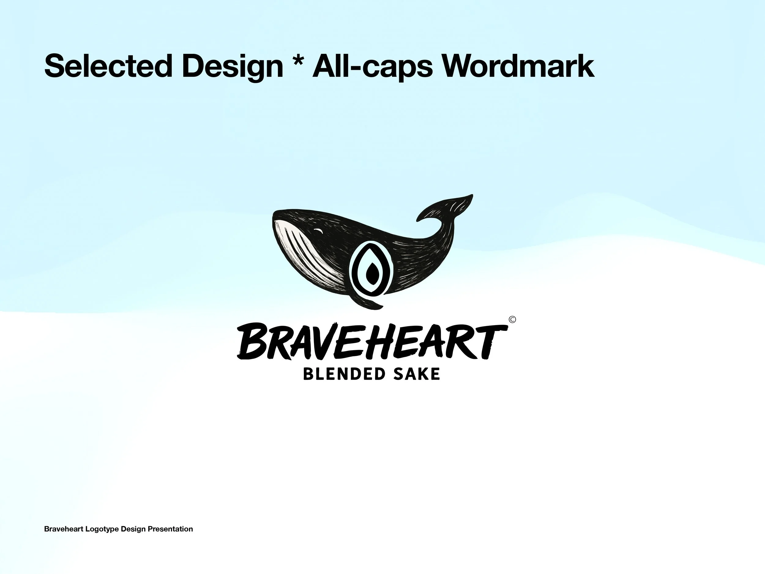
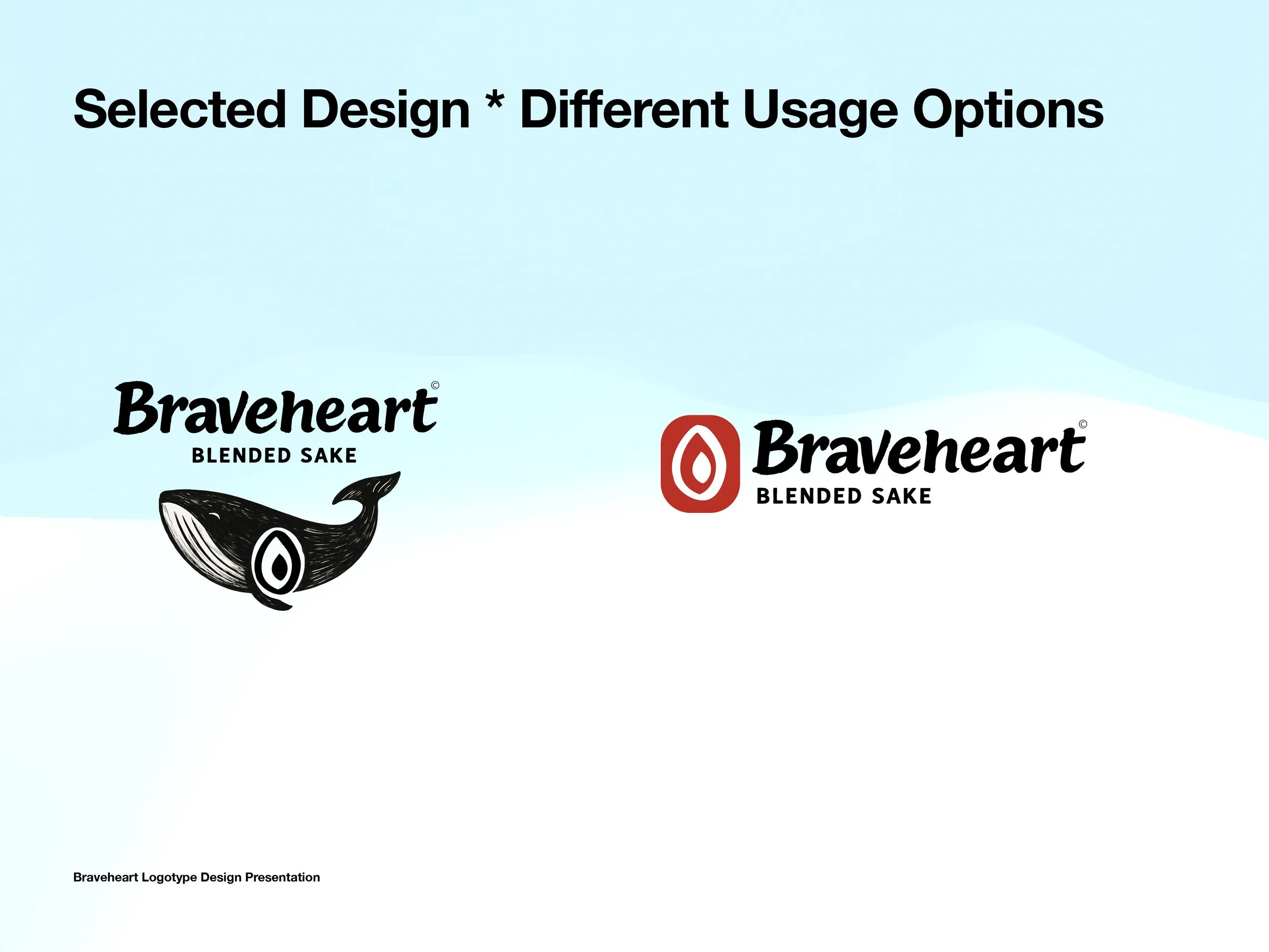
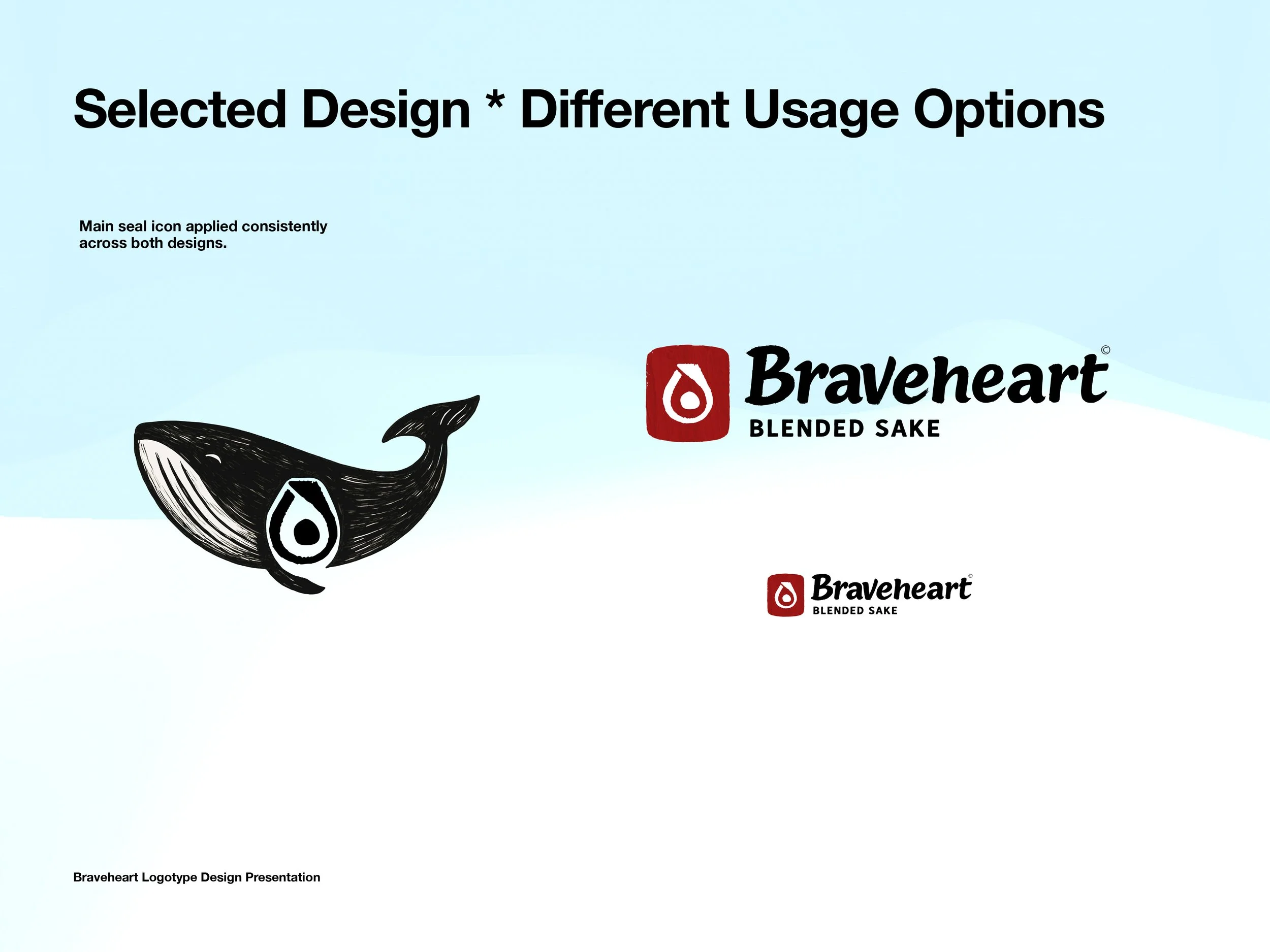
The client selected Design 1 – Shinpaku Negative Space, but asked us to combine elements:
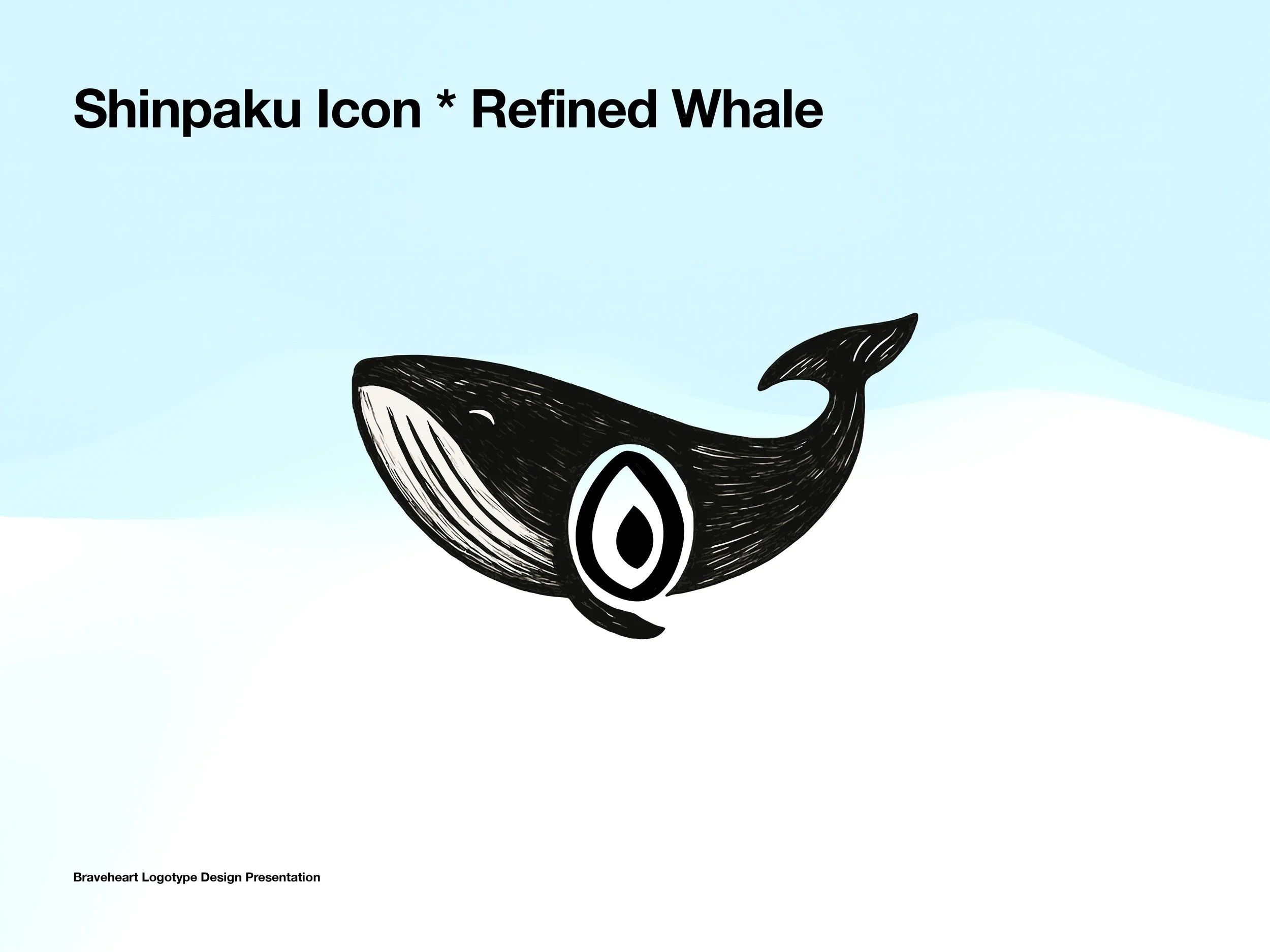
Refined the whale illustration with stronger brush strokes.
Integrated the Shinpaku grain directly into the whale’s body.
Adopted the edgier typography from Design 2.
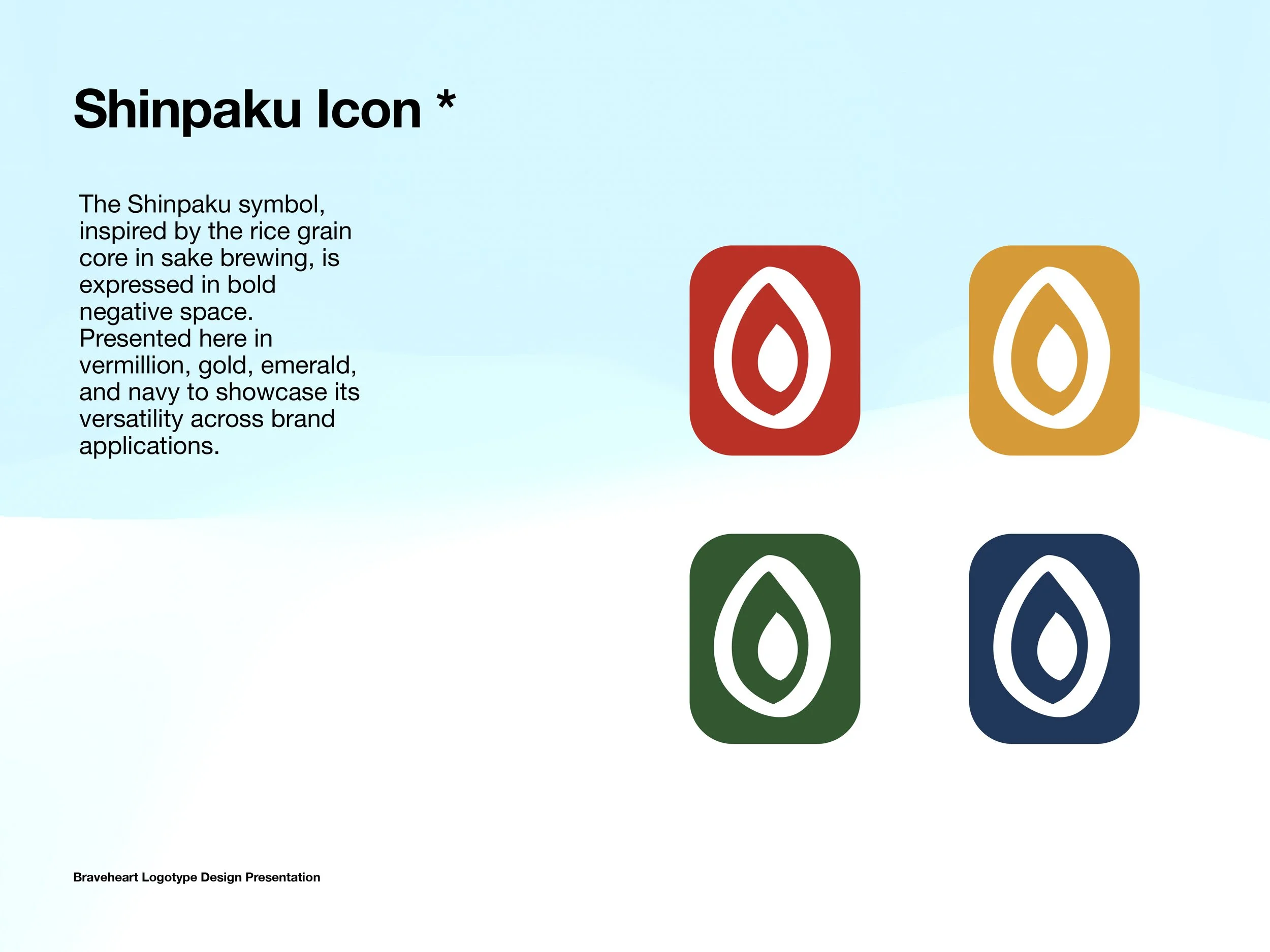
Created a secondary brand mark (the Shinpaku icon) for flexible applications.
Explored colorways (vermillion, gold, emerald, navy) to build a versatile identity system.
This hybrid solution perfectly balanced tradition with rebellion — a Braveheart in visual form.


Stage 3: First Packaging Explorations
With the identity locked, we moved to can design (250ml sleek format).

Can design brief
We presented five conceptual directions:
Collage Watercolor – Textured, handcrafted illustrations.
Minimal Line Art – Refined drawings with premium foil accents.
Dynamic Wave Expression – Abstract brushstroke energy.
Minimal Botanical – Clean ingredient sketches.
Bold Brushstroke Heart – Strong, central heart motif integrating ingredients.


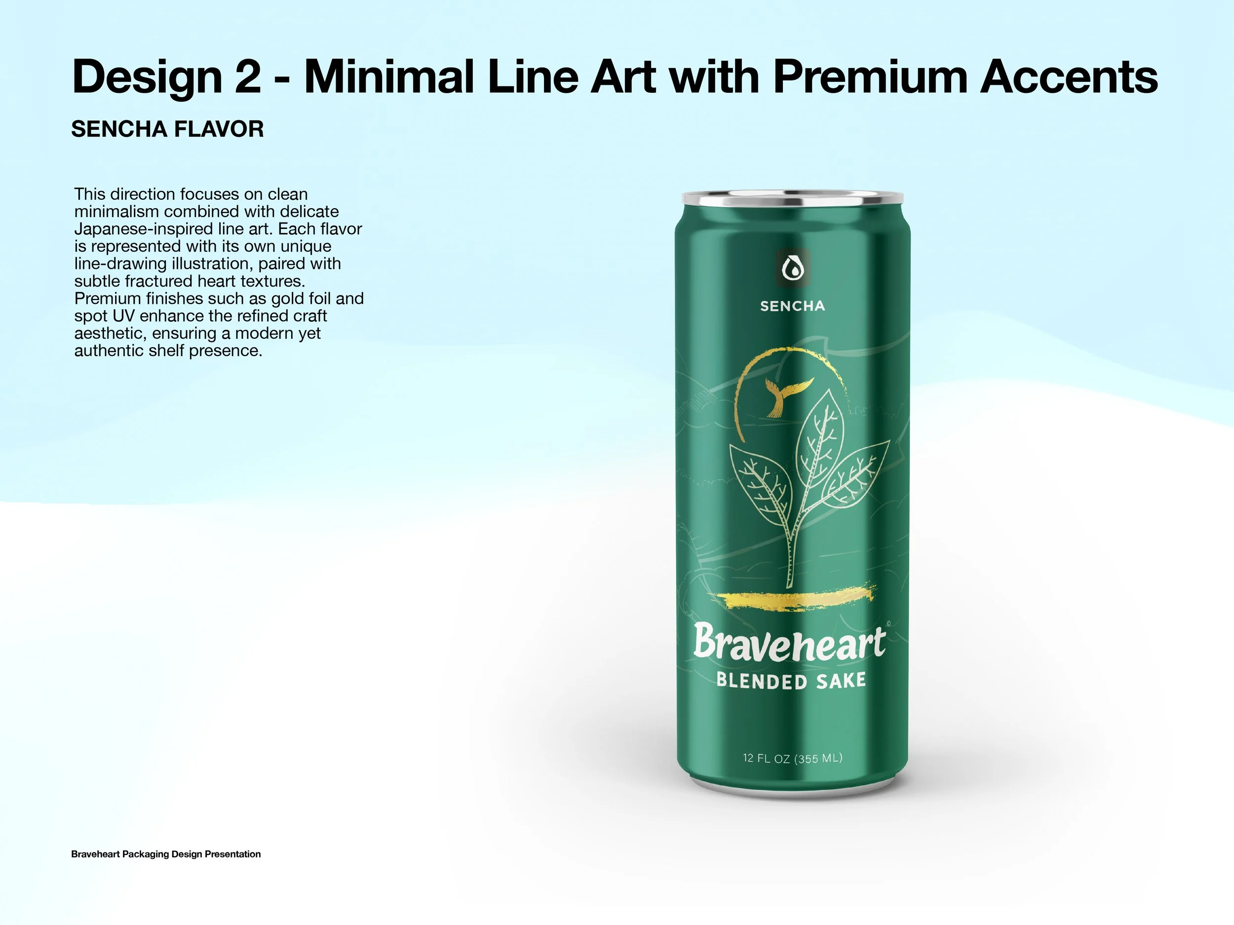
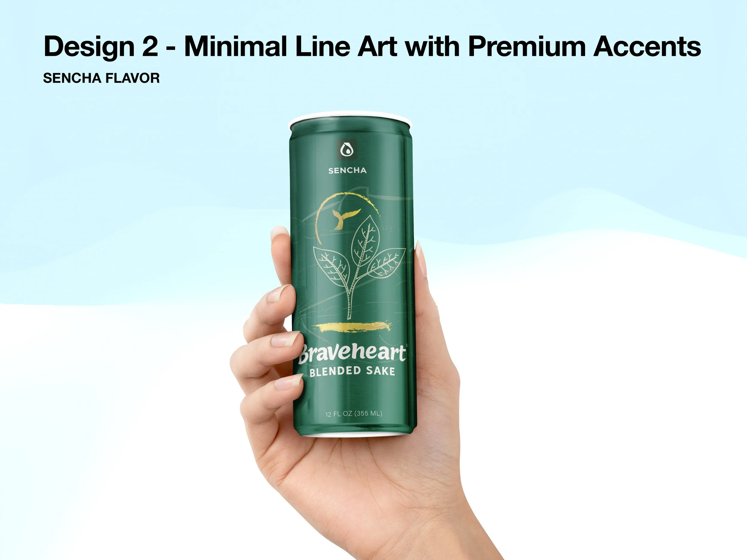


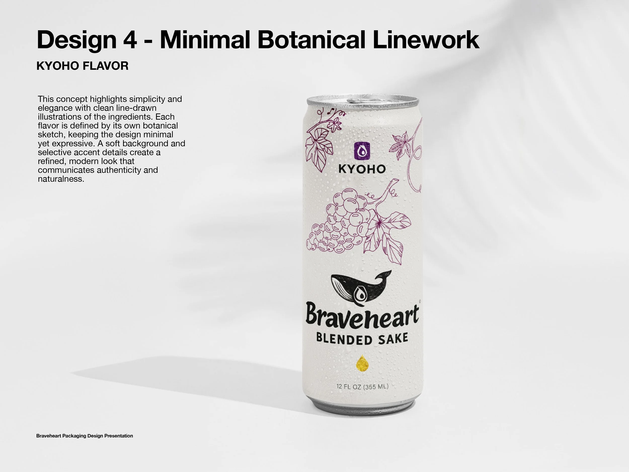
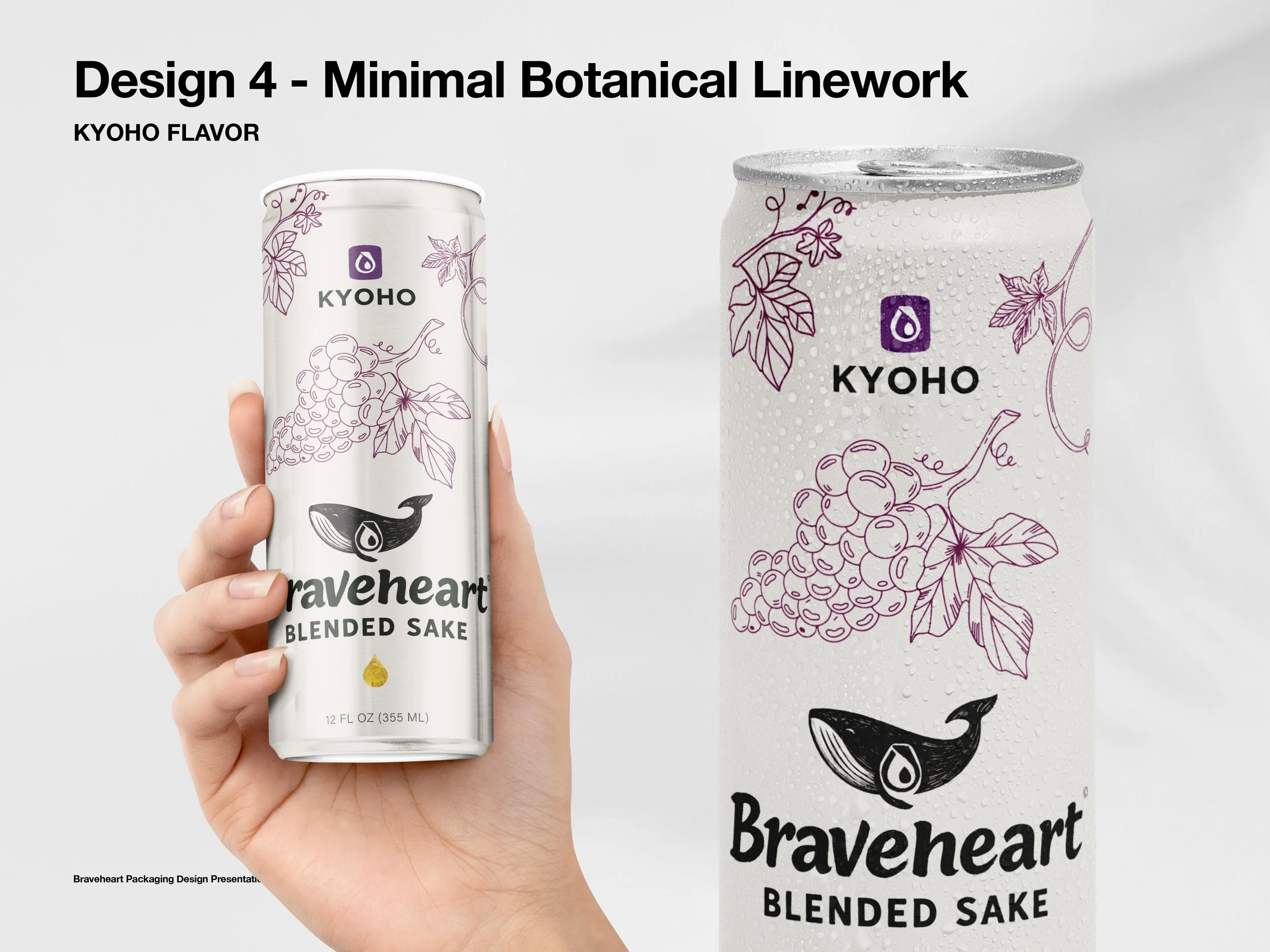


While beautiful, the client felt the concepts leaned too elegantly/minimally and lacked the bold edginess they envisioned. They wanted something closer to the rebellious, Asian-inspired energy of their original references.
This became a pivotal moment: instead of pushing forward, we paused to let the client refine their vision — a collaborative reset that clarified direction.
Stage 4: Bold Alternatives
To answer the call for edginess, we created two stronger mockups:
Purple Kyoho Can – Dark, premium with metallic gold motifs (waves, clouds, grapes).
Blue Coconut Can – Playful, rebellious with bright yellow brushstrokes and whimsical wave curls.
These two styles reignited the discussion — one leaning premium & sophisticated, the other rebellious & raw.


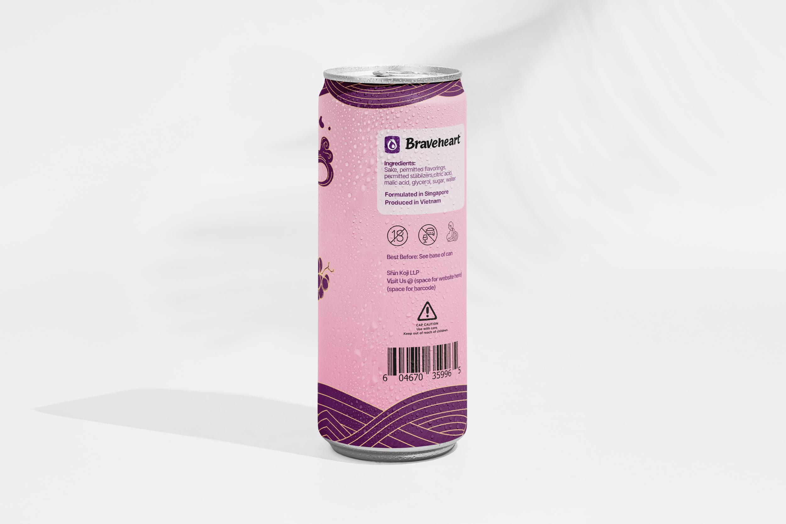
Stage 5: System Building
Once the tone was agreed, we systemized the packaging across flavors (Sencha, Kyoho, Koko):
Flavor Profiles clearly listed on front.
One-liner
Ingredient illustrations in duo-tone, flowy style.
Seal moved to the back with space for a 15-word brand story.
Compliance icons added.
Production details (Formulated in Singapore, Produced in Vietnam).
Stage 6: Final Variants
We presented two complete design systems for the final decision:
Dark Version → bold overall tone, white typography, bronze ribbon consistent across flavors.
Light Version → lighter base, dark typography, ribbon color changes per flavor for differentiation.
Both versions carried the Braveheart DNA: whale icon, Shinpaku heart, Asian line motifs, and bold shelf presence.
Outcome
The brand decided to go with the dark variant, and we wrapped up the three initial flavours.


Braveheart’s identity evolved through exploration, reset, and refinement into a bold and authentic brand:
A logotype system rooted in Japanese tradition but styled with rebellious energy.
Packaging that stands apart on shelves with distinctive flavor colors and dynamic detailing.
A design system scalable across multiple SKUs and future expansions.
Braveheart is now ready to take its place as a modern sake for the free-spirited, bridging heritage and rebellion — true to its name.