

October 27, 2026
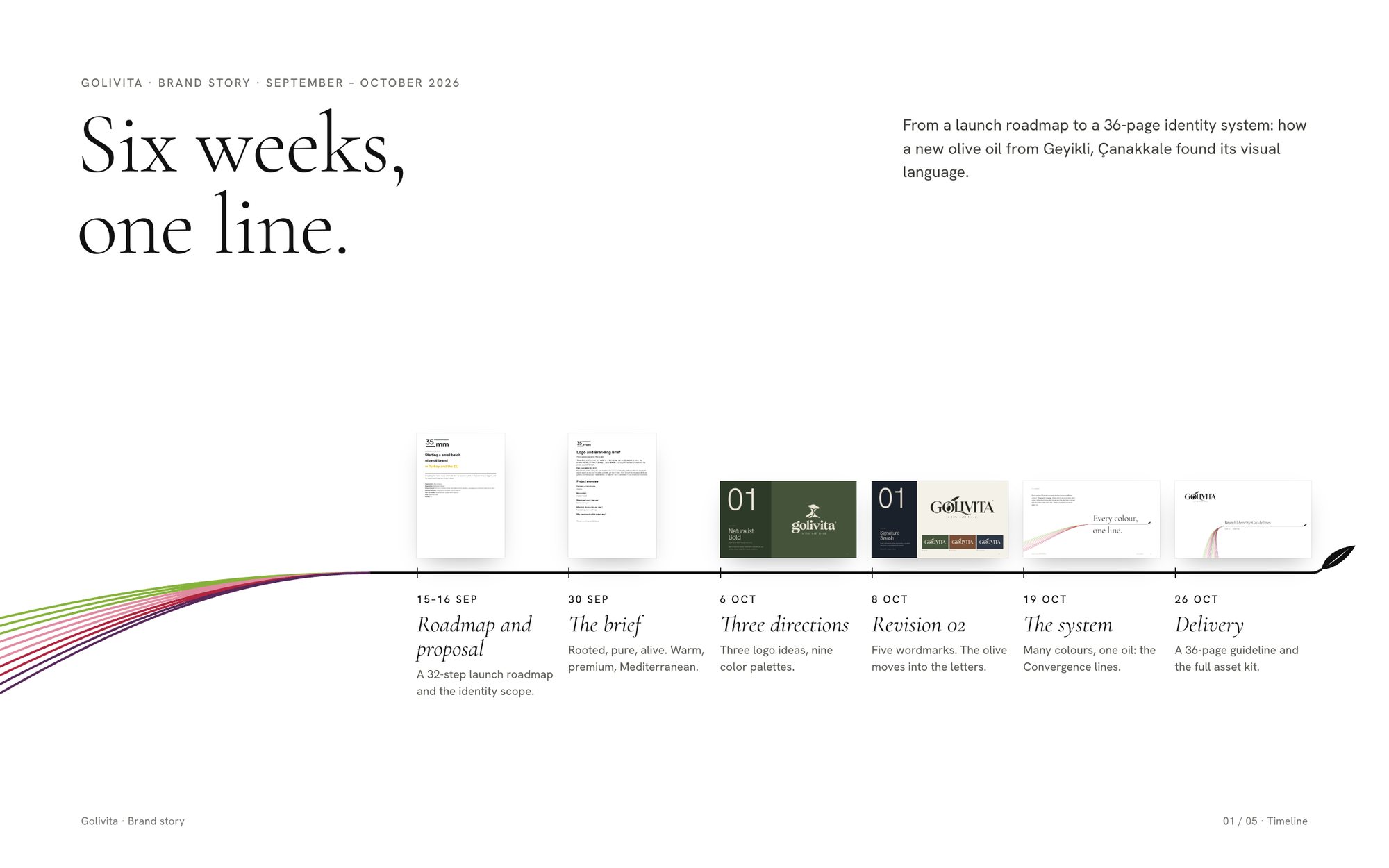
Golivita is a new premium olive oil from Geyikli, Çanakkale. Between September 15 and October 26, 2026, we took it from a blank page to a 36-page guideline and a full asset kit.
This is how the identity evolved, including the options we left behind and the turn that changed everything.
Three words in one name
The name came from the founder, and it carries the whole idea. Golivita is three words in one:
- G for Geyikli, the village where the farm and its trees are.
- Oliva for the olive.
- Vita for life.
The founder's brief put the idea in one line. Olive oil is not just something we add to the table; it is one of the oldest rituals of a good life. The tagline follows from it: A life well lived.
The brief: rooted, pure, alive
The founder came to olives after more than 30 years in technology. The farm uses data to plan irrigation, fertilizing, pruning and harvest, and adapts the methods of Europe's leading producers to Turkish conditions.
The brand starts in Turkey, but it is built to travel. The owners want to enter European and Japanese markets within a few years, so the identity had to feel modern and premium from day one.
The brief gave us three words to work with:
- Rooted: it comes from a real place.
- Pure: simple and natural.
- Alive: about the table, people and nature.
It also gave us clear limits. Muted colors, nothing vivid. Legible on dark glass and on a yellow tin. Original, never busy.
Round one: three ideas of the brand
On October 6 we presented three directions. Each one was a different answer to the question "What is Golivita?" Each came with a logo, a bottle study and three color palettes.
- Naturalist Bold: a tree and a figure in one silhouette, with a soft lowercase serif. The most everyday and the most natural on social media.
- Pure Elegant: classical Roman capitals with an LI ligature and a young tree. The strongest on glass, premium shelves and gift boxes.
- Rooted: an old tree with visible roots inside an emblem. The most shelf impact on tins and labels.
That makes nine palettes in total: olive grove, clay and sun, Aegean morning, ink and linen, golden harvest, navy table, century, soil and silver leaf. All of them were muted, as the brief asked.

Round two: the olive moves into the letters
On October 8 we came back with Revision 02: five wordmarks and no separate tree symbol. In every option, the olive now lives inside the letters.
- Signature Swash: classical capitals, an olive branch in the O and a swash under the letters.
- Organic Display: a high-contrast lowercase serif with an olive pit in the o.
- Heritage Bold: heavy flared capitals with a sprout inside the G.
- Pure Elegant: ultra-condensed capitals where the V becomes a leaf.
- Mediterranean Classic: Roman capitals with an olive in the O and a leaf in the L.
Option 01, Signature Swash, became the Golivita logo.

The turn
Up to this point, the brand lived in dark glass and muted grounds: olive green, clay and navy. The guideline we shared on October 19 looks very different. The ground is white. The logo is black. Color comes from the olives themselves.
[EDITOR NOTE: Add two or three sentences here on why the direction changed after Revision 02. For example, the owners' feedback, a shelf test, or our own proposal. Delete this note before publishing.]

Many colours, one oil
On one tree, olives ripen at different speeds. Green, blush, ruby and black fruit are picked on the same day. In the bottle, they become one oil.
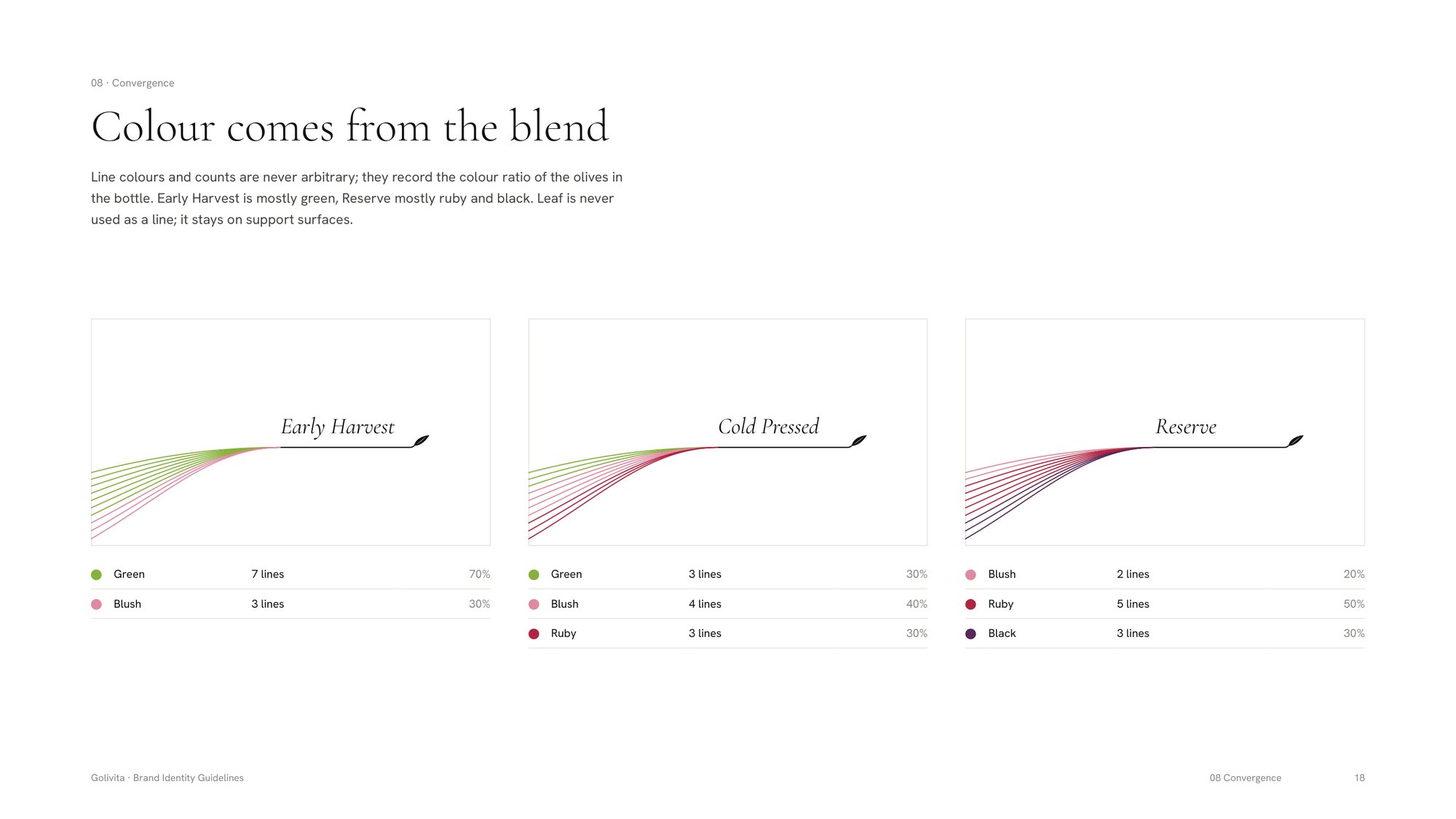
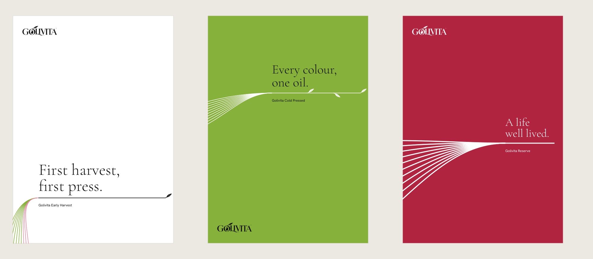
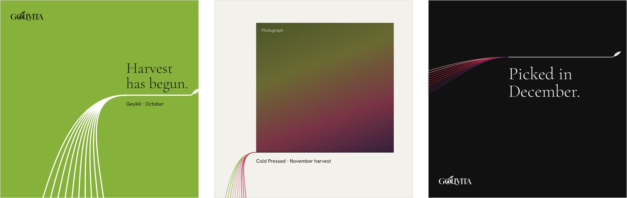
The identity draws exactly that. Each color in a blend enters the page as a line. The lines meet and leave as a single black line. That line is a baseline: the product name sits on it and the information hangs below it.
The colors are never decorative. A blend is drawn with 10 lines, and each line stands for 10 percent of the olives:
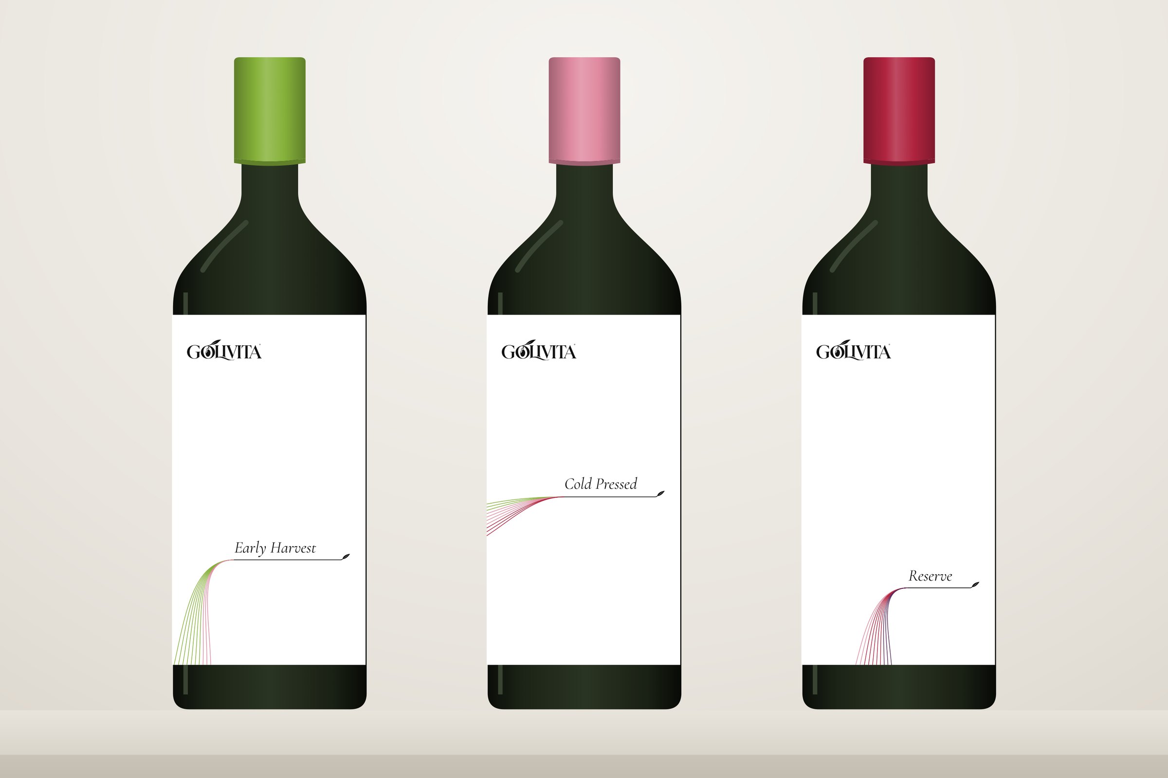
- Early Harvest: 7 green, 3 blush.
- Cold Pressed: 3 green, 4 blush, 3 ruby.
- Reserve: 2 blush, 5 ruby, 3 black.
So every product carries its own record of the harvest.
The signature
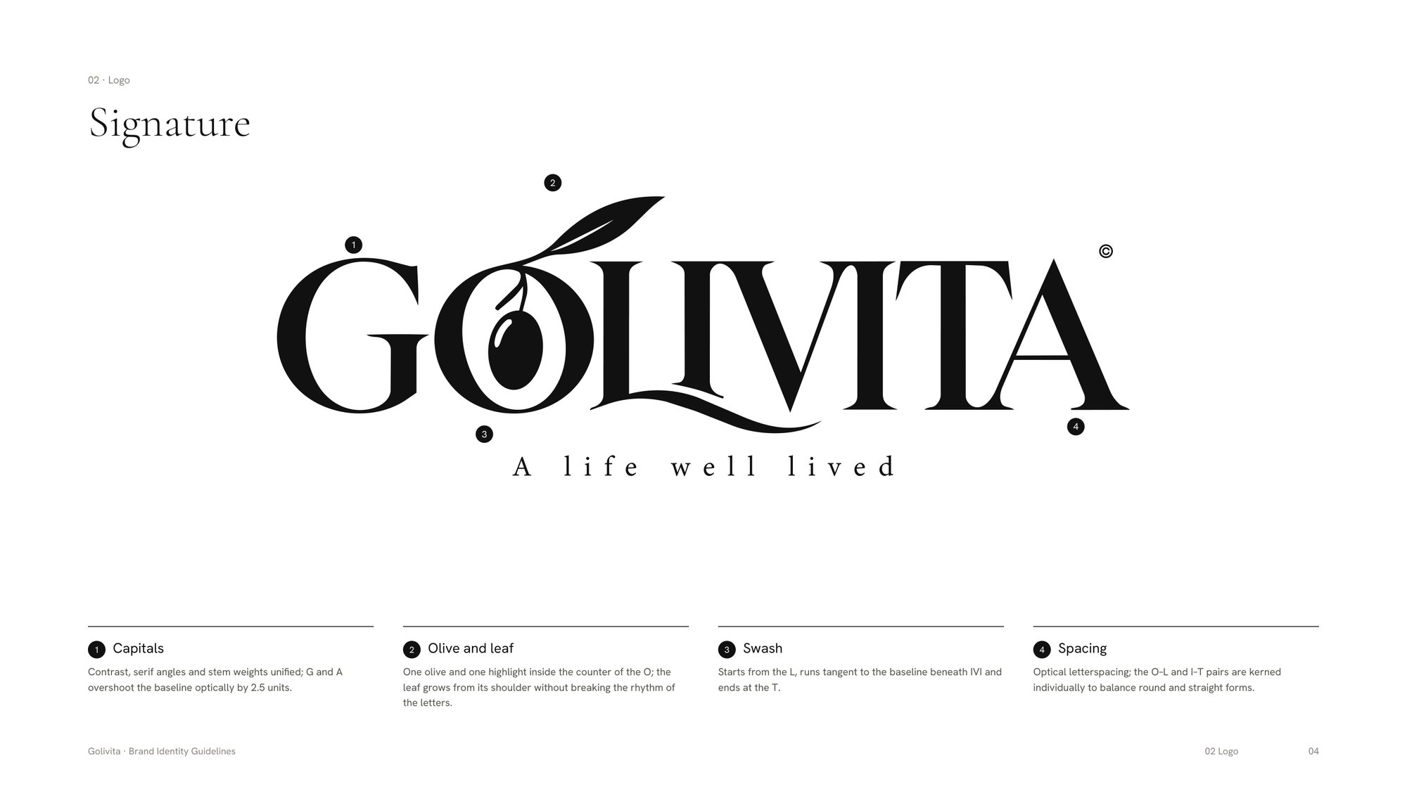
The final logo keeps the spirit of Signature Swash and tightens everything else. Contrast, serif angles and stem weights are unified. One olive and one highlight sit inside the O, and the leaf grows from its shoulder. The swash starts from the L and ends at the T.
The olive sits on a −18° axis. The same angle sets the entry of every Convergence line, so the logo and the graphic system come from one geometry.
The O also works on its own as the symbol: on the cap, the seal, the app icon and the favicon.
One system, many behaviors
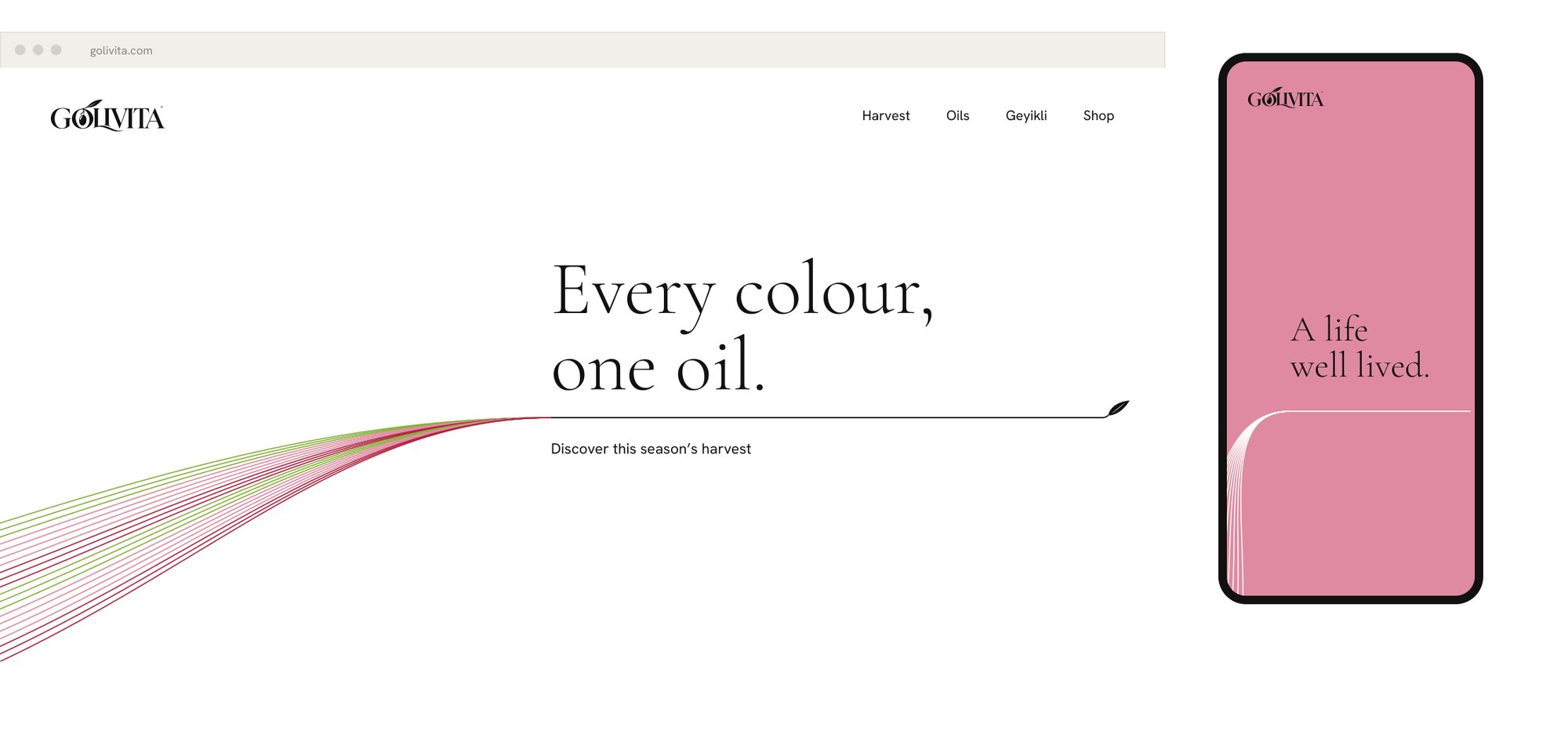
The final palette is mostly white, with black for the logo and type. The four harvest colors (Fresh Green, Blush, Ruby and Aubergine) appear only in the lines. Now and then, a whole surface takes a harvest color, and the lines turn white.
Typography has two clear roles. Cormorant Garamond carries the contrast of the logo into headlines and product names. Hanken Grotesk carries the information.

The rule stays fixed; the position is free. The convergence point follows the type: high or low, from the left or from below, at any scale. That keeps posters, social posts and web pages from repeating each other.
What we delivered
On October 26 the owners received 204 files:
- A 36-page brand identity guideline.
- The primary logo, small-use logotype and symbol, in positive, reversed, off-white, monochrome and blind-emboss versions.
- The Convergence line system for all three blends, in standard, bold crop, harvest ground, negative, 20-line, 30-line, signature and leaf versions.
- The color palette with HEX, RGB, CMYK and Pantone direction, plus swatch files and CSS for development.
- Both font families, under the SIL Open Font License.
- App icons for iOS and Android, and favicons.
What comes next
Label and packaging design for the tin, the bottle and the gift box is the next phase. The photography will happen in Geyikli during the harvest: real fruit, controlled light, no Mediterranean clichés.
Golivita began with one idea: many olives, one oil. Six weeks later, that idea became the brand.
If you'd like to see more of our branding and packaging work, have a look at 35milimetre.com.