


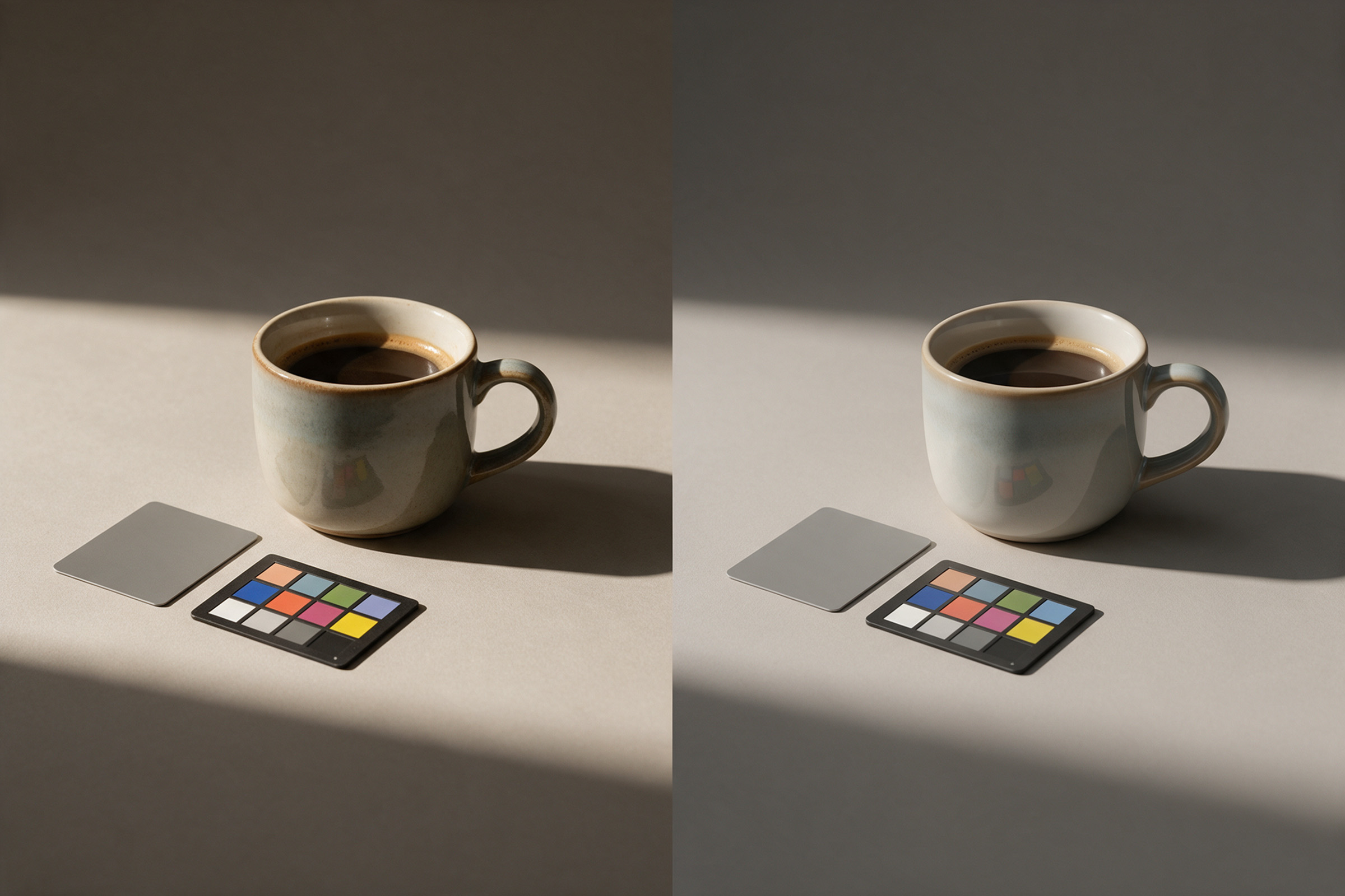
You light the 3D product well. The shadows sit right. The materials are correct. Then you place the render next to the campaign photos, and something is off. The white looks blue. The reds look too loud. The highlights look flat. This is one of the most common problems in 3D render colour matching with photography, and most of the time it is not a lighting problem at all.
It is a colour management problem: how the render's light values become the colours you see, and whether that matches the way the photographs were processed. In this article we explain, in plain words, why a render can look wrong next to a photo, and the simple pipeline we use to fix it before delivery. It builds on our earlier guide on how to combine 3D with photography.
Why a good render can still look wrong next to a photo
A 3D renderer works with light as numbers. Those numbers are "linear": twice the light means twice the value, and bright highlights can go far above what a screen can show. A camera sensor also records light this way. Then two very different things happen.
The photograph goes through a raw converter. The photographer picks a white balance, a camera profile and a contrast curve, and exports a file, usually in sRGB or Adobe RGB. All those choices give the photo its look.
The render goes through a view transform: a set of rules that turns linear light into a picture for the screen. Every 3D package has its own default. Blender, for example, made AgX the default view transform in new files from version 4.0, replacing Filmic. Other tools and other artists use other settings.
So the render and the photo can start from the same kind of data and still end up with different contrast, different saturation and a different idea of what "white" is. Put them side by side and the eye sees the gap at once.
The three things to line up
When we match CGI to photography, we check three things, in this order.
1. Working colour space. This is the "container" the renderer uses for its numbers. Linear Rec.709 is common and is still Blender's default. Wider spaces like ACEScg exist for pipelines that need them. Blender 5.0, released in November 2025, added a per-file working colour space with Linear Rec.709 as the default and options for Linear Rec.2020 and ACEScg. The important point is not which one you pick; it is that textures, renders and compositing all agree on it.
2. White point. The render needs the same idea of "neutral" as the photos. If the photographer balanced to warm tungsten and the 3D artist lit with neutral daylight values, the product will look cold next to the set. The fix is simple: shoot a grey card or colour chart in the real light, and use it as the reference in both the raw conversion and the 3D scene.
3. View transform and grade. This is the step that shapes contrast and how highlights roll off. Blender 5.0 also added ACES 1.3 and 2.0 views as an alternative to AgX and Filmic, for teams working in ACES pipelines. Whichever view you use, the photos and the render should then go through the same final grade, not two separate ones.
ACES and OpenColorIO, in one paragraph
You will see these names often. OpenColorIO (OCIO) is an open-source colour management framework that 3D and compositing software uses to describe colour spaces and conversions, so different programs can agree on what a file means. ACES is a colour system from the film industry, with defined spaces such as ACEScg and its own view transforms. Neither is a magic fix. They are shared rules. They help most when several people and programs touch the same images. For a single product render placed into a shoot, a careful, consistent setup in your own tools is often enough. It is worth knowing that ACES support is now built into common tools; it is not the default everywhere, and you should not assume your 3D artist is using it.
A simple pipeline for matching renders to photos
This is the pipeline we follow when a CGI product has to sit next to, or inside, real photography.
- Get the references from the shoot. A grey card or colour chart shot in the real light, a clean plate of the set, and if possible an HDRI of the location.
- Agree on colour spaces at the start. Write down the working space for the 3D scene, the space of the textures, and the space of the final delivery files. Put it in the brief.
- Convert the photos consistently. Raw files converted with the chart as the white balance reference, exported to the agreed space, without a heavy creative look yet.
- Render to a linear file. EXR files keep the full range of light values, so highlights can be graded later instead of clipping.
- Match in compositing. Put the render and the photo in the same comp, in the same working space. Match black level, white point and highlight roll-off first; saturation last.
- Grade once, on top of everything. The creative look goes over the photo and the render together, so they share it.
- Check on more than one screen. A calibrated monitor first, then a phone. Most final images are seen on phones.
If the product still looks "too CG" after this, the cause is usually material detail, not colour: reflections too clean, edges too sharp, no dust or micro texture. That is a separate pass.
What to ask your 3D studio
If you are commissioning renders to sit alongside photography, a few questions save a lot of revision:
- Which working colour space and view transform will you use?
- Will you deliver linear EXR files or only graded JPGs or PNGs?
- Do you need a grey card or chart from our shoot?
- Who does the final grade: the photographer, the 3D studio or a retoucher? (One person should.)
The practical takeaway
When a render looks wrong next to a photo, check colour before you touch the lighting. Agree on one working space, use a real grey card as the shared white point, keep renders linear until the end, and grade the photo and the render together, once.
We combine 3D and photography in our product and packaging work, and Mehmet has 26 years in post-production, much of it spent making different sources look like one image. If you want to see how that looks in practice, our 3D and compositing work is at 35milimetre.com.