


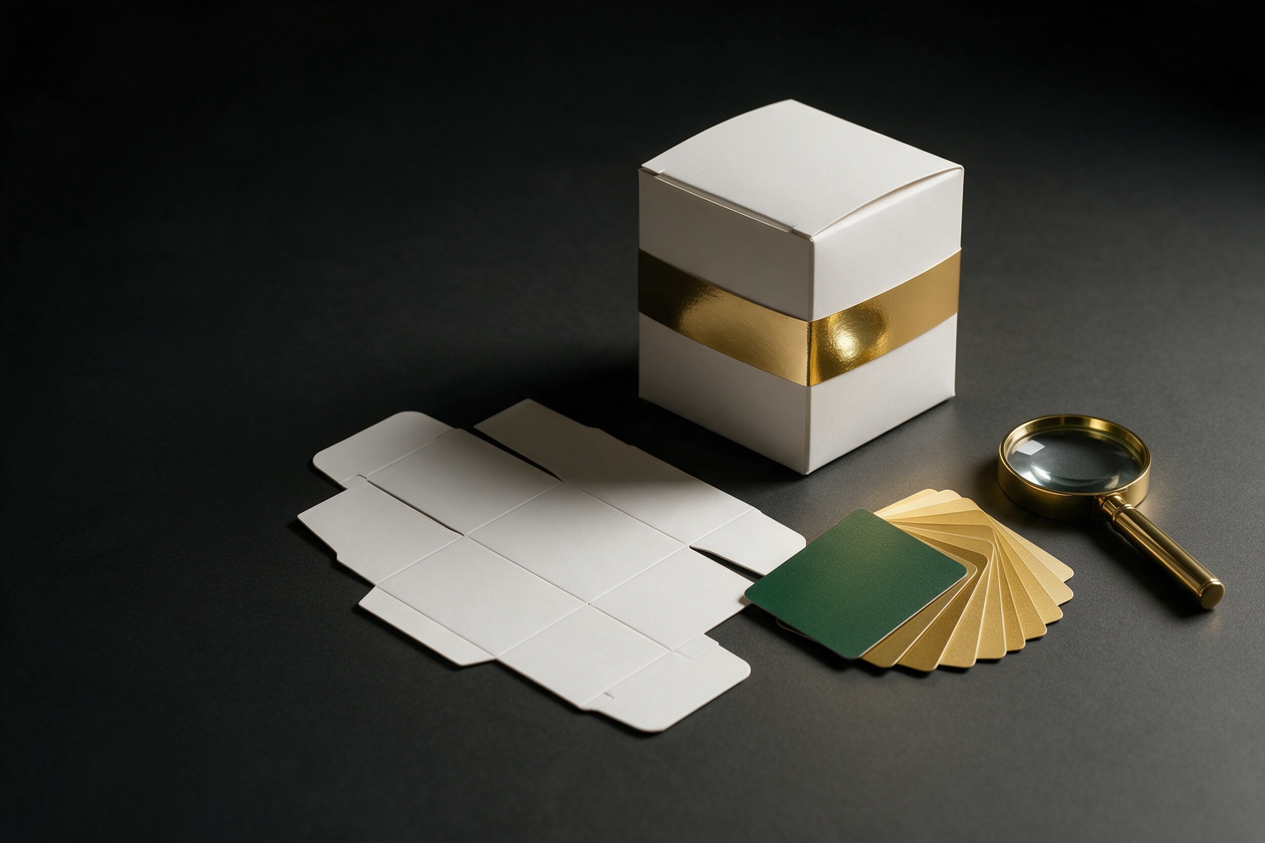
A printed carton that comes back wrong is an expensive lesson. The foil sits too far left, the green looks muddy, the gloss that looked rich on screen is flat on board. Most of this can be caught earlier, and a 3D packaging mockup before print is the cheapest way to catch the first half of it.
The second half it cannot catch. This article separates the two, so you know what to sign off on a render and what still needs a physical proof.
What does a 3D packaging mockup show well?
A good 3D render puts the real dieline on a real shape and lights it. That lets you approve things that a flat PDF hides:
- Shape and proportion. How the design wraps around the pack, and what the front looks like from the angle a shopper sees it.
- Layout. Where the logo, claims and legal text land once the pack is folded, including what falls on a seam or a fold.
- Hierarchy on shelf. Which element reads first, and at what distance.
- Finish concept. Whether matte, gloss or foil suits the design.
- Range look. How the new pack sits next to the other flavors or sizes.
- Sales use. The same render can go into a presentation or an early product page before production starts.
These are decisions about design and layout, and a render is a good tool for them.
What can a render not prove?
Color and the physical behavior of materials. One packaging supplier states it directly: a digital mockup gives an approximate sense of finish, including matte, gloss and foil, but cannot establish true color because a monitor is not a printing device, and it does not show how a specific substrate takes ink (4Packaging). The same source says a mockup cannot verify foil registration tolerance. That is a supplier's view, but it matches what we see in production.
In plain terms:
- Color. A screen shows light; print shows ink on a surface. Brand colors, especially greens, oranges and deep blues, can shift.
- Foil and varnish. A render can show where the foil goes. It cannot show whether it registers exactly with the printed artwork.
- Board and substrate. Show-through, absorption, texture and how the stock folds.
- Emboss and structure. Depth is simulated, not tested.
What are the proof types after the render?
The same supplier describes two stages. A contract proof is made on the production substrate, or a close match, before the cylinders are engraved, and it is the place to check color, foil and varnish registration and ink behavior. A press proof is a short run on the intended press, and it checks the things a contract proof cannot, such as production-speed behavior and press-specific issues (4Packaging). The details vary by printer and process, so ask yours which proofs it offers.
A structural sample, a plain folded and glued carton, is a separate check for fit, windows and die-cut alignment.
How do you combine the two?
Use the render first, and the proof last:
- Render for design sign-off. Approve shape, layout, hierarchy and the finish idea in 3D. Change things here, where changes cost a few hours.
- Fix the file. Make the print-ready artwork with the printer's specs and color profile.
- Physical proof for color and finish. Approve color and foil on the real stock. Agree an acceptable color tolerance in writing beforehand.
- Press check if the run is large or color-critical.
Do not skip the third step because the render looked perfect. The render is a design tool, not a color standard.
What should you tell your 3D studio?
Send the dieline, the finish list (foil, spot varnish, emboss), the brand color references with their print values, and the stock the printer will use. Say which decisions the render has to support: for example "approve layout and finish placement, not color." That keeps everyone honest about what the image is for. Our guide on how to get foils, labels and shrink-wraps right in CGI beverage packaging shows how finishes are built in a render.
What are the most common mistakes?
The first is approving color from a screen render and skipping the proof. The second is sending the printer a file that differs from the one that was rendered, so the approved look never reaches the press. Keep one master file and have the printer confirm which version they received. The third is treating finish as decoration. Foil and spot varnish add production steps and tolerances, and they need the same attention as the artwork.
A fourth, smaller one: reviewers who do not know what they are signing. Label each approval round with what it covers, for example "layout approved" or "color approved on proof."
Practical takeaway
Use a 3D packaging mockup to settle the design, and a physical proof to settle the color. If a job has foil or tight brand colors, plan the proof into the schedule from the first day, and tell approvers which of the two they are looking at.
If you want packaging rendered before it goes to the printer, you can see our work at 35milimetre.com.