Color Unleashed: How Retouchers, 3D Designers, and Photographers Paint the Future of Advertising
It has been a while since I last shared a newsletter. Not because I lack interesting projects to write about but because I often have to wait for some projects to be approved by their owners. However, I frequently check LinkedIn lately, as I find more content I enjoy reading and seeing there than on other platforms. Twitter is typically disheartening, and I am uncertain about what it is precisely anymore. Nevertheless, it remains a valuable resource for AI imagery. Although I enjoy the imagery there, Instagram is visually appealing but does not necessarily educate me. Finally, I find LinkedIn the most engaging platform, where I can follow and see the works of people I admire (and unfollow those I don't). Recently, a few photographers have caught my attention with their innovative use of color. If you're not following, please check out Charlotte Turton, Sigourney Whitesel & Chrissie Knudsen. I love the minimalistic but, at the same time, impactful use of colors.
Lately, I have been retouching and creating 3D renders for both alcoholic & non-alcoholic products. As it's summertime and there is a higher use of them, as a result, I work with them more often. I'm drawn to using saturated colors with such visuals because I like impactful colors.

Photography by Wonnacot
Color plays a vital role in beverage advertising. Brands use specific hues to trigger certain emotions and perceptions in consumers. For example, the bright red of a Coke can signify excitement and bold flavor. The crisp aqua of a Dasani water bottle conveys purity and refreshment. As a photo editor and 3D artist, I leverage the psychology of color to make beverage ads more compelling. The right tones can attract attention, convey product attributes, and drive purchase intent.

Photo by Wes Kroninger, Retouch by Mehmet Turan
With the emergence of new digital platforms and tools, how we approach color has significantly evolved, yet the foundational principles remain the same. We've seen this clearly in the beverage industry, where 3D renders have become an essential aspect of marketing. Through meticulous planning and an artistic understanding of color, I can create visuals that not only align with the brand's identity but also resonate with the target audience. The rich, vivid hues of a tropical cocktail or the subtle, calming shades of a herbal tea - each color is chosen with intention and tailored to the product's unique appeal.
Yet, color is not a static element; it is dynamic and interacts with other aspects of the composition. Lighting, texture, and even the shape of the container play roles in how a color is perceived. This is where technical skill meets creativity, allowing a photo editor and 3D artist like myself to manipulate these elements to create a cohesive and visually stunning image. Whether it's amplifying the golden glow of a beer or enhancing the cool blue of a sports drink, the careful interplay of these factors elevates the overall impact of the advertisement. As we move forward in this ever-changing landscape, the ability to adapt and innovate in our use of color will continue to be a critical skill for those in the creative field.
One of the most iconic uses of color in advertising is the "Share a Coke" campaign by Coca-Cola. This campaign featured personalized Coke cans and bottles with people's names, all set against the unmistakable bright red that has become synonymous with the brand. The red not only attracts attention but also ignites feelings of passion, excitement, and a sense of connection. It's a color that has been part of Coca-Cola's identity for decades, and this campaign leveraged it to create a personalized and engaging connection with consumers.

Another remarkable campaign is Absolut Vodka's print ads, particularly their series, which highlights the purity of the product. Using a stark, minimalist design with a transparent bottle against a white background, the focus is placed on the clarity of the vodka itself. The simplicity of the color scheme emphasizes purity and quality, conveying the essence of the product without distraction. In both these campaigns, the thoughtful and strategic use of color creates a powerful visual statement, translating the brand's message into something tangible and resonant with the audience.
Fanta's "Don't Stop The Play" campaign emphasized yellow and orange to reflect the soda's bright, fruity flavor. Their ads featured youthful, active characters having carefree fun - playing sports, games, dancing - with Fanta as part of the experience. The bold yellow (my favorite color, as you may guess) and orange hues energized the imagery and supported the upbeat, lively vibe. Fanta effectively aligned the soda's vibrant colors with a fun, playful identity that appealed to teens and young adults. The colors were both attractive and instantly recognizable as Fanta's.
These examples demonstrate how strategically leveraging brand colors in advertising campaigns can increase engagement, recognition, and sales. Both Coca-Cola and Fanta created memorable executions that made their drinks undeniably identifiable through their established color palettes.
As we navigate the intricacies of a visually driven marketplace, planning and utilizing color in projects for retouchers, 3D designers, and photographers must be strategic and imaginative. Understanding the target audience, brand values, and the emotional response desired are key factors in selecting the right color palette. It's about creating a visual language that speaks directly to the consumer, aligning with the brand's identity and prevailing cultural sentiments.
Here are some tips for visual artists to strategically use color when planning beverage advertising projects, along with potential color trends:

Fanta Re-brand Campaign by Greg Stroube
Understand color psychology - know what different hues convey and how they make audiences feel. Use colors intentionally to evoke desired emotions and associations.
Align colors with a brand strategy - incorporate colors that are recognizable for the brand, reinforce their messaging, and make their products identifiable.
Consider context - factor in where/how images will be seen and how that impacts color perceptions. Colors may translate differently on a billboard vs. a phone screen.
Use contrast wisely - bold color contrasts grab attention, while complementary palettes create harmony. Find the right balance for your goals.
Don't forget black and white - removing color can artistically highlight shapes, patterns, and textures.
Experiment with gradients - blended color transitions can create visual interest and depth.
Try unusual color combos - brands increasingly use unexpected hues, like Pantone's 2022 Color of the Year, Very Peri, to stand out.
Focus on natural hues - earthy tones and ingredients as color inspiration aligns with consumer desire for authenticity.
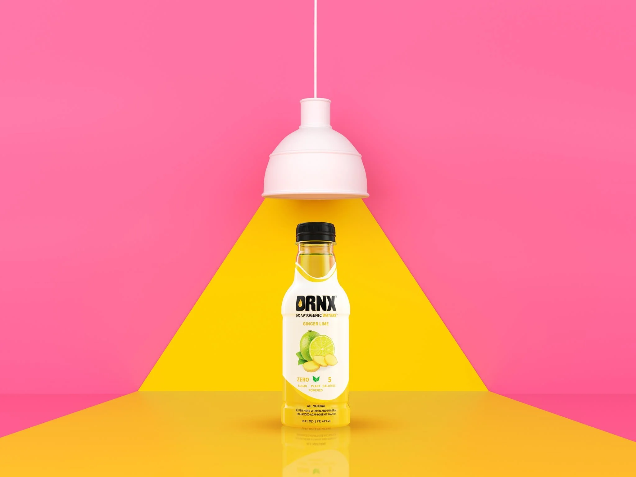
Go for bold saturation - vivid, intense colors feel energizing and convey flavor intensity. (You may check our DRNX renders.)
3D Render & Compositing by Emre Zorer & Mehmet Turan
Looking ahead, we can anticipate a continued exploration of bold, saturated colors that capture attention and elicit strong emotional reactions. Using color gradients and duotones, especially in digital spaces, is likely to be a prominent trend, allowing for a more dynamic and immersive visual experience. Sustainability and social responsibility also shape color choices, with earth tones and natural hues reflecting a growing environmental awareness.
3D rendering technology will further enable a more sophisticated manipulation of color, texture, and light, opening new doors for creativity and innovation. Collaboration between photographers, retouchers, and 3D designers will become even more essential, forging a unified vision that capitalizes on each discipline's strengths.
Thoughtful color use requires both strategy and creativity. Leveraging color trends and timeless principles of color theory can make beverage visuals more compelling, on-brand, and effective at engaging consumers.
In conclusion, the impactful use of color is a complex yet rewarding endeavor requiring artistic insight, technical prowess, and cultural awareness. As creative professionals, our ability to harness the full spectrum of color to tell compelling stories, evoke emotions, and build brand affinity will remain vital to our craft. The future of color in advertising is bright and multifaceted, and those who can skillfully navigate its nuances will be at the forefront of the industry.